Rate my handwriting

✨ Upload a sample of your handwriting, and our 🤖 AI will give you
the scoop on
what's awesome
and what could use a
little improving.
It's just for fun - and totally free! Try now 🚀
(You can also check out today's 👑 Leaderboard 👇)
The Determined Planner
This handwriting suggests a methodical planner with a dash of spontaneity, demonstrated by the organized structure and occasional variations in letter size and slant.
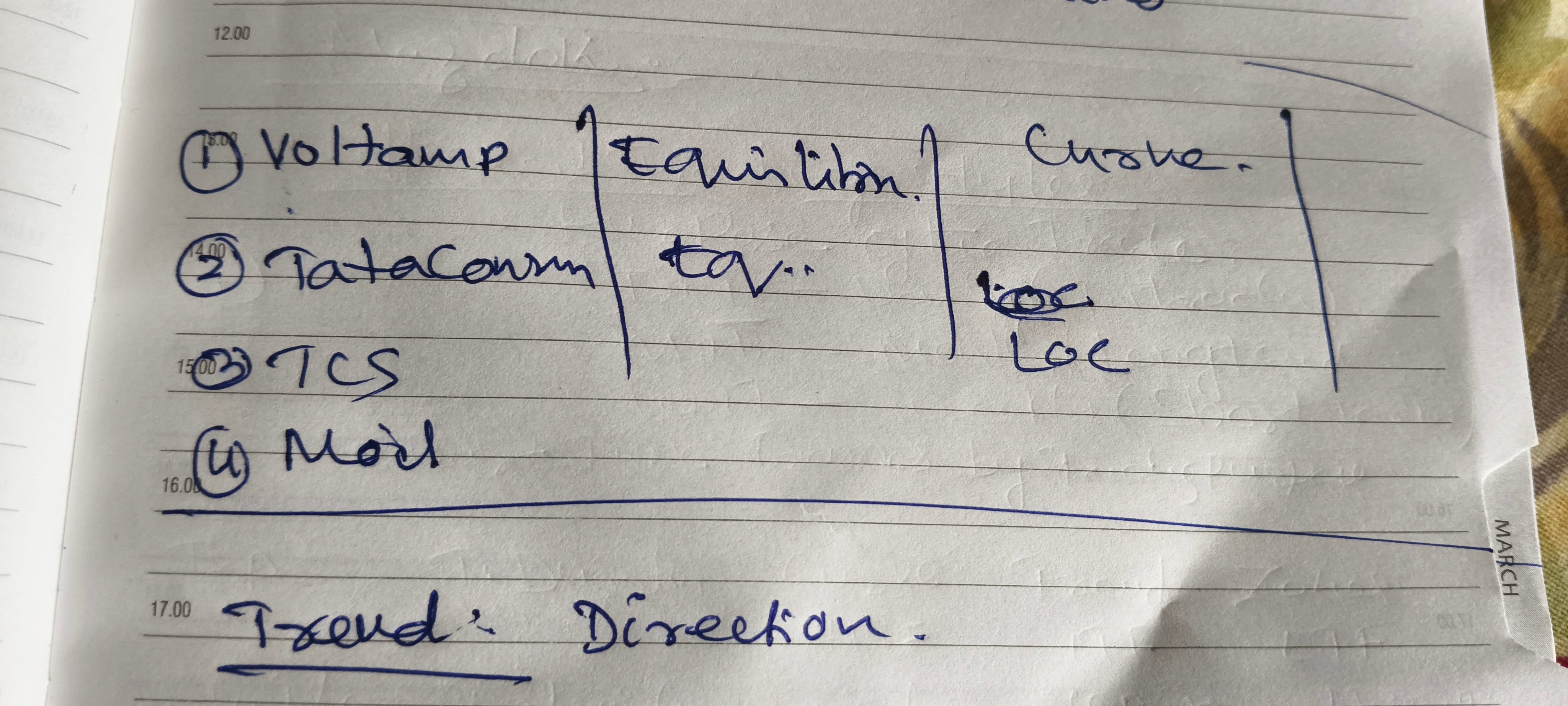
This handwriting is generally legible, although certain idiosyncrasies are notable. Words like "Voltamp" and "Tataconn" are written with a connected, almost cursive style, but with some irregularities in letter proportion. The "T" in "Trend" stands tall and determined, indicating a focus on direction. While some words like "Curve" lean slightly, the overall impression is one of order, exemplified by the vertical dividing lines separating items and the numbered list format.
The connected letters and forward slant suggest an organized and determined individual. The varying letter sizes hint at a touch of spontaneity and creativity within this structured approach. The underlined "Trend: Direction" underscores an analytical mind, focused on anticipating and navigating future pathways. The numbered list and dividing lines further enhance this sense of a methodical planner, one who likely values clarity and conciseness.
While generally legible, greater consistency in letter size and spacing could enhance readability. Focusing on uniform heights for letters like "m," "n," and "u" would make words like "Tataconn" appear neater. Paying attention to the baseline, ensuring that words like "Curve" don't float above it, would also improve the overall impression of orderliness.
Legibility
Expressiveness
Consistency
Overall
Leaderboard for Tuesday, 28 October 2025
| 1 | The Divine Calligrapher |
80
|
| 2 | The Humble Hand |
76
|
| 3 | The Cursive Narrator |
74
|
| 4 | The Pristine Print |
71
|
| 5 | The Diligent Student |
71
|
| 6 | The Coastal Bard |
69
|
| 7 | The Cursive Cartographer |
68
|
| 8 | Sunrise Musings |
68
|
| 9 | The Coastal Chronicler |
67
|
| 10 | The Coastal Dreamer |
67
|
| 11 | The Cursive Narrator |
67
|
| 12 | The River's Flow |
67
|
| 13 | The Diligent Note-Taker |
67
|
| 14 | The Studious Note-Taker |
66
|
| 15 | The Eloquent Pen |
66
|
| 16 | The Pragmatic Pen |
66
|
| 17 | The Deliberate Draftsman |
65
|
| 18 | The Upright Pen |
65
|
| 19 | The Dream Weaver |
65
|
| 20 | The Scientific Hand |
65
|
| 21 | The Historian's Hand |
64
|
| 22 | The Traditionalist's Script |
64
|
| 23 | The Script of Devotion |
64
|
| 24 | The Elegant Academic |
63
|
| 25 | The Typographer's Testament |
63
|
| 26 | The Studious Note-Taker |
63
|
| 27 | The Loopy Dreamer |
62
|
| 28 | Babylonian Beaches |
62
|
| 29 | The Aquatic Caller |
62
|
| 30 | The Pragmatic Professor |
61
|