Rate my handwriting

✨ Upload a sample of your handwriting, and our 🤖 AI will give you
the scoop on
what's awesome
and what could use a
little improving.
It's just for fun - and totally free! Try now 🚀
(You can also check out today's 👑 Leaderboard 👇)
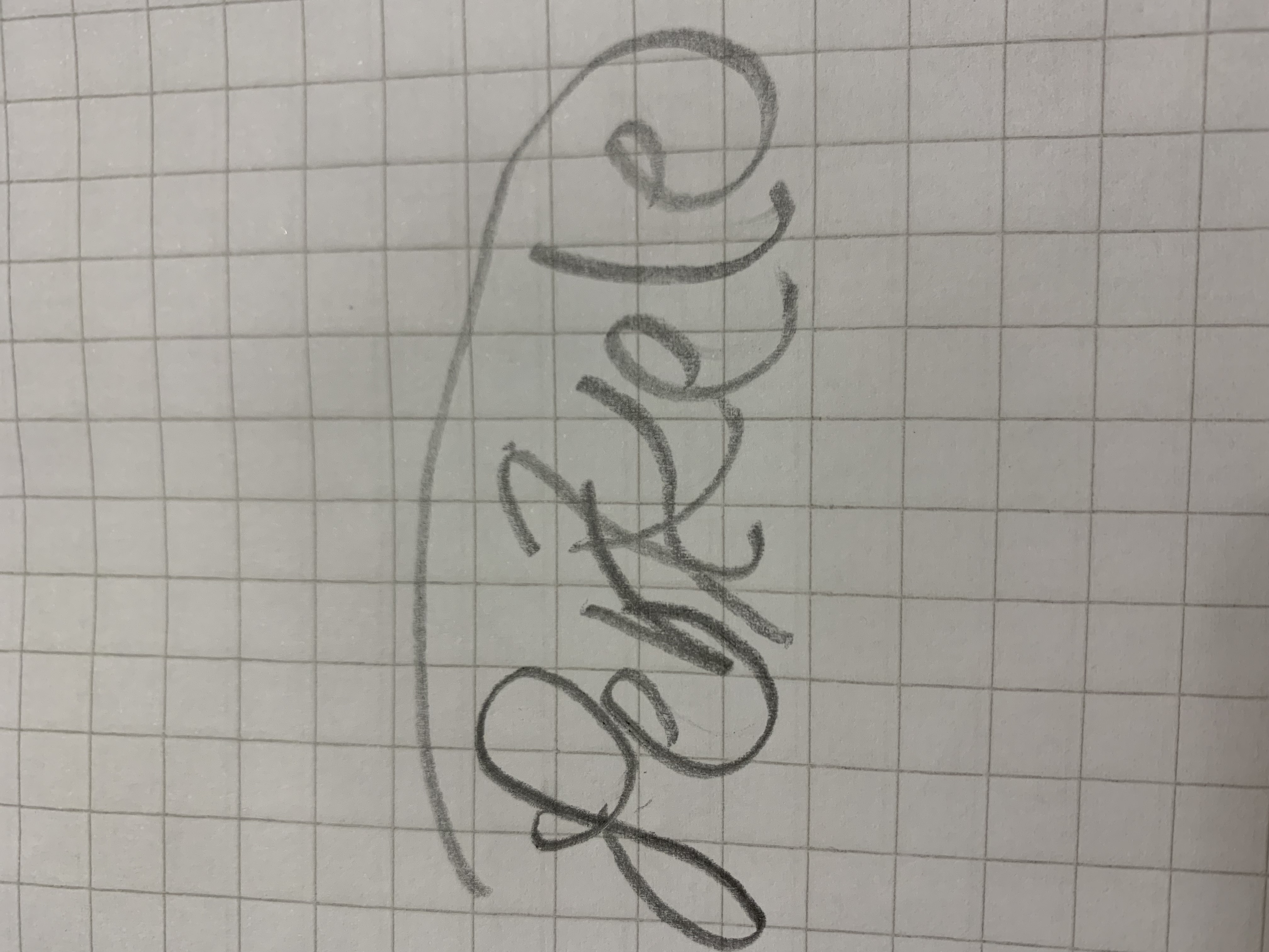
The Calligrapher
This handwriting shows a creative person who appreciates beauty and detail, with a bit of sophistication and practicality. Attention to consistency and spacing would further enhance their already elegant calligraphic style.
The handwriting sample showcases a unique blend of calligraphy and personal flair. The word "Portfolio" is written with deliberate strokes, exhibiting a rhythm and flow. The elongated ascenders and descenders in "P" and "f" respectively, along with the distinct loops in "o", demonstrate a conscious effort towards aesthetics. However, there's a slight inconsistency in letter sizes, with the "l" appearing a tad smaller than the other letters. The baseline is relatively straight, hinting at stability. Overall, the handwriting exudes a sense of elegance and individuality.
This handwriting suggests a personality that appreciates beauty and creativity. The deliberate and rhythmic strokes indicate patience and attention to detail. The elegant flourishes hint at a desire for self-expression and a touch of sophistication. The slight inconsistency in letter sizes may suggest a degree of flexibility and adaptability, while the straight baseline implies groundedness and practicality. The calligraphic style reveals an artistic inclination and a love for aesthetics. The choice to write in calligraphy for a portfolio further implies an intention to impress and a desire to stand out.
To enhance this already impressive handwriting, a bit more attention to consistency in letter size and spacing could be beneficial. Ensuring that the "l" matches the height of other ascenders like "f" would create a more balanced look. Additionally, paying attention to the negative spaces between letters and words would improve overall legibility. While the loops in letters like "o" are visually appealing, slightly reducing their size could make the writing appear less crowded and more streamlined. Experimenting with different pen angles and pressures could also add further depth and nuance to the calligraphic style.
Legibility
Expressiveness
Consistency
Overall
Leaderboard for Wednesday, 17 September 2025
| 31 | The Fluid Philosopher |
58
|
| 32 | The Anatomist's Script |
58
|
| 33 | The Graceful Leaper |
58
|
| 34 | The Emotive Pen |
57
|
| 35 | The Eloquent Essayist |
56
|
| 36 | The Rounded Romantic |
56
|
| 37 | The Towering Tycoon |
56
|
| 38 | The Academic Hustler |
56
|
| 39 | The Precise Penman |
56
|
| 40 | The Curious Cosmographer |
56
|
| 41 | The Introspective Inker |
54
|
| 42 | The Loop Master |
54
|
| 43 | The Loopy Linguist |
54
|
| 44 | The Bold Go-Getter |
54
|
| 45 | The Pragmatic Physicist |
53
|
| 46 | The Flowing Wellspring |
52
|
| 47 | The Spirited Initialist |
52
|
| 48 | The Quiet Achiever |
52
|
| 49 | The Fury |
51
|
| 50 | The Serpentine Script |
51
|
| 51 | The Minimalist's Marker |
50
|
| 52 | The Pragmatic Pen |
50
|
| 53 | The Curious Calligrapher |
49
|
| 54 | The Forest Whisperer |
49
|
| 55 | The Enigmatic Dash |
29
|