Rate my handwriting

✨ Upload a sample of your handwriting, and our 🤖 AI will give you
the scoop on
what's awesome
and what could use a
little improving.
It's just for fun - and totally free! Try now 🚀
(You can also check out today's 👑 Leaderboard 👇)

The Geographer
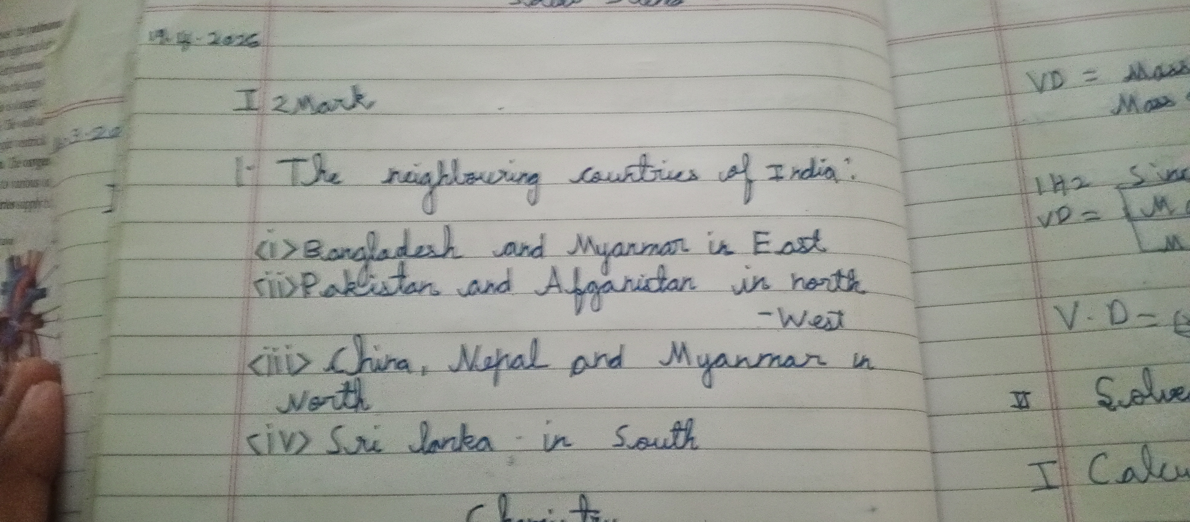
This legible, consistent handwriting suggests an organized and practical personality, with room for improvement in baseline adherence and letter formation.
The handwriting sample, which lists India's neighbouring countries, is generally legible and consistent, written with a blue ballpoint pen on lined paper. The script is upright and mostly cursive, with some printed letters like the "i" in "India". The letterforms are fairly simple and rounded, as seen in words like "neighbouring" and "countries". While the size and spacing of words are relatively uniform, there's a slight rightward slant, particularly noticeable in longer words such as "Bangladesh" and "Afghanistan". The overall impression is one of neatness and efficiency.
This handwriting suggests a personality that is organized and methodical, with a focus on clarity and accuracy. The consistent letterforms and spacing indicate a preference for order and structure. The slight rightward slant might betray a degree of extraversion and eagerness to connect with others. The simple, unadorned style of the writing implies a practical, down-to-earth nature, not overly concerned with outward appearances. The legibility of the script suggests a desire to communicate effectively and ensure understanding.
To enhance this already decent handwriting, a few minor tweaks could be implemented. Pay attention to the baseline; while mostly straight, some words drift slightly above or below. This can be corrected by focusing on aligning the bottom of each letter with the horizontal lines on the paper. Experiment with varying the slant more deliberately, which could add a touch of dynamism to the script. Finally, consider refining the formation of certain letters like "g" and "y", giving them more distinct tails or loops to further improve legibility and add a dash of flair.
Legibility
Expressiveness
Consistency
Overall
Leaderboard for Sunday, 26 October 2025
| 1 | The Constitutionalist |
74
|
| 2 | The Flowing Quill |
74
|
| 3 | The Curator's Script |
72
|
| 4 | The Eloquent Educator |
71
|
| 5 | The Student's Script |
70
|
| 6 | The Dreamer's Quill |
70
|
| 7 | The Constitutionalist |
68
|
| 8 | The Flowing Quill |
68
|
| 9 | The Hopeful Heart's Script |
68
|
| 10 | The Diligent Penman |
67
|
| 11 | The Agrarian Academic |
67
|
| 12 | The Unassuming Hand |
66
|
| 13 | The Studious Student |
65
|
| 14 | The Calculating Hand |
65
|
| 15 | The Diligent Note-Taker |
64
|
| 16 | The Mathematical Muse |
64
|
| 17 | The Contemplative Soul |
64
|
| 18 | The Flowing Font |
63
|
| 19 | The Gentle Flow |
63
|
| 20 | The Looping Legend |
62
|
| 21 | The Contemplative Calligrapher |
60
|
| 22 | The Signature Stylist |
59
|
| 23 | The Democratic Dreamer |
59
|
| 24 | The Devout Note-Taker |
58
|
| 25 | The Cipher's Quill |
57
|
| 26 | The Atom Alchemist |
57
|
| 27 | The Scientific Mind |
56
|
| 28 | The Loop-de-Loop Legend |
56
|
| 29 | The Orderly Typewriter |
56
|
| 30 | The Forward Leaning Letterer |
54
|