Rate my handwriting

✨ Upload a sample of your handwriting, and our 🤖 AI will give you
the scoop on
what's awesome
and what could use a
little improving.
It's just for fun - and totally free! Try now 🚀
(You can also check out today's 👑 Leaderboard 👇)
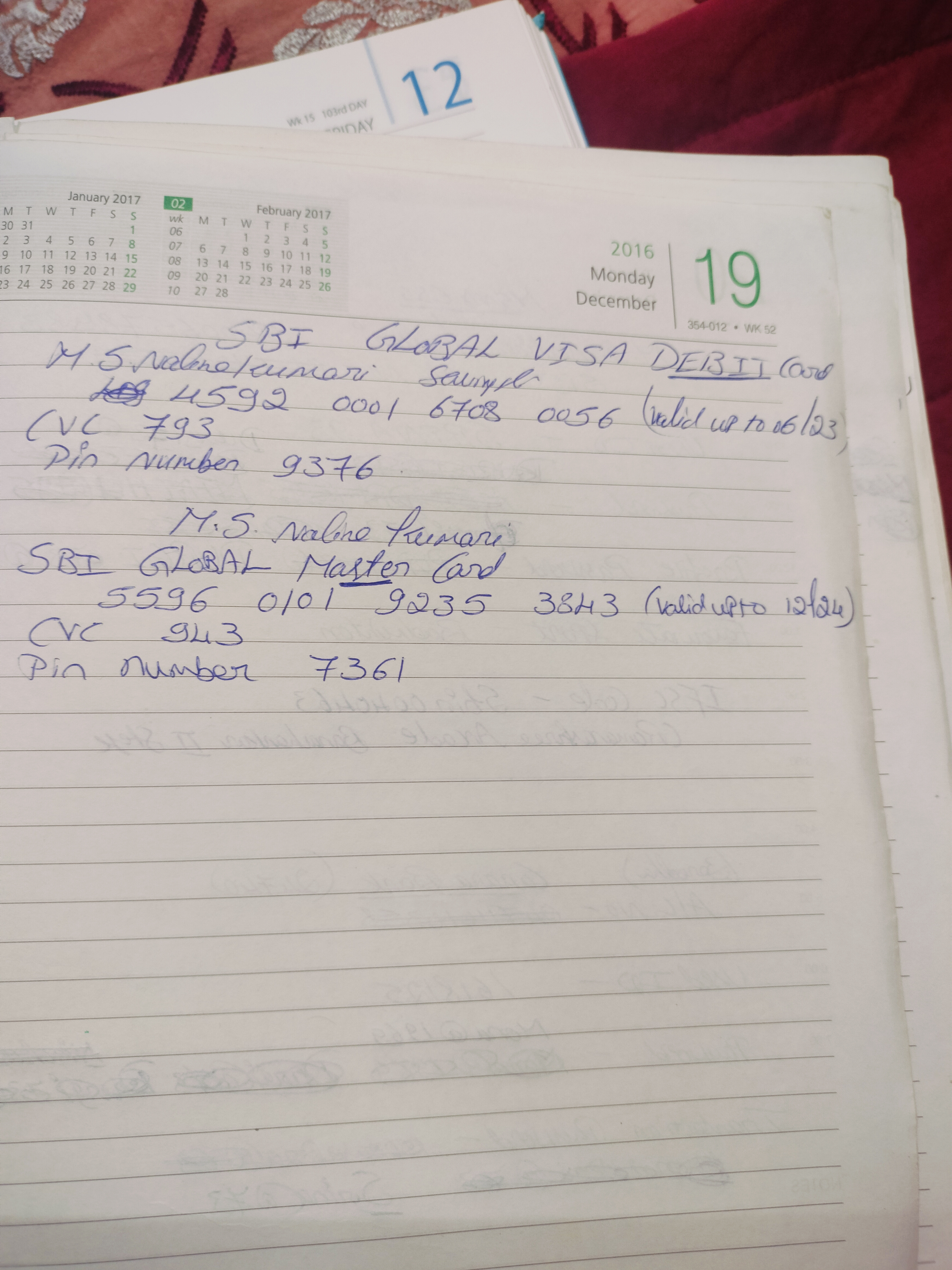
The Practical Notetaker
This handwriting prioritizes practicality and clarity, suggesting an efficient and adaptable personality, but there is room for improvement in consistency and adding personal touches.
The handwriting leans towards a practical style, prioritizing clarity over artistic flourish. The letter forms are generally well-defined, as seen in the clear distinction between characters in words like "VISA DEBIT Card". There's a functional consistency throughout the sample, although some variations in slant and letter size suggest a degree of casualness. The writing is mostly neat and legible, but there are occasional instances where letter spacing is slightly uneven. The writing appears to have been written quickly, possibly for recording information for personal use, and the line spacing is fairly consistent, suggesting a focused approach.
Based on the handwriting, one might infer a personality that values efficiency and directness. The consistent letter formation indicates a reliable nature, while the slight variations hint at adaptability and a willingness to deviate from strict rules when necessary. There is an organised approach to recording the information.
To enhance the handwriting, focus on maintaining a more uniform slant and consistent letter sizes. Practicing letter spacing to ensure equal distance between characters could improve legibility. While the current style is functional, incorporating subtle personal flourishes could add character without sacrificing clarity. Focus on writing slower and concentrating on each character.
Legibility
Expressiveness
Consistency
Overall
Leaderboard for Monday, 27 October 2025
| 1 | The Analytical Mind |
74
|
| 2 | The Eloquent Educator |
71
|
| 3 | The Student's Script |
70
|
| 4 | The Optimistic Poet |
68
|
| 5 | The Agrarian Academic |
67
|
| 6 | The Diligent Penman |
67
|
| 7 | The Analytical Alchemist |
65
|
| 8 | The Calculating Hand |
65
|
| 9 | The Scientific Hand |
65
|
| 10 | The Aesthetic Typist |
65
|
| 11 | The Mathematical Muse |
64
|
| 12 | The Agile Leaper |
64
|
| 13 | The Diligent Note-Taker |
64
|
| 14 | The Quill of Conviction |
62
|
| 15 | The Agile Artisan |
61
|
| 16 | The Curious Chemist |
59
|
| 17 | The Practical Notetaker |
58
|
| 18 | The Devout Note-Taker |
58
|
| 19 | The Elaborate Chronicler |
58
|
| 20 | The Considerate Confidant |
56
|
| 21 | The Orderly Typewriter |
56
|
| 22 | The Hurried Healer |
55
|
| 23 | The Aspiring Typesetter |
53
|
| 24 | The Architect of Letters |
53
|
| 25 | The Flourishing Academic |
53
|
| 26 | The Diligent Note-Taker |
53
|
| 27 | The Steadfast Student |
53
|
| 28 | The Ambitious Note-Taker |
52
|
| 29 | Celestial Notes |
52
|
| 30 | The Pragmatic Hand |
52
|