Rate my handwriting

✨ Upload a sample of your handwriting, and our 🤖 AI will give you
the scoop on
what's awesome
and what could use a
little improving.
It's just for fun - and totally free! Try now 🚀
(You can also check out today's 👑 Leaderboard 👇)
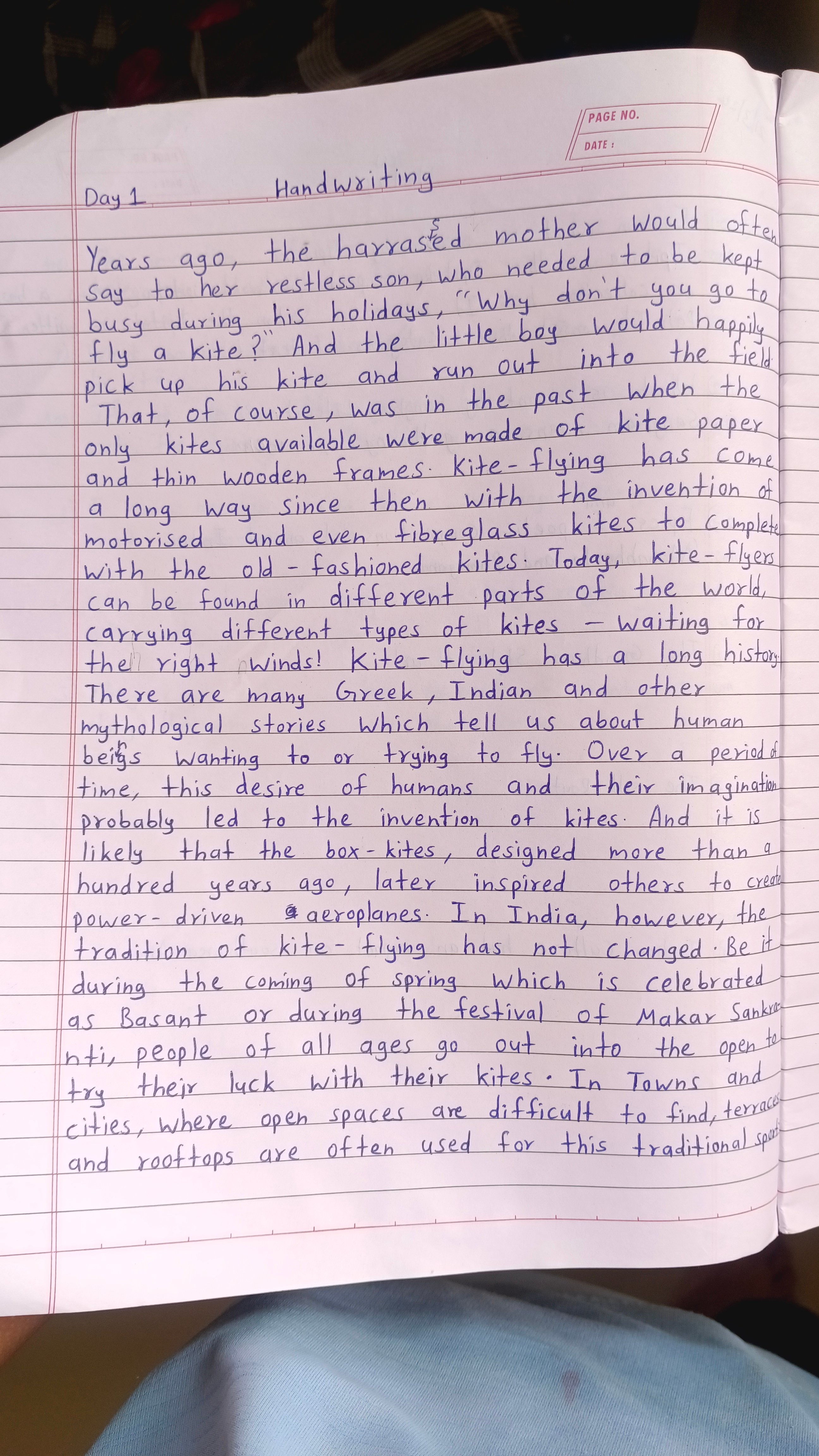
The Kite Flyer's Quill
This handwriting reflects a balanced and conscientious individual who values clarity and directness. A few minor adjustments could enhance the overall fluency and expressiveness.
The handwriting is upright and fairly uniform, suggesting a practical and grounded nature. The letters are well-formed, but not overly stylized, indicating a straightforward approach to communication. There's a slight roundness to some letters, such as the 'o' and 'a,' which could point to a friendly and approachable demeanor. The spacing between words is generally consistent, though the overall writing is somewhat compact.
Based on the neatness and legibility, the writer likely possesses a degree of conscientiousness and attention to detail. The lack of extreme slant or flamboyant flourishes suggests a balanced personality, not given to excessive emotional displays. The writer likely values clarity and directness in their interactions with others. The handwriting shows signs of self-control and the ability to focus on the task at hand.
To enhance the handwriting, consider practicing consistent letter sizing and spacing. Paying attention to the baseline and maintaining uniform pressure on the pen could also improve the overall appearance. Experimenting with a slightly more relaxed grip might promote greater fluency and reduce any signs of stiffness. Regular practice will ultimately lead to a more fluid and expressive style.
Legibility
Expressiveness
Consistency
Overall
Leaderboard for Thursday, 30 October 2025
| 1 | The Economist's Italic Hand |
74
|
| 2 | The Poet's Quill |
71
|
| 3 | The Flourishing Font |
69
|
| 4 | The Scientific Hand |
68
|
| 5 | The Upright Student |
67
|
| 6 | The Digital Diarist |
67
|
| 7 | The Logical Chemist |
66
|
| 8 | The Prudent Pen |
66
|
| 9 | The Pensive Student |
65
|
| 10 | The Literary Cartographer |
65
|
| 11 | The Agile Quill |
65
|
| 12 | The Pragmatic Planner |
65
|
| 13 | The Bio Notes |
64
|
| 14 | The Civic Philosopher |
63
|
| 15 | The Studious Scholar |
63
|
| 16 | The Meticulous Planner |
63
|
| 17 | The Elusive Poet |
62
|
| 18 | The Calligrapher's Chronicle |
62
|
| 19 | Le Gribouillage Scientifique |
62
|
| 20 | The Deliberate Democrat |
62
|
| 21 | Le Calligraphe Studieux |
61
|
| 22 | Algorithmic Alchemist |
61
|
| 23 | The Cellular Biologist |
61
|
| 24 | The Atomic Pen |
60
|
| 25 | The Spirited Student |
60
|
| 26 | The Fluent Intellectual |
60
|
| 27 | The Global Trotter |
59
|
| 28 | The Forthright Fount |
59
|
| 29 | The Determined Hand |
58
|
| 30 | The Energetic Note-Taker |
58
|