Rate my handwriting

✨ Upload a sample of your handwriting, and our 🤖 AI will give you
the scoop on
what's awesome
and what could use a
little improving.
It's just for fun - and totally free! Try now 🚀
(You can also check out today's 👑 Leaderboard 👇)
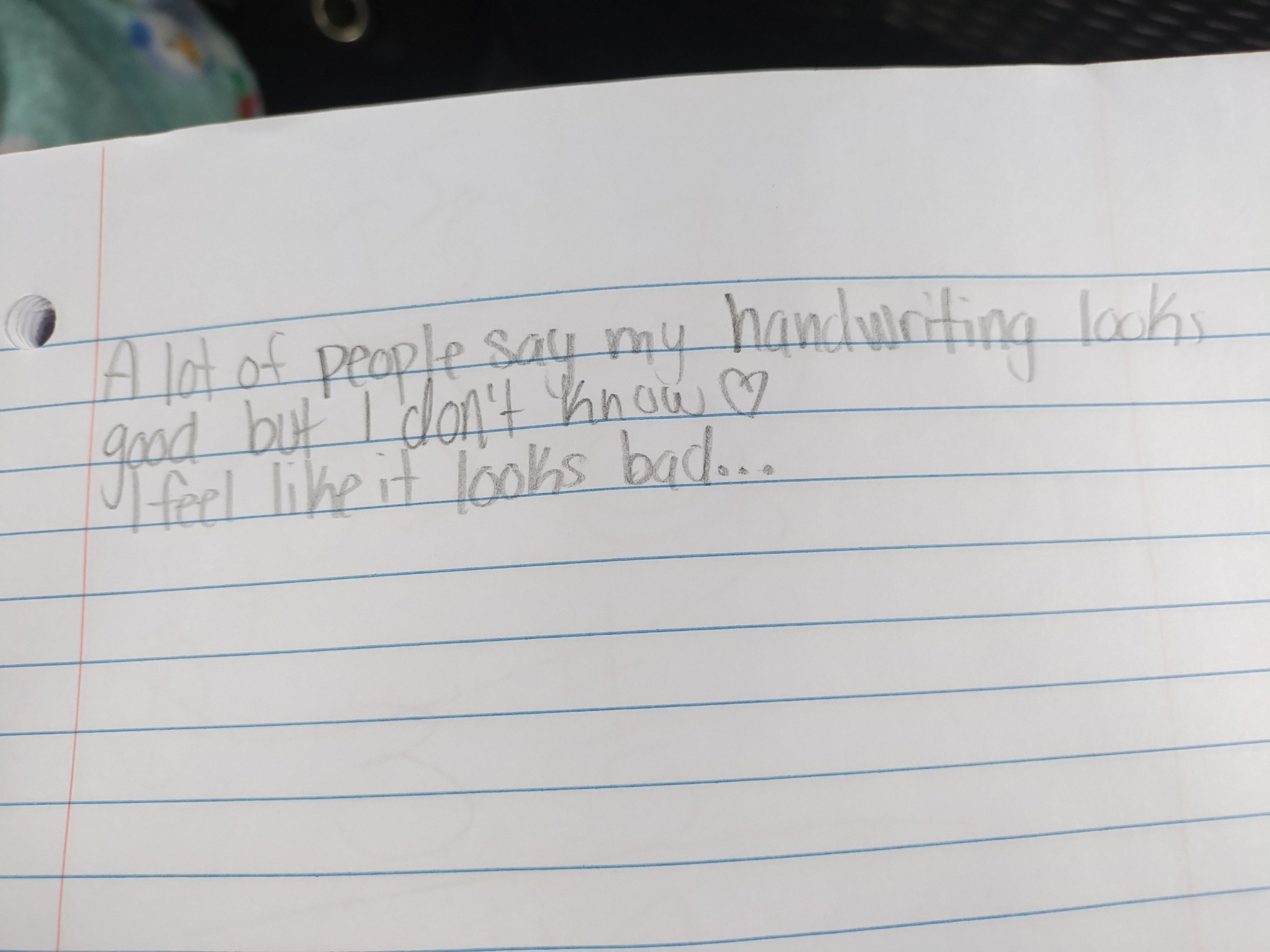
The Casual Penman
This handwriting suggests a friendly and approachable individual with a casual, slightly sentimental style. It's generally legible but could benefit from some attention to letter consistency and proportion.
This handwriting sample presents a casual, unpretentious style. The letters are generally rounded and flowing, with a slight rightward slant. Notice the varied letter sizes, especially in the phrase "handwriting looks", where the 'r' is much larger than other letters. The baseline is mostly consistent, adhering neatly to the lines on the paper. The overall effect is one of readable informality, punctuated by the little heart at the end of the second line.
The rounded letters and rightward slant suggest an open and friendly personality, someone approachable and perhaps a little sentimental (indicated by the heart). The slightly uneven baseline could indicate some degree of impatience or impulsiveness. While the writer states that they "feel like it looks bad", it is generally legible, hinting at a pragmatic and direct mode of communication. The variations in letter sizes and the flowing script might imply a degree of creativity and spontaneity, but also a casualness and dislike of formality.
While perfectly readable, a few minor tweaks could enhance this handwriting. Try to maintain a more consistent letter size, paying particular attention to letters like 'r' and 't' which seem prone to disproportionate growth. Practicing regular loops for letters like 'l' and 'h' could improve consistency and flow. Lastly, slowing down just a touch could help refine the forms of certain letters, like 'g' and 'y', making them even more pleasing to the eye.
Legibility
Expressiveness
Consistency
Overall
Leaderboard for Thursday, 30 October 2025
| 1 | The Economist's Italic Hand |
74
|
| 2 | The Poet's Quill |
71
|
| 3 | The Flourishing Font |
69
|
| 4 | The Scientific Hand |
68
|
| 5 | The Upright Student |
67
|
| 6 | The Digital Diarist |
67
|
| 7 | The Logical Chemist |
66
|
| 8 | The Prudent Pen |
66
|
| 9 | The Pensive Student |
65
|
| 10 | The Literary Cartographer |
65
|
| 11 | The Agile Quill |
65
|
| 12 | The Pragmatic Planner |
65
|
| 13 | The Bio Notes |
64
|
| 14 | The Civic Philosopher |
63
|
| 15 | The Studious Scholar |
63
|
| 16 | The Meticulous Planner |
63
|
| 17 | The Elusive Poet |
62
|
| 18 | The Calligrapher's Chronicle |
62
|
| 19 | Le Gribouillage Scientifique |
62
|
| 20 | The Deliberate Democrat |
62
|
| 21 | Le Calligraphe Studieux |
61
|
| 22 | Algorithmic Alchemist |
61
|
| 23 | The Cellular Biologist |
61
|
| 24 | The Atomic Pen |
60
|
| 25 | The Spirited Student |
60
|
| 26 | The Fluent Intellectual |
60
|
| 27 | The Global Trotter |
59
|
| 28 | The Forthright Fount |
59
|
| 29 | The Determined Hand |
58
|
| 30 | The Energetic Note-Taker |
58
|