Rate my handwriting

✨ Upload a sample of your handwriting, and our 🤖 AI will give you
the scoop on
what's awesome
and what could use a
little improving.
It's just for fun - and totally free! Try now 🚀
(You can also check out today's 👑 Leaderboard 👇)
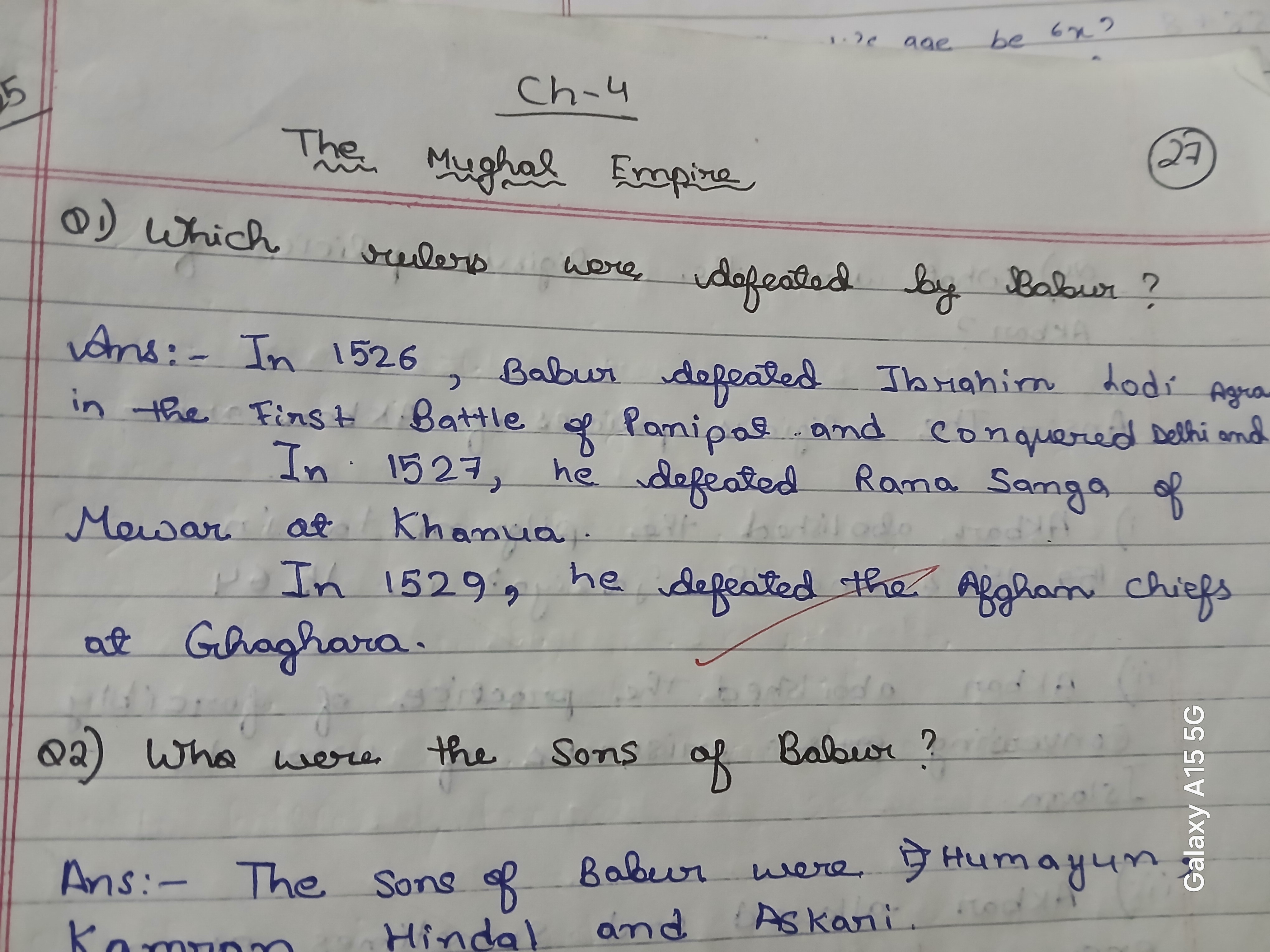
The Mughal Explorer's Quill
This handwriting suggests a thoughtful, detail-oriented person with a balanced approach to life. Some refinement in consistency would improve the overall impression.
The handwriting is characterized by a rounded, slightly cursive style, evident in words like "defeated" and "Babur." The strokes are generally smooth, suggesting a degree of fluency, though there's some inconsistency in letter size and spacing. For example, the size of letters in 'Empire' differ from 'Mughal', and spacing varies throughout. The handwriting appears neat and legible, but there's a certain lack of uniformity that gives it a personal touch. Overall, it presents as careful but not overly stylized.
Based on this sample, the writer may possess traits of thoughtfulness and attention to detail, balanced with a tendency to be adaptable and perhaps a bit unconventional. The rounded forms indicate a possible desire for harmony and a cooperative nature, while the variations in letter size might suggest a spontaneous or expressive personality. There could be a good balance of analytical and creative tendencies, with an underlying sense of purpose.
To improve, focus on consistent letter size and spacing. Practicing letter drills, paying close attention to maintaining uniformity, could be beneficial. Try to establish a consistent slant, and ensure adequate space between words to enhance legibility. Even small adjustments in these areas could create a more polished and confident appearance to your handwriting.
Legibility
Expressiveness
Consistency
Overall
Leaderboard for Monday, 27 October 2025
| 1 | The Constitutionalist |
74
|
| 2 | The Eloquent Educator |
71
|
| 3 | The Student's Script |
70
|
| 4 | The Dreamer's Quill |
70
|
| 5 | The Hopeful Heart's Script |
68
|
| 6 | The Constitutionalist |
68
|
| 7 | The Diligent Penman |
67
|
| 8 | The Agrarian Academic |
67
|
| 9 | The Analytical Alchemist |
65
|
| 10 | The Calculating Hand |
65
|
| 11 | The Contemplative Soul |
64
|
| 12 | The Agile Leaper |
64
|
| 13 | The Mathematical Muse |
64
|
| 14 | The Diligent Note-Taker |
64
|
| 15 | The Gentle Flow |
63
|
| 16 | The Looping Legend |
62
|
| 17 | The Agile Artisan |
61
|
| 18 | The Contemplative Calligrapher |
60
|
| 19 | The Democratic Dreamer |
59
|
| 20 | The Devout Note-Taker |
58
|
| 21 | The Practical Notetaker |
58
|
| 22 | The Considerate Confidant |
56
|
| 23 | The Orderly Typewriter |
56
|
| 24 | The Forward Leaning Letterer |
54
|
| 25 | The Steadfast Student |
53
|
| 26 | The Diligent Student |
53
|
| 27 | The Diligent Note-Taker |
53
|
| 28 | The Flowing River |
53
|
| 29 | The Architect of Letters |
53
|
| 30 | The Pragmatic Hand |
52
|