Rate my handwriting

✨ Upload a sample of your handwriting, and our 🤖 AI will give you
the scoop on
what's awesome
and what could use a
little improving.
It's just for fun - and totally free! Try now 🚀
(You can also check out today's 👑 Leaderboard 👇)
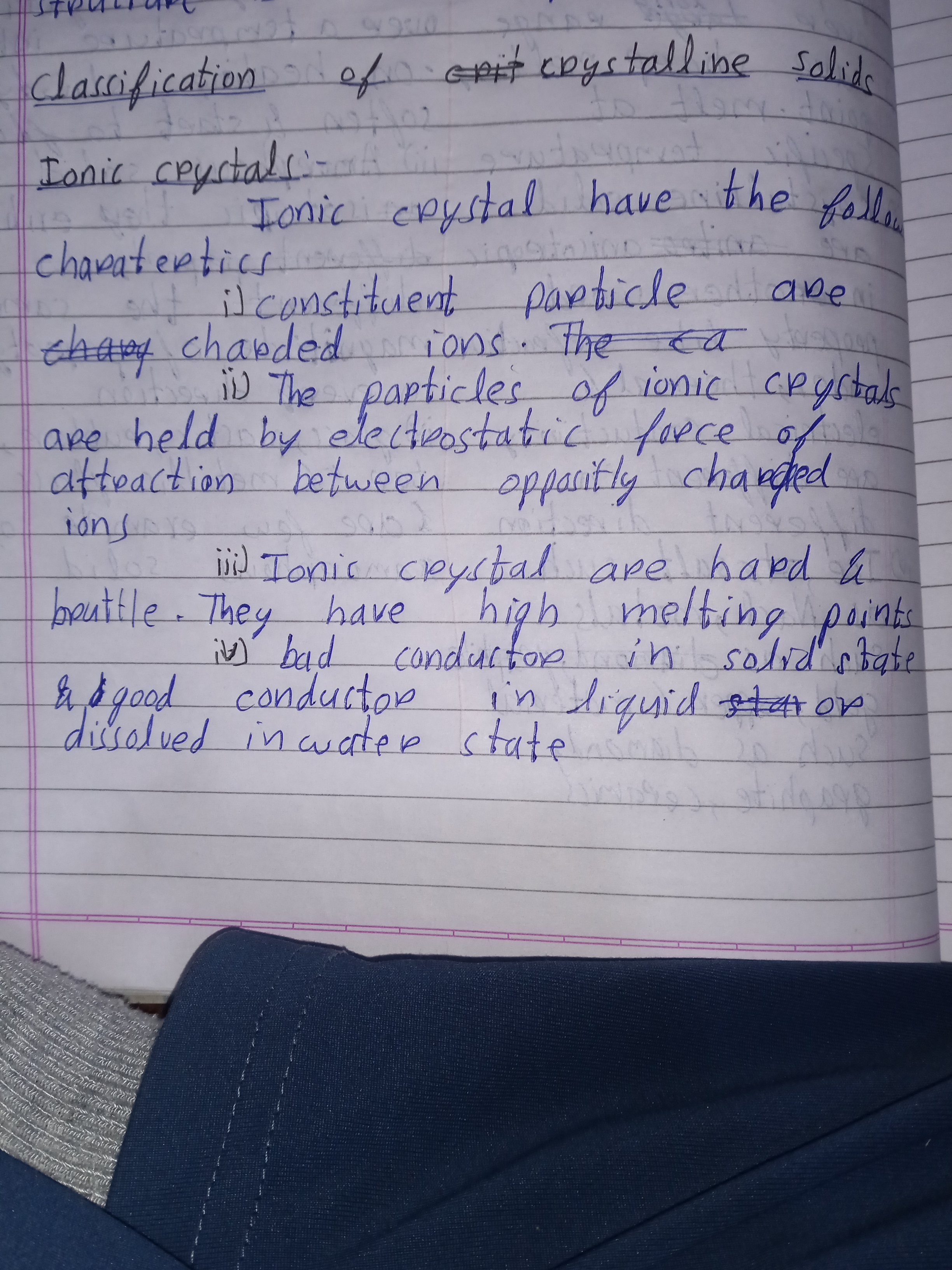
The Methodical Miner
This neat and consistent handwriting suggests an organized, detail-oriented individual who values clarity and precision. A lighter touch and more open letterforms would further enhance its legibility and add personality.
This handwriting is neat and generally legible, with a consistent slant and letter size. The letters are predominantly connected, as seen in words like "classification" and "electrostatic", suggesting a methodical and systematic approach. While the overall appearance is tidy, some letters like "a" and "o" occasionally appear closed or cramped, hinting at a slight tendency towards introversion. There's a certain uniformity to the script, lacking embellishments or flourishes, which indicates a focus on practicality rather than artistic expression. The consistent baselines and spacing between words further emphasize this organized nature.
The consistency and legibility suggest a personality that is organized, detail-oriented, and reliable. The connected letters hint at a logical and methodical thought process, while the closed or cramped forms of some letters may indicate a preference for working independently. The lack of expressive flourishes suggests a focus on efficiency and practicality. This handwriting speaks of someone who values clarity and precision in their communication, preferring to convey information directly and without ambiguity. They likely possess a strong sense of responsibility and take pride in their work, striving for accuracy and completeness in all their endeavors.
While generally legible, the handwriting could benefit from a slightly lighter touch and more open letterforms. Opening up the loops in letters like "a", "o", and "e" could enhance readability and add a touch of airiness to the overall appearance. Experimenting with varying letter sizes and incorporating subtle flourishes could inject a bit more personality and expressiveness into the writing. Paying attention to the spacing between letters within words, particularly in longer words like "electrostatic", could further improve legibility and create a more visually appealing script.
Legibility
Expressiveness
Consistency
Overall
Leaderboard for Wednesday, 29 October 2025
| 31 | The Artful Calligrapher |
57
|
| 32 | The Idealist's Italic |
57
|
| 33 | The Neatly Ordered Lexicographer |
56
|
| 34 | The Earnest Author |
56
|
| 35 | The Diligent Biologist |
56
|
| 36 | The Diligent Planner |
54
|
| 37 | The Ponderer's Prose |
54
|
| 38 | The Scientific Hand |
54
|
| 39 | The Spirited Soul |
54
|
| 40 | The Budding Engineer |
53
|
| 41 | The Whirlwind Writer |
53
|
| 42 | The Data Architect's Italic Hand |
53
|
| 43 | The Diligent Student |
53
|
| 44 | The Sensitive Soul's Script |
53
|
| 45 | Le Calligraphe Méthodique |
52
|
| 46 | The Dutiful Student |
52
|
| 47 | The Precise Correspondent |
51
|
| 48 | The Typist |
50
|
| 49 | The Energetic Flow |
49
|