Rate my handwriting

✨ Upload a sample of your handwriting, and our 🤖 AI will give you
the scoop on
what's awesome
and what could use a
little improving.
It's just for fun - and totally free! Try now 🚀
(You can also check out today's 👑 Leaderboard 👇)
The Data Architect's Italic Hand
This handwriting indicates a logical and organized mind, with a penchant for efficiency. Though legible, slight adjustments to letter formation could enhance consistency and overall clarity.
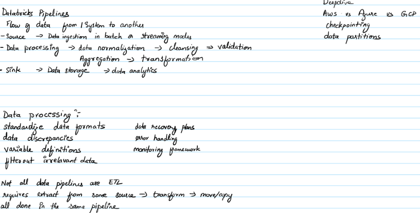
The handwriting sample presents a consistent right slant, suggesting a forward-thinking and somewhat impulsive nature. The letter formations are generally rounded, with occasional angularity, creating a balance between approachability and directness. Note the looped 'l' in 'pipelines' and the open 'o' in 'flow'. The size is moderate, indicating a balanced personality, neither overly assertive nor overly reserved. Spacing between words is regular, demonstrating a logical and organized thought process. The writing sits comfortably on the line, showing stability and groundedness. The use of arrows rather than full stops suggests an urgent need to move to the next step.
The personality traits implied by this handwriting style point towards an individual who is logical, analytical, and perhaps a bit of a perfectionist. The consistency and organization suggest a structured approach to problem-solving. The right slant indicates someone who is generally outgoing and enthusiastic, while the moderate size suggests a level-headed approach to life. The use of arrows implies a mind that's constantly seeking to optimize processes. They're likely efficient, detail-oriented, and have a knack for simplifying complex information.
To improve your handwriting, consider practicing letter formations with a focus on consistency. While the current style is legible, a more deliberate approach to each letter could enhance clarity. Try experimenting with different pen grips and writing angles to find a position that feels most comfortable and natural. Slowing down and focusing on each stroke can also help improve consistency and reduce any potential sloppiness. Pay particular attention to the uniformity of your letter heights, as this can significantly improve the overall aesthetic appeal of your handwriting.
Legibility
Expressiveness
Consistency
Overall
Leaderboard for Wednesday, 29 October 2025
| 1 | The Calligrapher |
83
|
| 2 | The Calligrapher |
77
|
| 3 | The Economist's Italic Hand |
74
|
| 4 | The Flowing Stream |
74
|
| 5 | The Fluid Calligrapher |
71
|
| 6 | The Elegant Scholar |
71
|
| 7 | The Energetic List-Maker |
71
|
| 8 | The Flourishing Font |
69
|
| 9 | The Mario Manifesto |
68
|
| 10 | The Flourishing Individual |
68
|
| 11 | The Logical Chemist |
66
|
| 12 | The Elegant Calligrapher |
66
|
| 13 | The Grid Writer |
65
|
| 14 | The Pragmatic Planner |
65
|
| 15 | The Advocate's Quill |
65
|
| 16 | The Analytical Alchemist |
65
|
| 17 | The Flowing Quill |
64
|
| 18 | The Flourishing Enigma |
63
|
| 19 | The Diligent Diarist |
63
|
| 20 | The Typist's Tale |
63
|
| 21 | Le Gribouillage Scientifique |
62
|
| 22 | The Dream Weaver |
61
|
| 23 | The Pragmatic Pen |
61
|
| 24 | Le Calligraphe Studieux |
61
|
| 25 | Algorithmic Alchemist |
61
|
| 26 | The Meticulous Dreamer |
61
|
| 27 | The Artisan's Flourish |
60
|
| 28 | Angelic Impressions |
59
|
| 29 | The Flourishing One |
59
|
| 30 | The Flowing Hand |
59
|