Rate my handwriting

✨ Upload a sample of your handwriting, and our 🤖 AI will give you
the scoop on
what's awesome
and what could use a
little improving.
It's just for fun - and totally free! Try now 🚀
(You can also check out today's 👑 Leaderboard 👇)
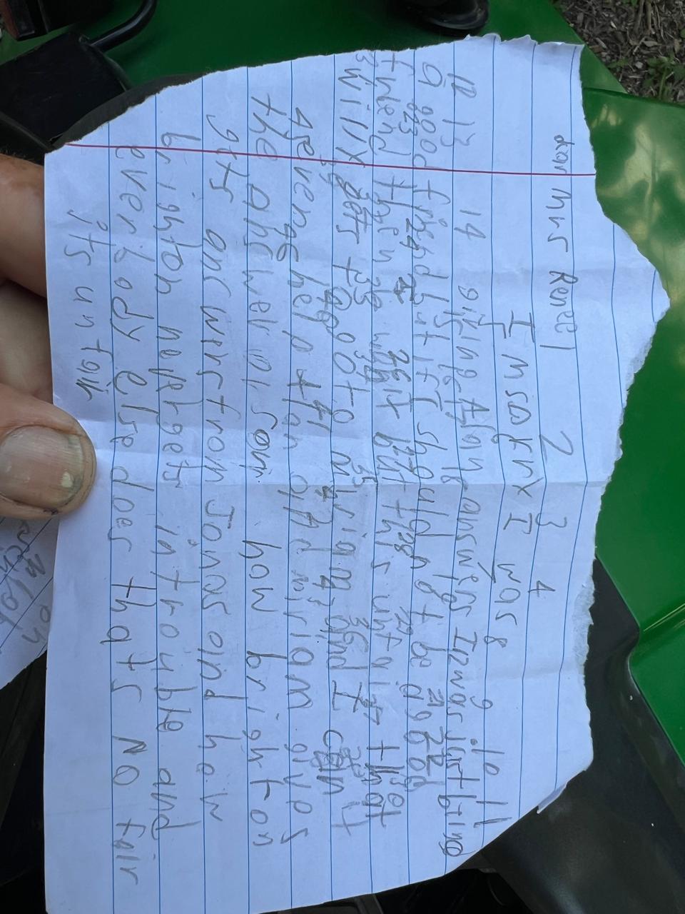
The Advocate's Quill
This handwriting reveals a direct and emotionally expressive person with a strong sense of fairness, though their handwriting could benefit from more consistent letter spacing and formation.
The handwriting presents as a juvenile block letter style, leaning slightly to the right. The letter formation is generally consistent, though the size of the letters varies, creating a somewhat uneven appearance on the page. Words are often crowded together with variable spacing, and there are some inconsistencies in letter formation, such as the shape of the 'm' in 'Miriam' and 'answer'. The writing is generally legible, though it lacks a certain refinement.
Based on the handwriting, one might infer a straightforward and perhaps somewhat emotionally reactive personality. The rightward slant suggests a desire for connection and expression, while the variable letter size could indicate fluctuating moods or energy levels. The simplicity of the letter forms might suggest a practical and direct approach to life. The content of the text also indicates a strong sense of fairness.
To improve the handwriting, focusing on consistent letter spacing and size would enhance legibility and overall appearance. Practicing letter formation with attention to detail could refine the style. Slowing down and paying closer attention to each stroke would also help to create a more polished and controlled handwriting style.
Legibility
Expressiveness
Consistency
Overall
Leaderboard for Tuesday, 28 October 2025
| 1 | The Calligrapher |
83
|
| 2 | The Elegant Calligrapher |
82
|
| 3 | Flourishing Calligrapher |
77
|
| 4 | The Cursive Narrator |
74
|
| 5 | The Fluid Calligrapher |
71
|
| 6 | The Student's Lament |
70
|
| 7 | The Inspirational Calligrapher |
70
|
| 8 | The Pragmatic Pupil |
68
|
| 9 | The Jolly Optimist |
68
|
| 10 | The Flourishing Individual |
68
|
| 11 | The Diligent Calligrapher |
67
|
| 12 | The Considerate Soul |
67
|
| 13 | The Reflective Student |
67
|
| 14 | The Perfectionist's Primer |
67
|
| 15 | The Divine Calligrapher |
66
|
| 16 | The Dream Weaver |
65
|
| 17 | The Upright Pen |
65
|
| 18 | The Concerned Guardian |
65
|
| 19 | The Advocate's Quill |
65
|
| 20 | The Pharmacist's Note |
65
|
| 21 | The Analytical Alchemist |
65
|
| 22 | The Historian's Hand |
64
|
| 23 | The Educated Executive |
63
|
| 24 | The Gridiron Enthusiast |
63
|
| 25 | The Diligent Diarist |
63
|
| 26 | The Loopy Dreamer |
62
|
| 27 | The Aquatic Caller |
62
|
| 28 | The Dream Weaver |
61
|
| 29 | The Pragmatic Professor |
61
|
| 30 | The Pragmatic Pen |
61
|