Rate my handwriting

✨ Upload a sample of your handwriting, and our 🤖 AI will give you
the scoop on
what's awesome
and what could use a
little improving.
It's just for fun - and totally free! Try now 🚀
(You can also check out today's 👑 Leaderboard 👇)
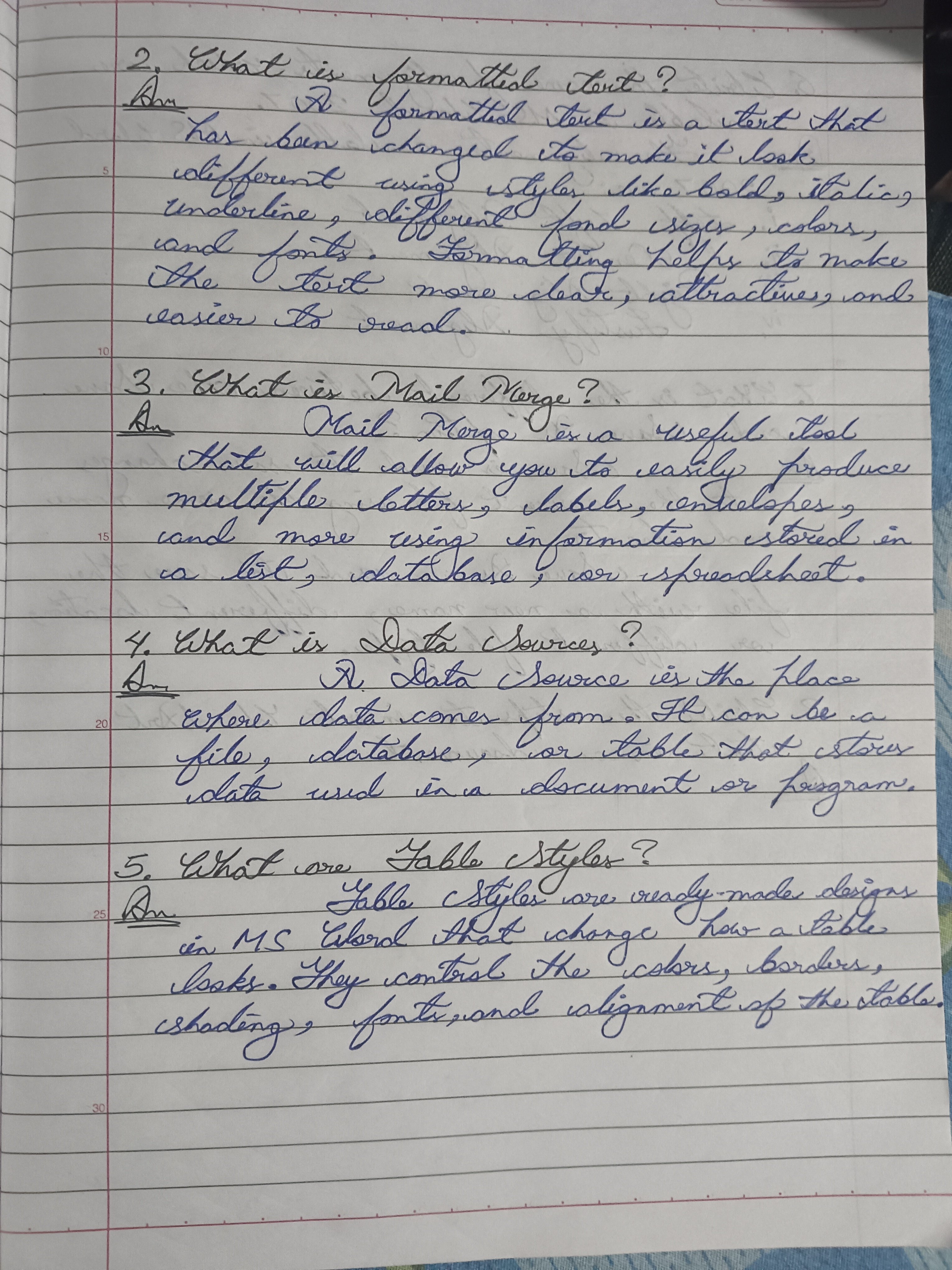
The Academic's Italic Hand
This handwriting showcases a thoughtful and detail-oriented person with a desire for clarity and order, but some inconsistencies can be improved for better legibility. Refinement of letterforms and slight pressure variation could enhance the writing's overall impact.
The handwriting leans towards an italic style, with a noticeable forward slant and rounded letterforms, as can be seen in the phrase 'Mail Merge'. The letter sizing is quite uniform, contributing to the overall neat appearance. Spacing between words is consistent, making the text relatively easy to read. The pressure applied seems even, resulting in a smooth, flowing script. However, there is some inconsistency in letter formation, particularly with 'a' and 'r'.
This handwriting suggests someone who is thoughtful and detail-oriented, with a desire for clarity and order. The neatness indicates a conscientious nature and an appreciation for aesthetics. The forward slant suggests a person who is proactive and eager to engage with the world. However, the slight inconsistencies may also reveal a tendency towards occasional impulsiveness or a desire for self-expression that sometimes overrides the need for perfect conformity.
To improve legibility further, focus on refining the consistency of letterforms, especially 'a' and 'r'. Practicing letter drills and consciously paying attention to the formation of each letter can help. Additionally, varying the pressure slightly can add depth and character to the writing. Ultimately, consistency and legibility will enhance the impact of the writing.
Legibility
Expressiveness
Consistency
Overall
Leaderboard for Monday, 27 October 2025
| 31 | The Quill of Conviction |
62
|
| 32 | The Forthright Font |
61
|
| 33 | The Flowing Script |
61
|
| 34 | The Agile Artisan |
61
|
| 35 | Coastal Rhapsody |
60
|
| 36 | The Diplomat's Quill |
60
|
| 37 | Coastal Contemplations |
59
|
| 38 | The Curious Chemist |
59
|
| 39 | The Elaborate Chronicler |
58
|
| 40 | The Idealist's Cursive |
58
|
| 41 | The Grand Calligrapher |
58
|
| 42 | The Practical Notetaker |
58
|
| 43 | The Deliberate Doodler |
57
|
| 44 | The Advocate's Quill |
56
|
| 45 | The Considerate Confidant |
56
|
| 46 | The Fantastical Dreamer |
56
|
| 47 | The Hurried Healer |
55
|
| 48 | The Principled Pen |
54
|
| 49 | The Eloquent Essayist |
54
|
| 50 | The Diligent Note-Taker |
53
|
| 51 | Neptune's Prose |
53
|
| 52 | The Gentle Leaning Tower |
53
|
| 53 | The Coastal Contemplator |
53
|
| 54 | The Flourishing Academic |
53
|
| 55 | The Aspiring Typesetter |
53
|
| 56 | The Introspective Historian |
52
|
| 57 | Celestial Notes |
52
|
| 58 | The Ambitious Note-Taker |
52
|
| 59 | The Pragmatic Note-Taker |
52
|
| 60 | The Energetic Author |
51
|