Rate my handwriting

✨ Upload a sample of your handwriting, and our 🤖 AI will give you
the scoop on
what's awesome
and what could use a
little improving.
It's just for fun - and totally free! Try now 🚀
(You can also check out today's 👑 Leaderboard 👇)
The Fleet-Footed Author
The handwriting shows a practical style, valuing clarity but lacking uniformity. Focusing on letter sizing and spacing could improve the overall flow and legibility.
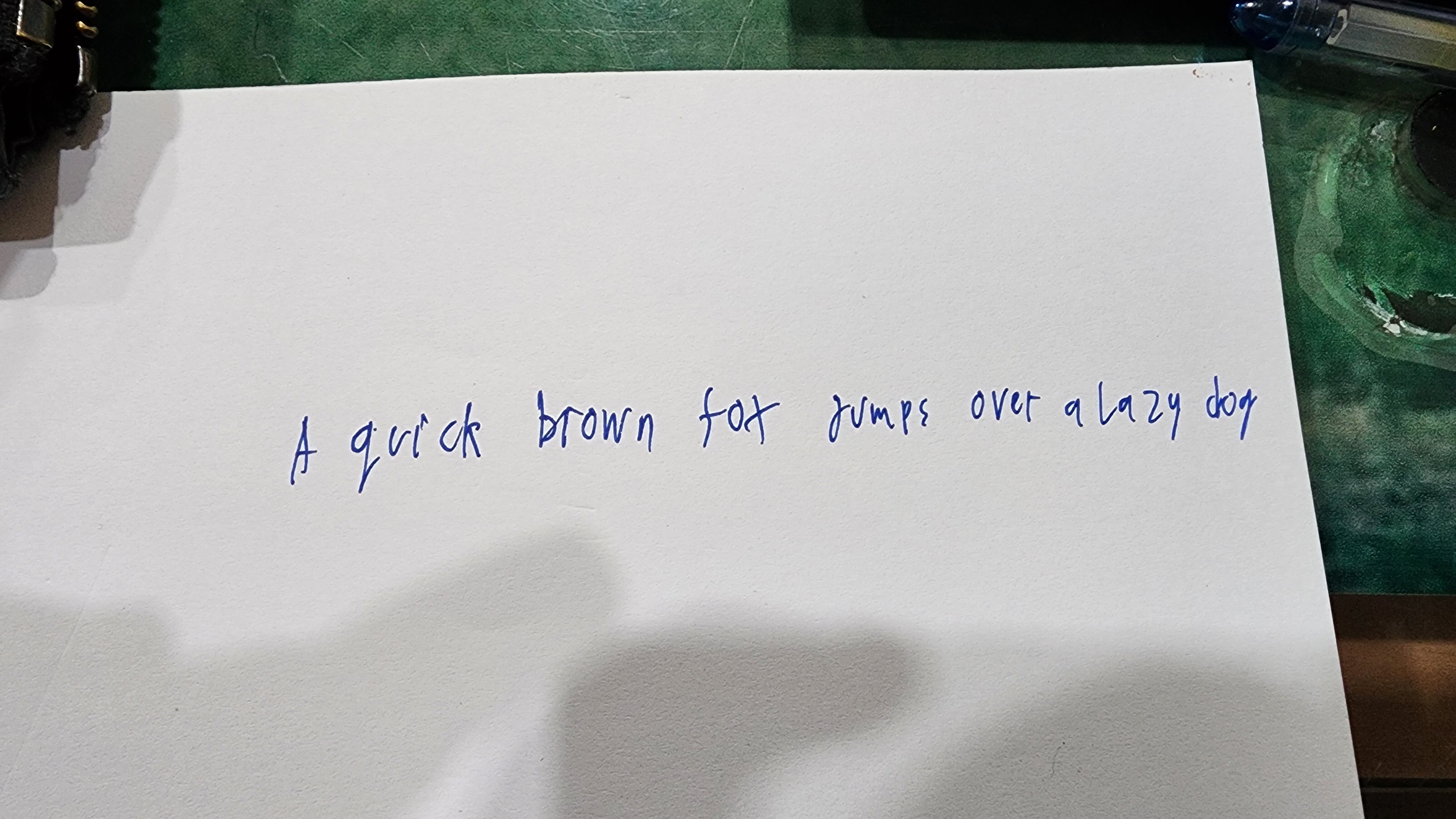
The handwriting style is characterized by its upright stance and somewhat inconsistent letter formations. There's a noticeable variation in the size and shape of letters, with some letters, like the 'o' in 'brown' appearing more rounded, while others, like the 't' in 'fox', are more angular. The spacing between words is generally consistent, but the individual letters within words can sometimes feel a bit cramped. The overall impression is one of a functional, but not particularly stylized hand.
This handwriting suggests a personality that values clarity and directness, perhaps prioritizing efficiency over elaborate expression. The variations in letter formation could indicate a flexible mindset, open to adapting to different situations. There might be a practical approach to problem-solving, with a focus on getting the job done rather than adhering to strict rules or conventions. The slightly cramped letter spacing might hint at a tendency to be detail-oriented, or perhaps a bit hurried in completing tasks.
To improve the handwriting, consider focusing on consistent letter sizing and spacing. Practicing individual letter forms, particularly those that appear less defined (like the 'k' in 'quick'), could help create a more uniform and legible style. Experimenting with a slightly more relaxed grip and allowing for more space between letters could also enhance the overall flow and readability of the handwriting.
Legibility
Expressiveness
Consistency
Overall
Leaderboard for Tuesday, 28 October 2025
| 1 | The Calligrapher |
83
|
| 2 | The Elegant Calligrapher |
82
|
| 3 | Flourishing Calligrapher |
77
|
| 4 | The Calligrapher |
77
|
| 5 | The Flowing Stream |
74
|
| 6 | The Fluid Calligrapher |
71
|
| 7 | The Inspirational Calligrapher |
70
|
| 8 | The Student's Lament |
70
|
| 9 | The Pragmatic Pupil |
68
|
| 10 | The Flourishing Individual |
68
|
| 11 | The Jolly Optimist |
68
|
| 12 | The Mario Manifesto |
68
|
| 13 | The Perfectionist's Primer |
67
|
| 14 | The Diligent Calligrapher |
67
|
| 15 | The Considerate Soul |
67
|
| 16 | The Reflective Student |
67
|
| 17 | The Elegant Calligrapher |
66
|
| 18 | The Divine Calligrapher |
66
|
| 19 | The Upright Pen |
65
|
| 20 | The Concerned Guardian |
65
|
| 21 | The Pharmacist's Note |
65
|
| 22 | The Analytical Alchemist |
65
|
| 23 | The Advocate's Quill |
65
|
| 24 | The Grid Writer |
65
|
| 25 | The Flowing Quill |
64
|
| 26 | The Historian's Hand |
64
|
| 27 | The Educated Executive |
63
|
| 28 | The Diligent Diarist |
63
|
| 29 | The Flourishing Enigma |
63
|
| 30 | The Gridiron Enthusiast |
63
|