Rate my handwriting

✨ Upload a sample of your handwriting, and our 🤖 AI will give you
the scoop on
what's awesome
and what could use a
little improving.
It's just for fun - and totally free! Try now 🚀
(You can also check out today's 👑 Leaderboard 👇)

The Contemplative Cursive
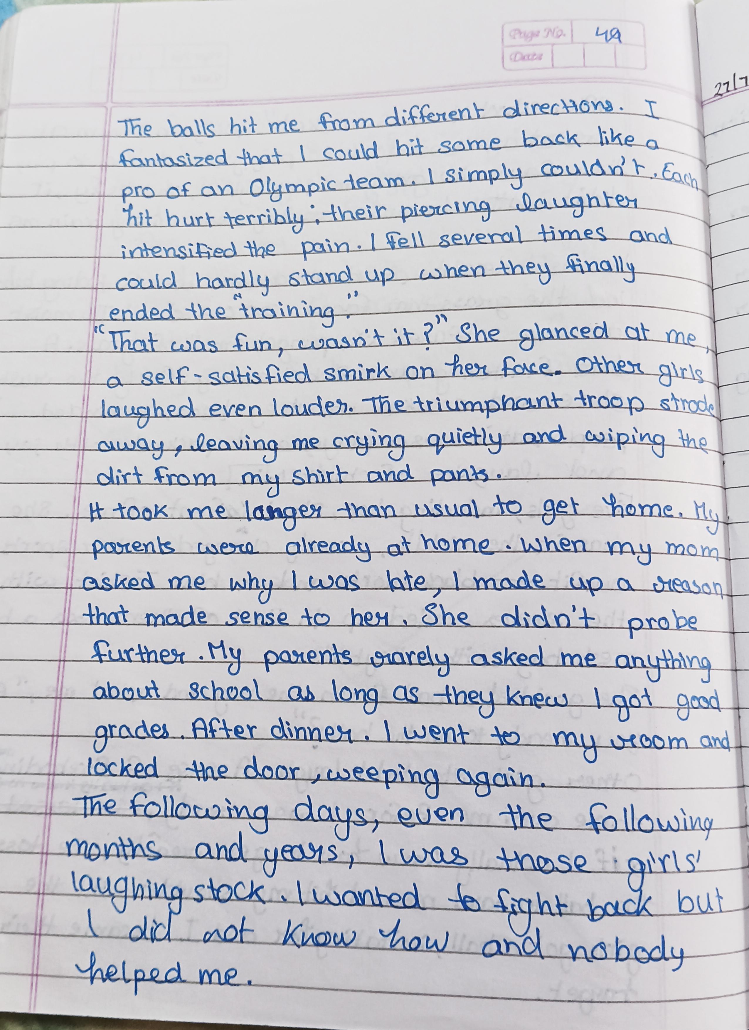
This handwriting displays a neat and consistent cursive style, suggesting a thoughtful and considerate personality. Further refinement in letter size and spacing could enhance its visual appeal.
Your handwriting presents a neatly formed, cursive style, with a slightly rounded appearance. The letter formations are generally consistent, though there's a hint of variability in the size of the letters, for example, compare the 't' in 'different' to the 't' in 'that'. The slant is fairly uniform and upright, suggesting a balanced approach. The loops in letters like 'l' and 'f' are moderately sized, contributing to the overall legibility.
This style of handwriting often reflects a personality that is thoughtful and considerate. The neatness indicates a desire for order and clarity in expression. The slight roundness may point to a friendly and approachable nature, someone who values harmony and is empathetic to others. There is also a certain determination reflected in the firm strokes, suggesting a person who is resilient and persevering.
To further refine your handwriting, consider practicing maintaining a more consistent letter size and spacing. Paying attention to the baseline and ensuring letters sit evenly can also enhance the visual appeal. Experiment with varying the pressure applied to the pen to add more character and flair. Overall, your handwriting is already quite pleasant and easy to read.
Legibility
Expressiveness
Consistency
Overall
Leaderboard for Sunday, 26 October 2025
| 1 | The Pristine Penman |
76
|
| 2 | The Determined Diarist |
75
|
| 3 | The Constitutionalist |
74
|
| 4 | The Flowing Quill |
74
|
| 5 | Geometric Author |
73
|
| 6 | The Diligent Dreamer |
73
|
| 7 | The Curator's Script |
72
|
| 8 | The Pragmatist's Script |
72
|
| 9 | The Eloquent Calligrapher |
71
|
| 10 | The Dreamer's Quill |
70
|
| 11 | The Organized Storyteller |
69
|
| 12 | The Hopeful Heart's Script |
68
|
| 13 | The Flowing Quill |
68
|
| 14 | The Constitutionalist |
68
|
| 15 | The Flowing Hand |
68
|
| 16 | The Looping Luminary |
68
|
| 17 | The Unassuming Hand |
66
|
| 18 | The Optimistic Artist |
65
|
| 19 | The Studious Student |
65
|
| 20 | The Contemplative Soul |
64
|
| 21 | The Minimalist's Mark |
64
|
| 22 | The Efficient Note-Taker |
64
|
| 23 | The Gentle Flow |
63
|
| 24 | The Flowing Font |
63
|
| 25 | Diligent Student |
63
|
| 26 | The Looping Legend |
62
|
| 27 | The Loop Whisperer |
61
|
| 28 | The Congratulatory Cursive |
60
|
| 29 | Zen Strokes |
60
|
| 30 | The Contemplative Calligrapher |
60
|