Rate my handwriting

✨ Upload a sample of your handwriting, and our 🤖 AI will give you
the scoop on
what's awesome
and what could use a
little improving.
It's just for fun - and totally free! Try now 🚀
(You can also check out today's 👑 Leaderboard 👇)
The Congratulatory Cursive
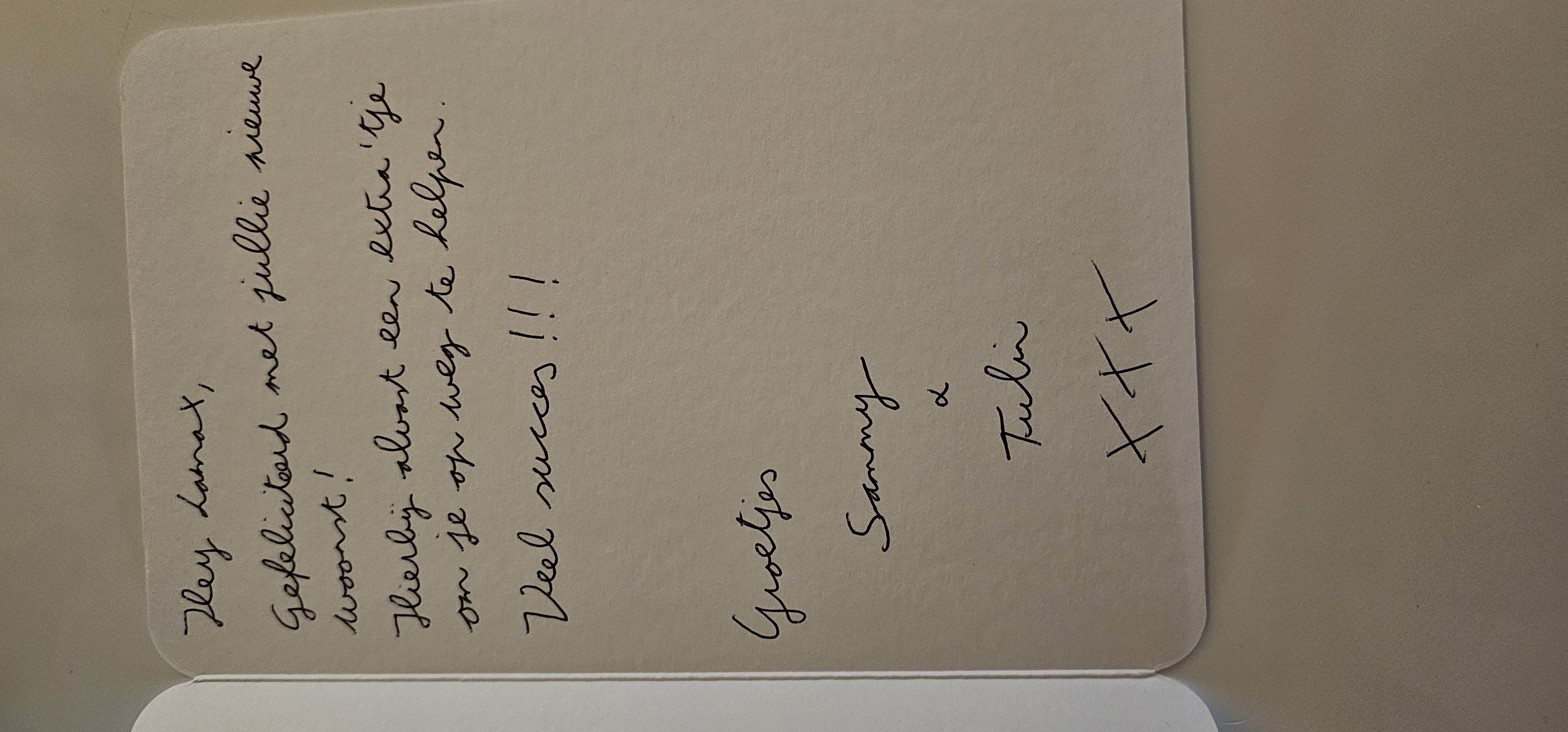
This cursive handwriting is generally neat and flowing, suggesting a friendly and conscientious personality. Some attention to consistency in letter size and spacing would improve its overall legibility.
The handwriting style presents as flowing and cursive, with a notable forward slant. The loops in letters such as 'g' in "Gefeliciteerd" and 'j' in "jullie" are well-formed, suggesting a degree of care and attention to detail. The baseline appears relatively stable, though there is a slight upward trend towards the end of some lines. The pressure applied seems consistent, creating uniform stroke thickness throughout the writing. The overall impression is one of neatness and reasonable legibility, despite some letter formations being slightly stylized.
Based on this sample, the writer likely possesses a friendly and approachable demeanor, as reflected in the welcoming tone of the message. The neatness and attention to detail could indicate a conscientious and organized nature. The forward slant may suggest enthusiasm and a proactive attitude. The evident effort put into the handwriting implies a genuine desire to connect with and express warmth towards the recipient.
To further improve, focusing on maintaining consistent letter size and spacing would enhance legibility. Practicing individual letter formations, particularly those that appear stylized, could also lead to a more uniform and easily readable style. Consider varying the pressure applied to create more contrast and visual interest in the handwriting. Overall, it's a pleasant style with room for refinement.
Legibility
Expressiveness
Consistency
Overall
Leaderboard for Saturday, 25 October 2025
| 1 | The Pristine Penman |
76
|
| 2 | The Determined Diarist |
75
|
| 3 | The Elegant Signature |
74
|
| 4 | The Diligent Dreamer |
73
|
| 5 | Geometric Author |
73
|
| 6 | The Pragmatic Planner |
73
|
| 7 | The Student |
73
|
| 8 | The Pragmatist's Script |
72
|
| 9 | The Eloquent Calligrapher |
71
|
| 10 | The Organized Storyteller |
69
|
| 11 | The Flowing Hand |
68
|
| 12 | The Looping Luminary |
68
|
| 13 | The Agile Acrobat |
67
|
| 14 | The Acrobatic Pen |
67
|
| 15 | The Classicist's Quill |
65
|
| 16 | The Optimistic Artist |
65
|
| 17 | The Minimalist's Mark |
64
|
| 18 | The Efficient Note-Taker |
64
|
| 19 | Diligent Student |
63
|
| 20 | The Pragmatic Pen |
63
|
| 21 | The Coordinator's Quill |
61
|
| 22 | The Liberty Lover's Cursive |
61
|
| 23 | The Loop Whisperer |
61
|
| 24 | Zen Strokes |
60
|
| 25 | The Congratulatory Cursive |
60
|
| 26 | The Enthusiastic Connector |
59
|
| 27 | The Pragmatic Idealist |
59
|
| 28 | The Elegant Calligrapher |
59
|
| 29 | The Poet's Quill |
59
|
| 30 | The Typist's Touch |
59
|