Rate my handwriting

✨ Upload a sample of your handwriting, and our 🤖 AI will give you
the scoop on
what's awesome
and what could use a
little improving.
It's just for fun - and totally free! Try now 🚀
(You can also check out today's 👑 Leaderboard 👇)
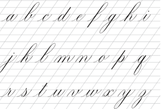
The Calligrapher's Apprentice
This is a promising calligraphic hand, demonstrating potential with a need for improved consistency in slant, baseline, and letter height for greater legibility.
This handwriting sample showcases a delightful attempt at the art of calligraphy, reminiscent of a student diligently practicing their strokes. The forms of the letters, such as the elegant loops of the 'f', 'g', 'j' and 'y', demonstrate an awareness of traditional cursive script. There's a charming lack of uniformity, as seen in the varying heights of letters like 'h' and 'k'. While the slant and baseline wander a little, it contributes to a natural, unpretentious feel.
This slightly inconsistent hand suggests a personality that values both tradition and personal expression. The writer is likely drawn to classic forms but enjoys adding their own individual touch. The gentle variations hint at a flexible and adaptable nature, perhaps with a touch of free-spiritedness. The emphasis on neatness, however, indicates a respect for order and attention to detail, balanced with a dash of creative freedom.
While aesthetically pleasing, improving consistency would enhance legibility. Focus on maintaining a consistent slant for all letters. Ensure the baseline of each letter rests on the same line. Regular practice, focusing on uniformity in height and spacing, would refine this already promising script into a truly elegant hand. Keep experimenting with different calligraphic styles to discover your unique signature style.
Legibility
Expressiveness
Consistency
Overall
Leaderboard for Tuesday, 28 October 2025
| 31 | The Loopy Dreamer |
62
|
| 32 | Babylonian Beaches |
62
|
| 33 | The Pragmatic Professor |
61
|
| 34 | The Forthright Font |
61
|
| 35 | The Elegant Elocutionist |
61
|
| 36 | The Flowing Script |
61
|
| 37 | The Flowing Pen |
60
|
| 38 | Coastal Rhapsody |
60
|
| 39 | The Diplomat's Quill |
60
|
| 40 | Coastal Contemplations |
59
|
| 41 | The Casual Communicator |
59
|
| 42 | The Diligent Storyteller |
58
|
| 43 | The Idealist's Cursive |
58
|
| 44 | The Grand Calligrapher |
58
|
| 45 | The Furious Finisher |
58
|
| 46 | The Deliberate Doodler |
57
|
| 47 | The Deliberate Doodler |
56
|
| 48 | The Fantastical Dreamer |
56
|
| 49 | The Elegant Optimist |
56
|
| 50 | The Advocate's Quill |
56
|
| 51 | The Principled Pen |
54
|
| 52 | The Eloquent Essayist |
54
|
| 53 | Neptune's Prose |
53
|
| 54 | The Coastal Contemplator |
53
|
| 55 | The Gentle Leaning Tower |
53
|
| 56 | The Introspective Historian |
52
|
| 57 | The Pragmatic Note-Taker |
52
|
| 58 | The Maverick's Mark |
51
|
| 59 | The Pragmatic Pen |
51
|
| 60 | Coastal Rhythms |
51
|