Rate my handwriting

✨ Upload a sample of your handwriting, and our 🤖 AI will give you
the scoop on
what's awesome
and what could use a
little improving.
It's just for fun - and totally free! Try now 🚀
(You can also check out today's 👑 Leaderboard 👇)
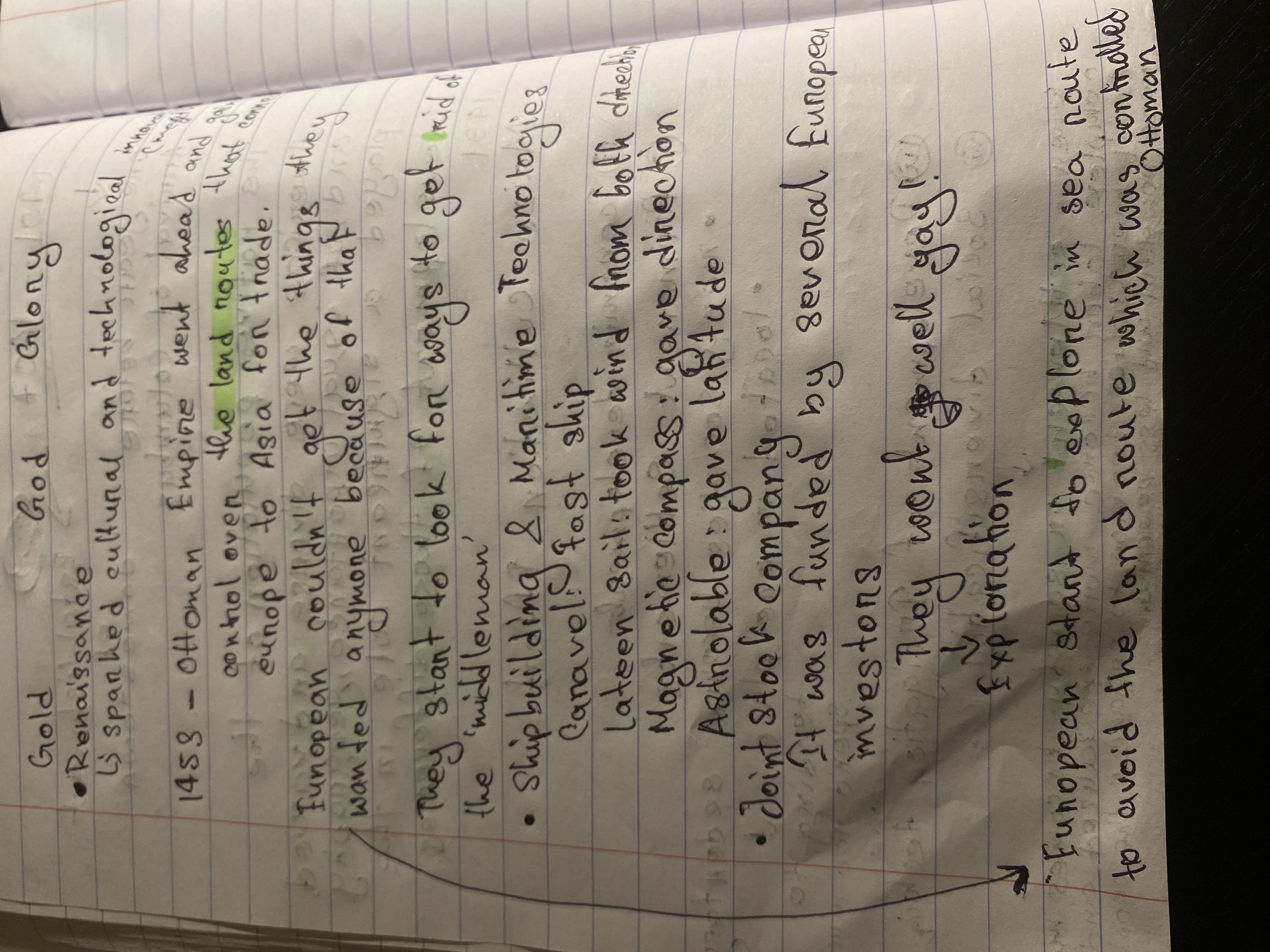
The Cursive Cartographer
The handwriting displays a functional style with slight variations in letter size, suggesting a pragmatic and adaptable personality.
The handwriting is mostly neat and functional, resembling casual note-taking. There's a slight forward slant and some variation in letter size, particularly noticeable between uppercase and lowercase letters. Words are generally well-spaced, though some lines are a little crowded. The pressure appears to be medium, creating a consistent line thickness, and letter formations are mostly rounded. The writing style is a mix of print and cursive, such as with the word "Glory" which appears to be written in a flowing script, and "Ottoman", which is clearly printed.
Based on the organized and functional style, it suggests a pragmatic and efficient personality. The mix of print and cursive indicates a blend of traditional and modern approaches, showing adaptability and a willingness to combine different methods. The consistent pressure and letter forms suggest a level of focus and attention to detail, implying a person who values clarity and precision in their communication.
To improve legibility, focus on consistently sizing the letters. While the mix of print and cursive can be charming, standardizing letter formations might enhance clarity. Experimenting with different pen grips or writing angles can also help refine the style. Perhaps a dedicated handwriting practice session would yield satisfying results, as this hand is well on the way to greatness.
Legibility
Expressiveness
Consistency
Overall
Leaderboard for Monday, 13 October 2025
| 1 | The Pragmatic Planner |
72
|
| 2 | The Upbeat Optimist |
71
|
| 3 | The Population Pyramids Analyst |
71
|
| 4 | The Environmentalist's Elegant Cursive |
71
|
| 5 | The Pragmatic Penman |
68
|
| 6 | The Upright Citizen |
68
|
| 7 | The Cartographer's Quill |
66
|
| 8 | The Spirited Student |
66
|
| 9 | The Rhythmic Reveler |
64
|
| 10 | The Pensive Professor |
63
|
| 11 | The Pragmatic Note-Taker |
61
|
| 12 | The Ornate Innovator |
61
|
| 13 | The Concise Communicator |
61
|
| 14 | The Diligent Note-Taker |
61
|
| 15 | The Practical Student |
61
|
| 16 | The Elegant Upright |
60
|
| 17 | The Looping Dreamer |
59
|
| 18 | The Diligent Chronicler |
58
|
| 19 | The Diligent Student |
58
|
| 20 | The Coastal Chronicler |
58
|
| 21 | The Navigator's Log |
57
|
| 22 | The Cursive Cartographer |
56
|
| 23 | The Navigator's Log |
56
|
| 24 | The Rhythmic Soul |
56
|
| 25 | The Silent Sufferer |
55
|
| 26 | The Upright Penman |
54
|
| 27 | The Whispering Quill |
53
|
| 28 | The Diplomat's Hand |
52
|
| 29 | The Flourishing Thinker |
50
|
| 30 | The Pragmatic Pen |
49
|