Rate my handwriting

✨ Upload a sample of your handwriting, and our 🤖 AI will give you
the scoop on
what's awesome
and what could use a
little improving.
It's just for fun - and totally free! Try now 🚀
(You can also check out today's 👑 Leaderboard 👇)

The Contemplative Chronicler
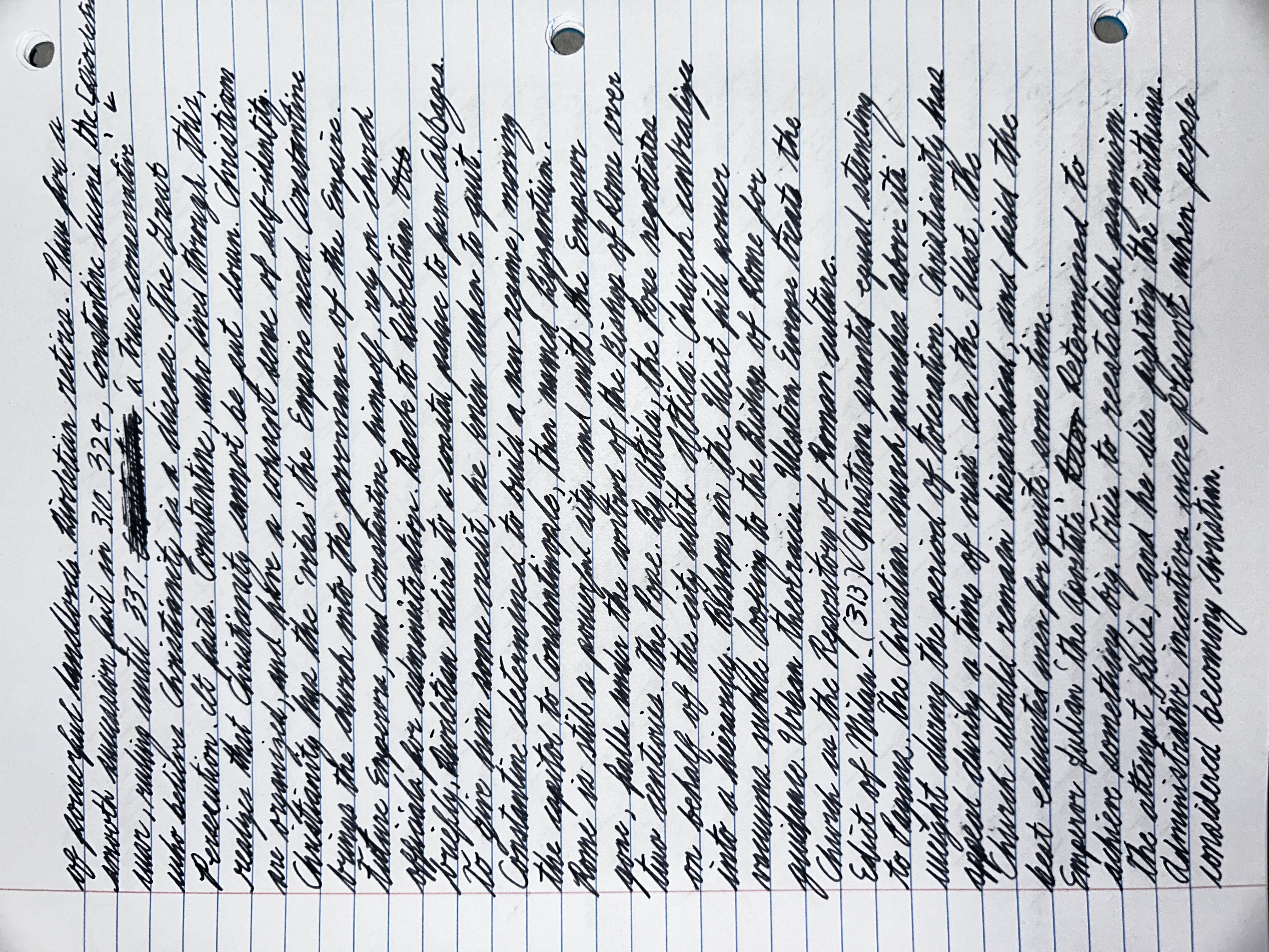
This handwriting suggests a thoughtful and organized individual, and with a few minor adjustments, the writer could further enhance the clarity and expressiveness of their style.
The handwriting presents as a cursive style, exhibiting a consistent slant to the right. The letter formation is generally rounded, with occasional sharp angles, particularly noticeable in the uppercase letters. The pressure applied appears relatively uniform, suggesting a steady hand. The size of the letters is moderately consistent, though there are slight variations throughout the text. Overall, the handwriting appears quite neat, with clear spacing between words, which contributes to its legibility. The writing flows continuously, indicating fluency and ease of expression. One might note the occasional flourish, adding a personal touch to the writing style.
Based on the handwriting, one might infer a personality that is thoughtful and deliberate. The consistency and neatness suggest someone who is organized and pays attention to detail. The rounded letter forms might indicate a warm and approachable nature, while the rightward slant suggests a forward-looking and proactive attitude. The overall fluency of the writing could point to a person who is articulate and confident in their communication. The presence of flourishes could imply a creative and expressive side, indicating a desire to add a personal touch to their work.
To improve the handwriting, focusing on maintaining a more consistent letter size and spacing could enhance its clarity. Experimenting with varying the pressure applied to the pen could add depth and character to the writing. Paying attention to the formation of specific letters that appear less defined could also improve overall legibility. While the handwriting is already quite neat, consciously practicing a more consistent slant could create a more uniform and visually appealing style. Consider practicing on different paper types to get a feel for how the pen interacts with various surfaces.
Legibility
Expressiveness
Consistency
Overall
Leaderboard for Friday, 17 October 2025
| 1 | The Diligent Pupil |
73
|
| 2 | The Elegant Flow |
71
|
| 3 | The Precise Ledger Keeper |
70
|
| 4 | The Botanical Mind |
68
|
| 5 | The Intricate Intellectual |
67
|
| 6 | The Inquisitive Soul |
67
|
| 7 | The Organized Alchemist |
66
|
| 8 | The Humble Soul |
66
|
| 9 | The Demanding Diner |
65
|
| 10 | The Hill Walker's Itinerary |
61
|
| 11 | The Diligent Recorder |
60
|
| 12 | The Earth Explorer's Handbook |
59
|
| 13 | The Diligent Student |
57
|
| 14 | The Benevolent Beinn |
56
|
| 15 | The Contemplative Chronicler |
56
|
| 16 | The Conceptualist's Hand |
55
|
| 17 | The Cerebral Hand |
54
|
| 18 | The Practical Planner |
53
|
| 19 | The Optimistic Flow |
52
|
| 20 | The Scientific Mind |
52
|
| 21 | The Jumpy Fox's Mark |
52
|
| 22 | The Rambler's Itinerary |
51
|
| 23 | The Diligent Chronicler |
51
|
| 24 | The Straight-Talker |
50
|
| 25 | The Pragmatic Pen |
50
|
| 26 | The Energetic Quill |
49
|
| 27 | The Legal Eagle's Quill |
49
|