Rate my handwriting

✨ Upload a sample of your handwriting, and our 🤖 AI will give you
the scoop on
what's awesome
and what could use a
little improving.
It's just for fun - and totally free! Try now 🚀
(You can also check out today's 👑 Leaderboard 👇)
The Eloquent Idealist
The handwriting suggests a warm, thoughtful, and creative individual with a penchant for balance and harmony, who can improve by varying letter sizes and spacing.
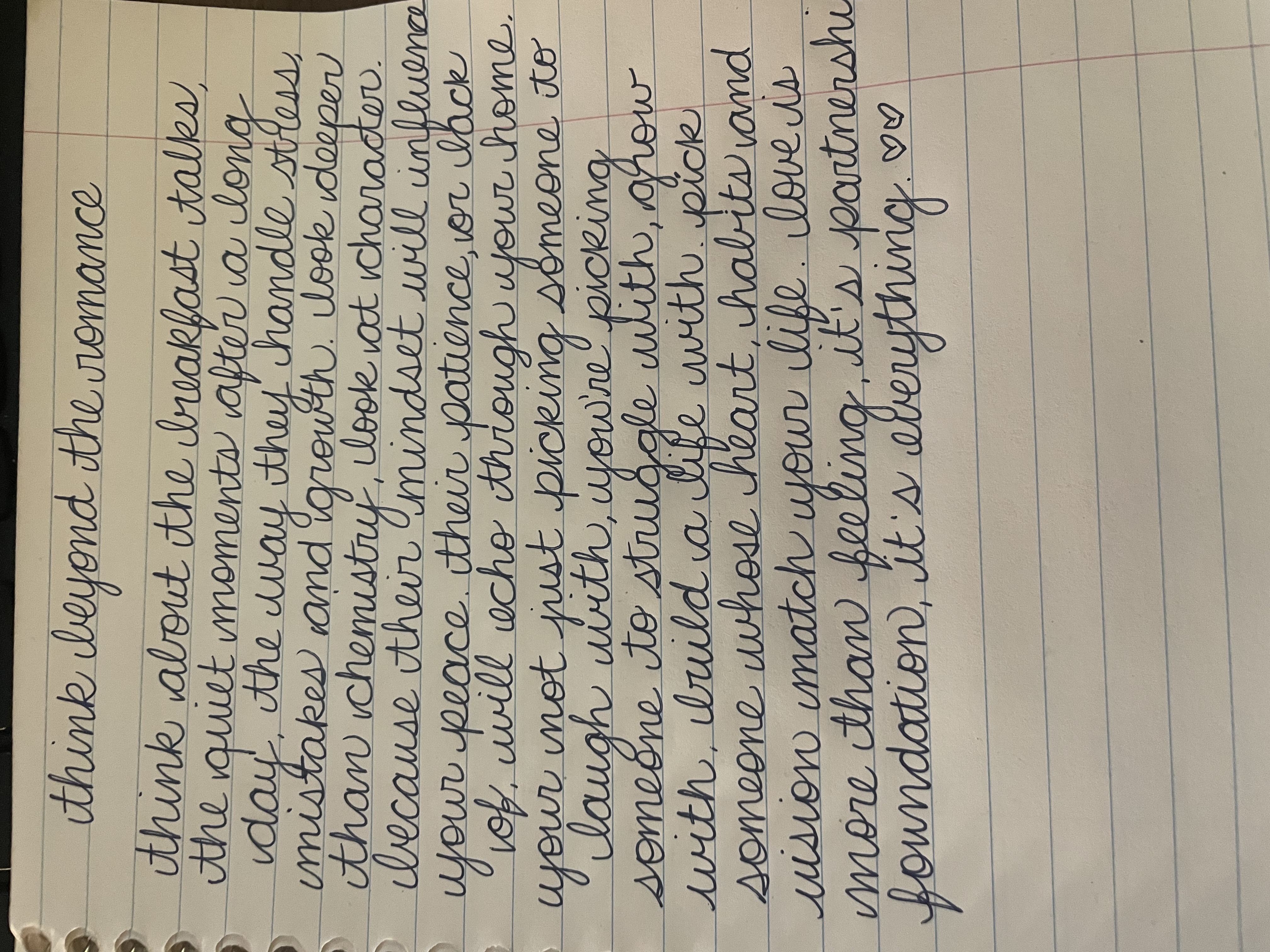
The handwriting exhibits a cursive style, characterized by a right slant and flowing connections between letters, giving it a dynamic feel. The strokes appear relatively uniform in pressure, indicating a steady hand and consistent approach. The letter 'y' in words like 'day' and 'your' and the letter 'g' in 'growth' and 'picking' show a distinctive loop, adding a touch of elegance and personality. The size is medium, fitting comfortably within the lines of the paper, suggesting a balance between assertiveness and consideration. The overall impression is one of deliberate care and attention to detail, as well as the consistent letter forms throughout the writing sample.
Based on this handwriting, the individual may possess a warm and empathetic nature, valuing connection and harmony in relationships. The consistent pressure and controlled slant suggest a person who is reliable, thoughtful, and strives for balance in their life. The elegant loops indicate a creative flair and appreciation for beauty, hinting at someone who finds joy in expressing themselves. They likely have a positive outlook and approach life with optimism, seeking deeper meaning and understanding in their experiences. The message itself suggests a romantic with an idealistic and thoughtful view of relationships.
To further enhance the handwriting, consider practicing variations in letter size to add more visual interest. Experimenting with slight variations in slant can also infuse more character and energy into the writing. Focus on maintaining the consistent pressure while allowing for more fluidity in the strokes to achieve a balance between control and expressiveness. Paying attention to the spacing between words can also improve readability and create a more harmonious flow across the page.
Legibility
Expressiveness
Consistency
Overall
Leaderboard for Sunday, 26 October 2025
| 31 | The Democratic Dreamer |
59
|
| 32 | The Elegant Calligrapher |
59
|
| 33 | The Enthusiastic Connector |
59
|
| 34 | The Signature Stylist |
59
|
| 35 | The Pragmatic Idealist |
59
|
| 36 | The Determined Motivator |
58
|
| 37 | The Devout Note-Taker |
58
|
| 38 | The Atom Alchemist |
57
|
| 39 | The Cipher's Quill |
57
|
| 40 | The Reproductive Note-Taker |
57
|
| 41 | The Loop-de-Loop Legend |
56
|
| 42 | The Scientific Mind |
56
|
| 43 | The Bold Artisan |
55
|
| 44 | The Minimalist |
55
|
| 45 | The Celestial Stylist |
54
|
| 46 | The Forward Leaning Letterer |
54
|
| 47 | The Stoic Calligrapher |
54
|
| 48 | The Calligrapher's Flourish |
54
|
| 49 | The Diligent Student |
53
|
| 50 | The Flowing River |
53
|
| 51 | The Architect of Letters |
53
|
| 52 | The Architect's Alphabet |
51
|
| 53 | The Provocateur's Quill |
51
|
| 54 | The Optimistic Loopist |
51
|
| 55 | The Pragmatic Penman |
47
|
| 56 | The Minimalist's Mark |
43
|