Rate my handwriting

✨ Upload a sample of your handwriting, and our 🤖 AI will give you
the scoop on
what's awesome
and what could use a
little improving.
It's just for fun - and totally free! Try now 🚀
(You can also check out today's 👑 Leaderboard 👇)
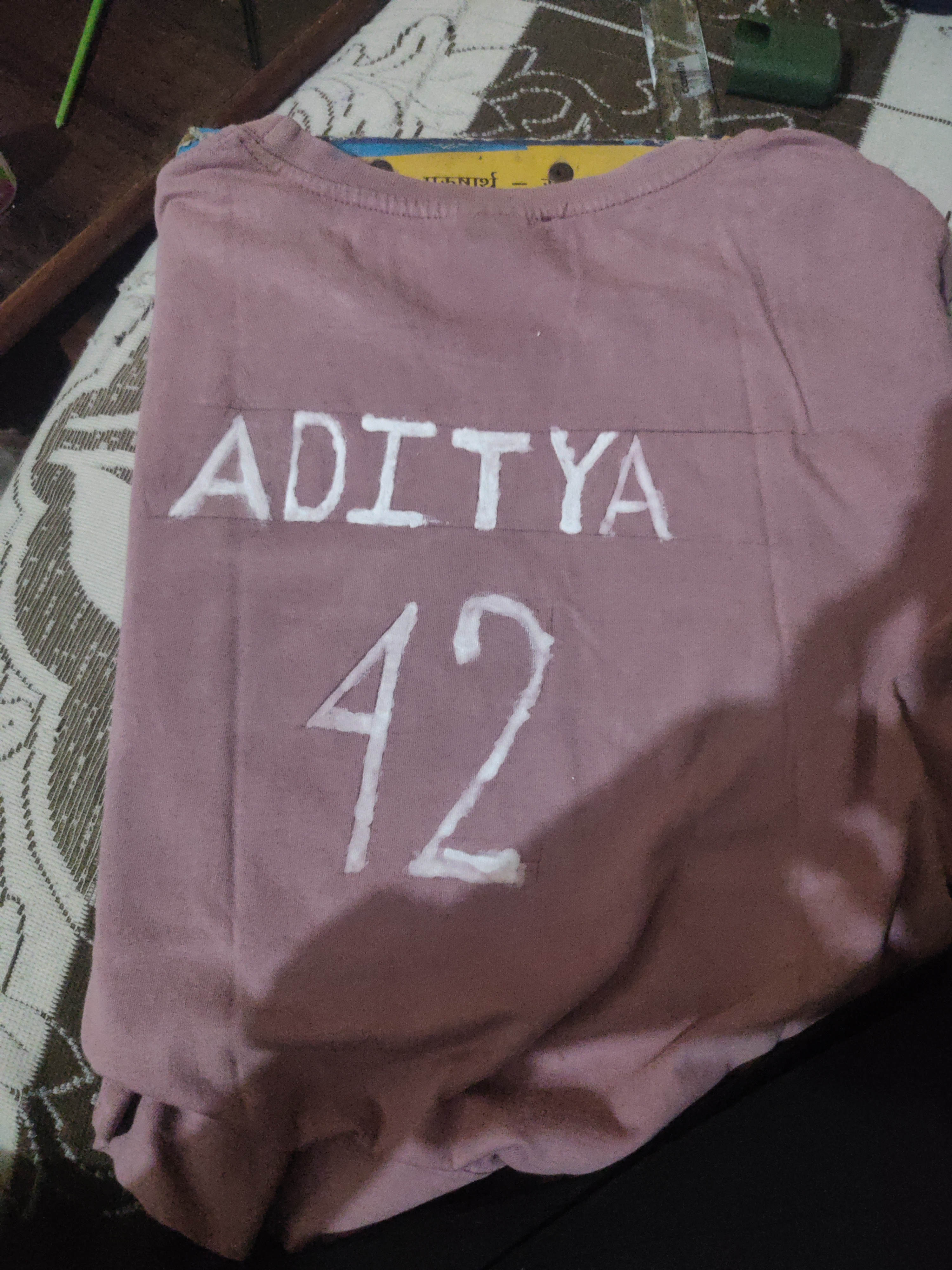
The Bold Artisan
This bold and blocky handwriting suggests a confident and creative individual who is not afraid to make a statement. Focusing on refining stroke consistency and incorporating smoother curves could further enhance the overall style.
The handwriting in this sample, spelling out "ADITYA 42", exhibits a bold and somewhat blocky style. The letters are formed with thick strokes and a noticeable lack of curves, giving them a strong, almost architectural quality. There's an overall impression of deliberate formation, rather than rapid or cursive flow. The size of the lettering is substantial, suggesting confidence and a desire to be noticed. The 'A's in "ADITYA" are particularly distinctive, with a wide base and sharply angled apex. The numeral "4" also stands out, featuring a prominent peak. The letters are not uniform in size, but they appear to follow a horizontal alignment. The neatness is compromised by a slightly uneven application of the medium, suggesting that it was done without special equipment or care.
Based on this handwriting, one might infer that the writer is self-assured and not afraid to make a statement. The blocky style indicates a practical, down-to-earth nature. The writer might be a creative individual who enjoys expressing themselves through bold and straightforward means. The imperfections and variations in letter size suggest someone who is not overly concerned with perfection but values individuality and impact. The boldness of the script indicates a confident person who enjoys being noticed.
To improve the handwriting, one could focus on refining the consistency of the strokes and letter sizes. Practicing smoother curves, especially in letters like 'D' and 'Y', would enhance the fluidity. Experimenting with different writing instruments might also lead to more refined results. A steady hand and more patience in the letter creation process would also improve the overall look of the script. Focus on making the application of the writing medium more even.
Legibility
Expressiveness
Consistency
Overall
Leaderboard for Saturday, 25 October 2025
| 1 | The Pristine Penman |
76
|
| 2 | The Determined Diarist |
75
|
| 3 | The Elegant Signature |
74
|
| 4 | Geometric Author |
73
|
| 5 | The Pragmatic Planner |
73
|
| 6 | The Diligent Dreamer |
73
|
| 7 | The Student |
73
|
| 8 | The Pragmatist's Script |
72
|
| 9 | The Eloquent Calligrapher |
71
|
| 10 | The Organized Storyteller |
69
|
| 11 | The Flowing Hand |
68
|
| 12 | The Looping Luminary |
68
|
| 13 | The Acrobatic Pen |
67
|
| 14 | The Agile Acrobat |
67
|
| 15 | The Classicist's Quill |
65
|
| 16 | The Optimistic Artist |
65
|
| 17 | The Efficient Note-Taker |
64
|
| 18 | The Minimalist's Mark |
64
|
| 19 | Diligent Student |
63
|
| 20 | The Pragmatic Pen |
63
|
| 21 | The Coordinator's Quill |
61
|
| 22 | The Loop Whisperer |
61
|
| 23 | The Liberty Lover's Cursive |
61
|
| 24 | The Congratulatory Cursive |
60
|
| 25 | Zen Strokes |
60
|
| 26 | The Enthusiastic Connector |
59
|
| 27 | The Poet's Quill |
59
|
| 28 | The Precise Mathematician |
59
|
| 29 | The Elegant Calligrapher |
59
|
| 30 | The Typist's Touch |
59
|