Rate my handwriting

✨ Upload a sample of your handwriting, and our 🤖 AI will give you
the scoop on
what's awesome
and what could use a
little improving.
It's just for fun - and totally free! Try now 🚀
(You can also check out today's 👑 Leaderboard 👇)
The Looping Dreamer
The handwriting reveals an affable and organized personality with a preference for harmony and expression, though some minor adjustments could enhance legibility. It suggests a detail-oriented and conscientious individual.
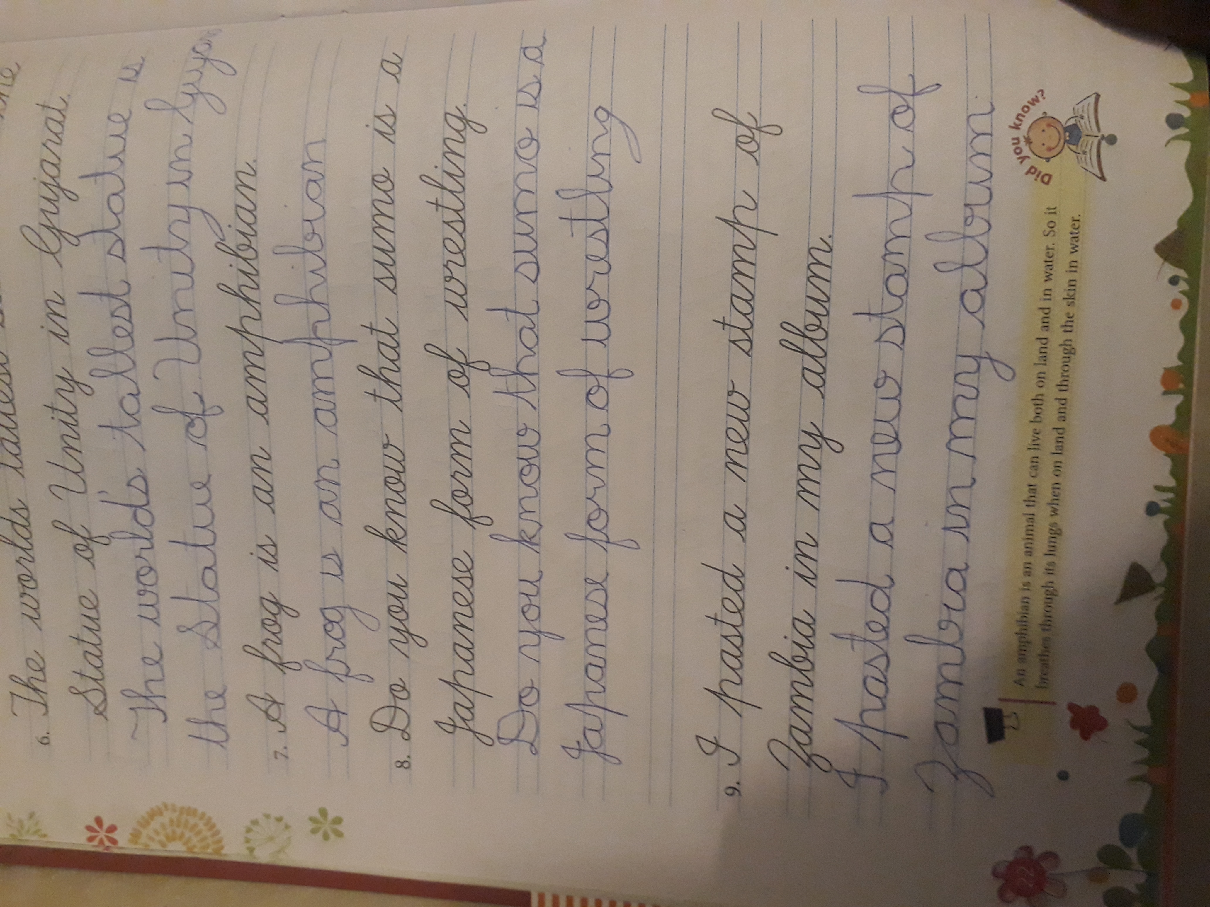
The handwriting is characterized by its looping forms and rounded letter shapes, seen clearly in words like "Statue", "Unity", "frog", and "amphibian". The strokes appear to be light and flowing, suggesting a comfortable pace of writing. The slant is fairly consistent, leaning slightly to the right, which could indicate a natural inclination towards expression and connection. Overall, the handwriting presents a neat and organized appearance, especially considering the cursive style. The words are well-spaced, and the lines are generally straight, demonstrating a good sense of spatial awareness. The letter height and size seem to be consistent throughout the sample.
This handwriting suggests a personality that is likely affable and approachable. The rounded forms imply a desire for harmony and a preference for avoiding conflict. The rightward slant could point to someone who is sociable, expressive, and enjoys connecting with others. The neatness and organization suggest a conscientious and detail-oriented nature. This individual probably values structure and order in their environment. There may be a tendency to be empathetic and considerate of others' feelings, given the gentle curves and flowing lines. The consistent slant indicates a stable emotional state and a generally positive outlook.
To further refine the handwriting, focusing on sharper distinctions between certain letters could enhance legibility. For example, ensuring that the 'n' and 'u' are clearly differentiated, especially in words like "Unity", would improve clarity. Practicing consistent pressure on the pen or pencil could also help in creating more uniform strokes. Varying the size of the loops, especially in letters like 'l' and 'g', can add a personal flair while maintaining readability. Remember, the goal is to find a balance between expressiveness and clarity, allowing the writing to reflect your unique personality while remaining easily understood.
Legibility
Expressiveness
Consistency
Overall
Leaderboard for Thursday, 25 September 2025
| 1 | The Steadfast Hand |
75
|
| 2 | The Pop Star's Fan |
73
|
| 3 | The Looping Dreamer |
71
|
| 4 | The Precise Communicator |
71
|
| 5 | The Bold Minimalist |
69
|
| 6 | The Diligent Student |
69
|
| 7 | The Pragmatic Pen |
68
|
| 8 | The Corporate Courier |
68
|
| 9 | The Optimist's Italic |
68
|
| 10 | The Level-Headed Letterer |
68
|
| 11 | The Scholarly Hand |
67
|
| 12 | The Gentle Bow |
64
|
| 13 | The Upright Citizen |
64
|
| 14 | The Existential Enigma |
64
|
| 15 | The Flowing River |
63
|
| 16 | The Playful Page |
63
|
| 17 | The Diligent Chronicler |
61
|
| 18 | The Dreamer's Script |
61
|
| 19 | The Loop Artist |
61
|
| 20 | The Determined Idealist |
61
|
| 21 | The Wandering Pen |
61
|
| 22 | The Minimalist's Mark |
60
|
| 23 | The Curious Calligrapher |
60
|
| 24 | The Reluctant Scholar |
60
|
| 25 | The Minimalist's Quill |
59
|
| 26 | The Definitive Doodler |
59
|
| 27 | The Knight's Quest |
59
|
| 28 | The Logical Loop |
59
|
| 29 | The Independent's Script |
59
|
| 30 | The Flourishing Signature |
58
|