Rate my handwriting

✨ Upload a sample of your handwriting, and our 🤖 AI will give you
the scoop on
what's awesome
and what could use a
little improving.
It's just for fun - and totally free! Try now 🚀
(You can also check out today's 👑 Leaderboard 👇)

The Curious Calligrapher
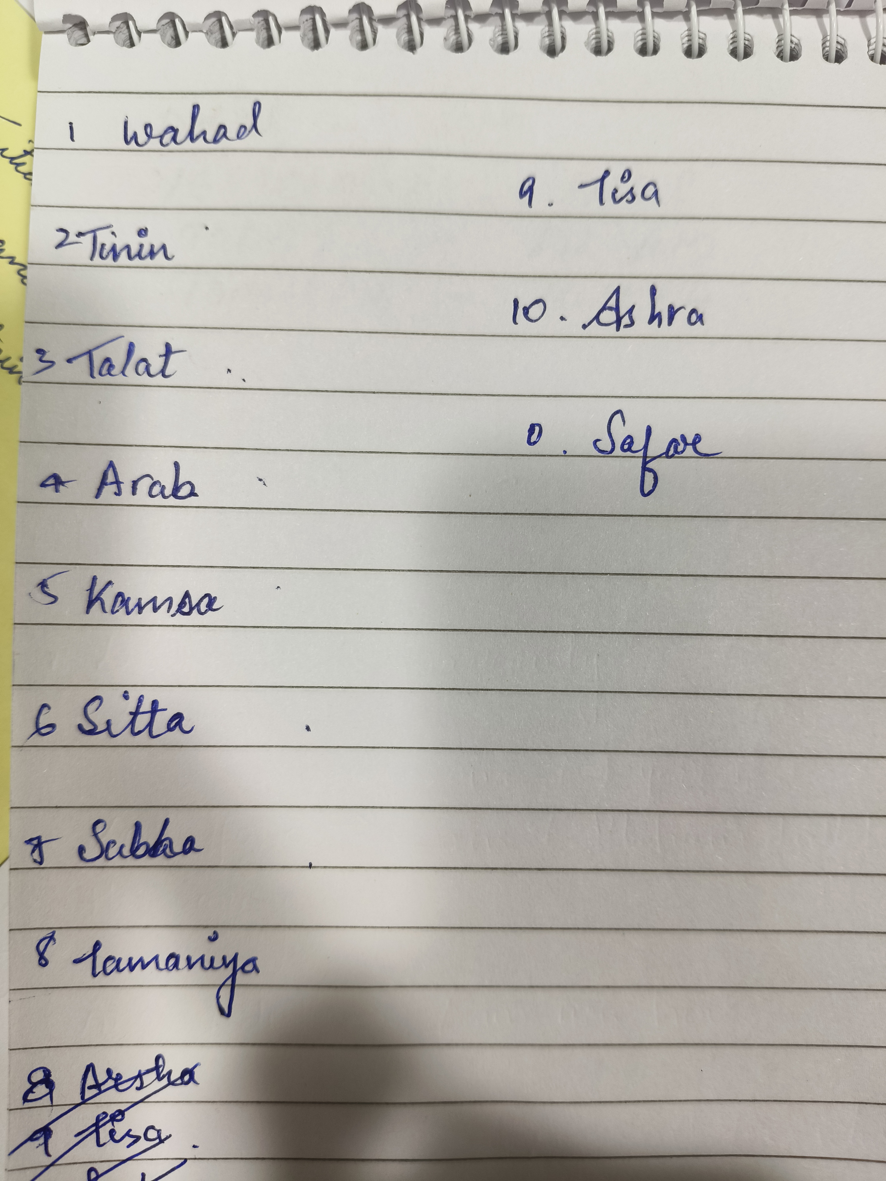
The handwriting reveals an approachable personality with a creative streak, balanced by a desire for clear communication; with a few minor adjustments, the writing could be improved for enhanced legibility and a more polished appearance.
The handwriting style is a blend of cursive and print, with rounded forms dominating the script. Letters like 'a', 's', and 't' exhibit a looping quality, creating a somewhat decorative effect. The writing has a generally consistent slant and pressure, but the size of the letters varies slightly, especially when transitioning between words. There is a degree of neatness, but it is not overly precise, suggesting a balance between care and speed. The word 'lamaniya' has some flourishing, with an elongated tail on the 'y', suggesting a bit of playfulness or flair. Overall, the handwriting is legible, but not without a few moments of hesitation or correction as evidenced by the strikethrough.
Based on this handwriting, the writer likely possesses a friendly and approachable demeanor. The rounded letter forms suggest a cooperative and empathetic nature. The presence of both cursive and print might indicate adaptability and a willingness to adjust to different situations. The variations in letter size could reflect a spontaneous and expressive personality, while the occasional flourish hints at a creative streak. The legibility, despite some imperfections, suggests a desire to communicate clearly, albeit without excessive rigidity.
To enhance the handwriting, focusing on maintaining a consistent letter size would be beneficial. Practicing letter spacing to ensure uniform gaps between words can also improve legibility. Pay attention to the baseline, aiming for a straighter line to give the writing a more grounded appearance. Also, reducing unnecessary flourishes will lead to a cleaner, more professional look, while retaining the individual character of the handwriting.
Legibility
Expressiveness
Consistency
Overall
Leaderboard for Thursday, 25 September 2025
| 1 | The Steadfast Hand |
75
|
| 2 | The Pop Star's Fan |
73
|
| 3 | The Precise Communicator |
71
|
| 4 | The Looping Dreamer |
71
|
| 5 | The Bold Minimalist |
69
|
| 6 | The Diligent Student |
69
|
| 7 | The Level-Headed Letterer |
68
|
| 8 | The Optimist's Italic |
68
|
| 9 | The Pragmatic Pen |
68
|
| 10 | The Corporate Courier |
68
|
| 11 | The Scholarly Hand |
67
|
| 12 | The Existential Enigma |
64
|
| 13 | The Gentle Bow |
64
|
| 14 | The Playful Page |
63
|
| 15 | The Flowing River |
63
|
| 16 | The Elusive Hand |
62
|
| 17 | The Loop Artist |
61
|
| 18 | The Diligent Chronicler |
61
|
| 19 | The Wandering Pen |
61
|
| 20 | The Dreamer's Script |
61
|
| 21 | The Determined Idealist |
61
|
| 22 | The Reluctant Scholar |
60
|
| 23 | The Hopeful Dreamer |
60
|
| 24 | The Minimalist's Mark |
60
|
| 25 | The Curious Calligrapher |
60
|
| 26 | The Definitive Doodler |
59
|
| 27 | The Logical Loop |
59
|
| 28 | The Knight's Quest |
59
|
| 29 | The Minimalist's Quill |
59
|
| 30 | The Flourishing Signature |
58
|