Rate my handwriting

✨ Upload a sample of your handwriting, and our 🤖 AI will give you
the scoop on
what's awesome
and what could use a
little improving.
It's just for fun - and totally free! Try now 🚀
(You can also check out today's 👑 Leaderboard 👇)

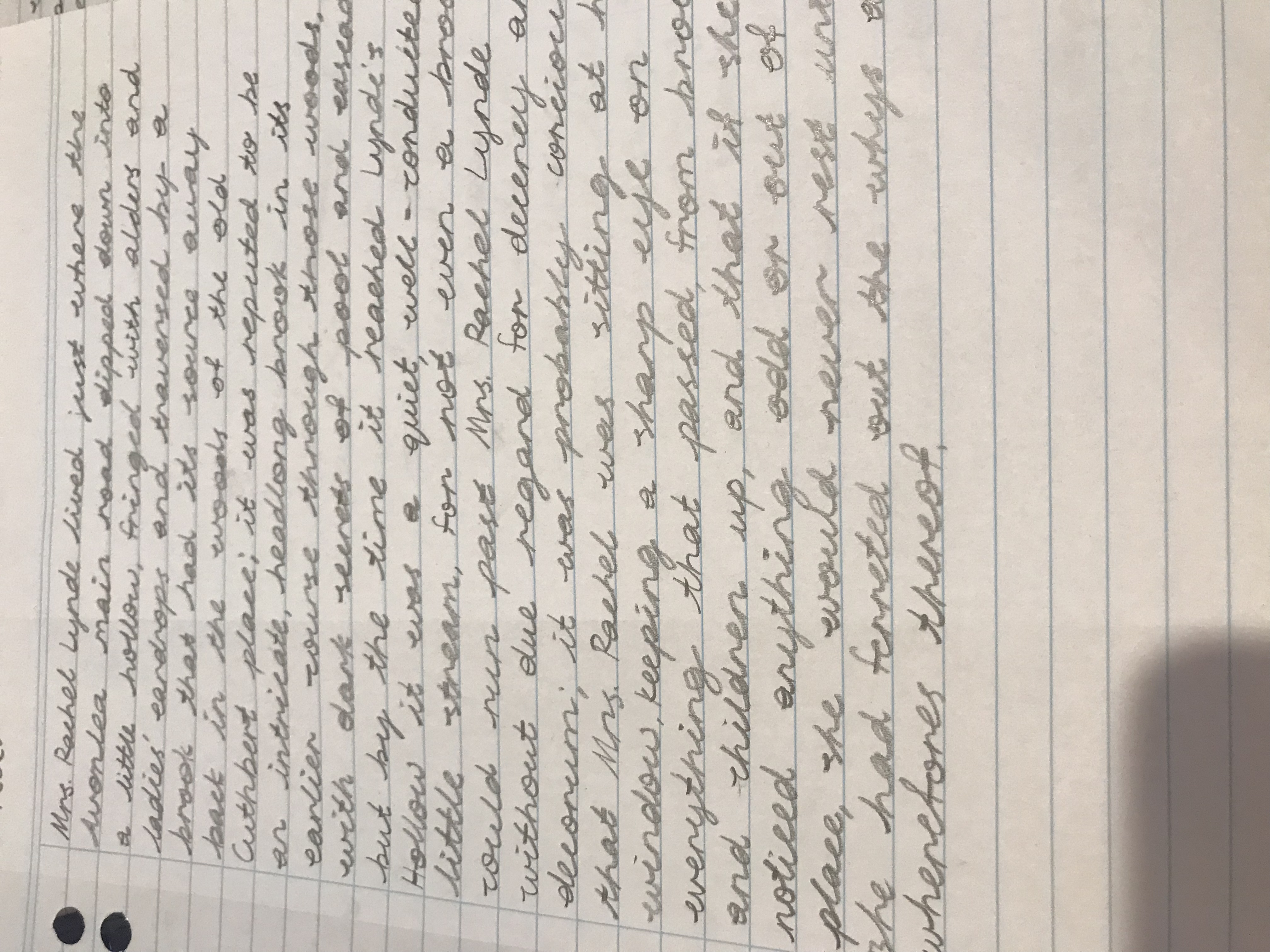
The Curator of Decency and Decorum
This neat and generally consistent handwriting indicates a personality that is organized and detail-oriented, while also hinting at an underlying creativity and strong sense of observation.
This handwriting sample exhibits a formal cursive style. The letters are generally well-formed, with consistent slant and spacing. Words like "decorum" and "ferreted" showcase the writer's attention to detail, particularly in the formation of loops and ascenders. However, certain idiosyncrasies, such as the slightly exaggerated "d" in "dipped", and "road" hint at a personality that deviates from strict adherence to traditional forms.
This handwriting suggests a personality that values order and propriety. The consistent slant and spacing imply a methodical and organized mind. The precise formation of letters suggests a focus on accuracy and attention to detail. However, the occasional flourishes, such as the exaggerated loops, hint at a touch of creativity and a desire for self-expression, peeking through a veneer of conventionality. "Keeping a sharp eye on everything" implies someone observant and possibly even judgmental, though also invested in their surroundings.
To improve legibility and overall aesthetic appeal, focus on maintaining consistent letter size and spacing throughout. While the cursive style is generally neat, some letters, like "r" and "e" tend to be a bit cramped. Paying more attention to the spacing between these letters will enhance readability. Also, try to reduce the flourish on certain letters, such as the "d", as these can sometimes make words appear cluttered.
Legibility
Expressiveness
Consistency
Overall
Leaderboard for Wednesday, 29 October 2025
| 1 | The Calligrapher |
83
|
| 2 | The Elegant Calligrapher |
82
|
| 3 | Flourishing Calligrapher |
77
|
| 4 | The Calligrapher |
77
|
| 5 | The Flowing Stream |
74
|
| 6 | The Fluid Calligrapher |
71
|
| 7 | The Energetic List-Maker |
71
|
| 8 | The Elegant Scholar |
71
|
| 9 | The Student's Lament |
70
|
| 10 | The Inspirational Calligrapher |
70
|
| 11 | The Jolly Optimist |
68
|
| 12 | The Pragmatic Pupil |
68
|
| 13 | The Flourishing Individual |
68
|
| 14 | The Mario Manifesto |
68
|
| 15 | The Diligent Calligrapher |
67
|
| 16 | The Perfectionist's Primer |
67
|
| 17 | The Reflective Student |
67
|
| 18 | The Considerate Soul |
67
|
| 19 | The Divine Calligrapher |
66
|
| 20 | The Elegant Calligrapher |
66
|
| 21 | The Advocate's Quill |
65
|
| 22 | The Concerned Guardian |
65
|
| 23 | The Grid Writer |
65
|
| 24 | The Analytical Alchemist |
65
|
| 25 | The Pharmacist's Note |
65
|
| 26 | The Flowing Quill |
64
|
| 27 | The Flourishing Enigma |
63
|
| 28 | The Educated Executive |
63
|
| 29 | The Typist's Tale |
63
|
| 30 | The Diligent Diarist |
63
|