Rate my handwriting

✨ Upload a sample of your handwriting, and our 🤖 AI will give you
the scoop on
what's awesome
and what could use a
little improving.
It's just for fun - and totally free! Try now 🚀
(You can also check out today's 👑 Leaderboard 👇)
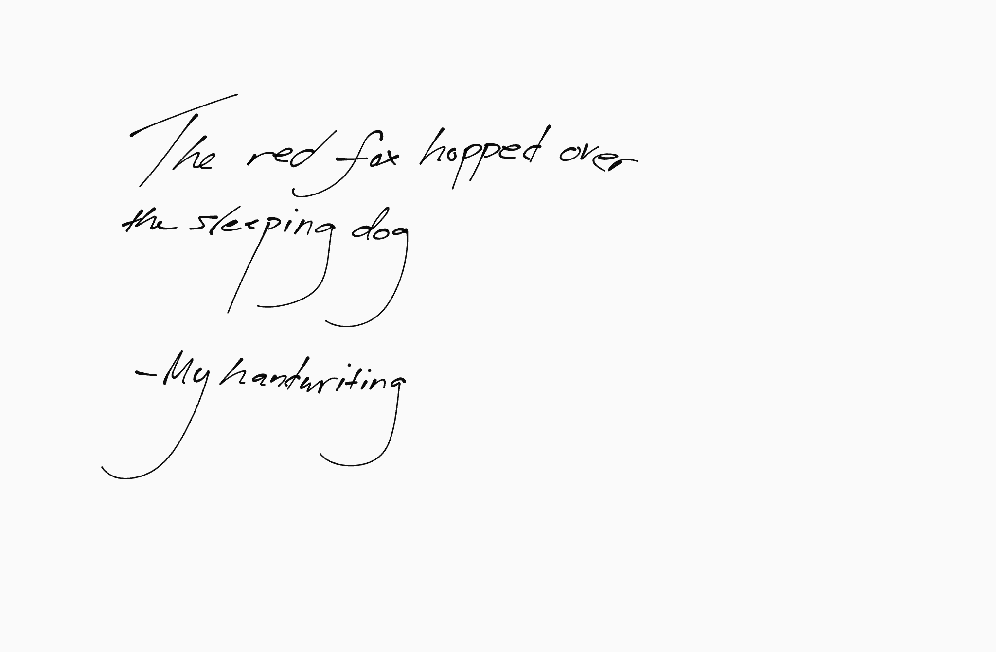
The Nimble Penman
This handwriting suggests a warm and organized person who balances quick thinking with a systematic approach. A bit more attention to consistency would enhance readability.
This handwriting sample presents a style that is generally legible and consistent, with a touch of casualness. The letters are formed with a fairly consistent size and slant, as seen in the words "sleeping dog." However, the style also exhibits some inconsistencies, such as the variation in the height of the 'h' in "The" and "handwriting." The baseline of the writing is generally straight, indicating a focus and groundedness. There is a moderate amount of spacing between words, enhancing the overall neatness.
The quick, connected strokes, especially noticeable in the word "hopped," suggest someone who thinks and acts fast. The slightly rightward slant indicates a person who is open to experiences and readily expresses themselves. The rounded forms of the letters, such as the 'o' and 'e', suggest a warm and friendly personality. The baseline variation, though subtle, hints at a spontaneous nature. The consistent letter size and slant suggest someone with a systematic approach, who likes to keep things organized and predictable. This systematic approach balances the quickness suggested by the connected strokes, implying a person who is both efficient and effective.
To improve this handwriting, focus on maintaining consistent height for all letters. For instance, the 'h' in "The" could be extended further down to align with the other letters. Practice joining letters smoothly within words to further improve consistency and flow. This could be achieved through exercises that involve repeatedly writing connected letters like 'op' as in "hopped." Also, paying attention to the baseline can enhance neatness. Try using lined paper or a baseline guide to maintain a straighter baseline. These improvements will help enhance legibility and project an even more polished image.
Legibility
Expressiveness
Consistency
Overall
Leaderboard for Wednesday, 30 April 2025
| 1 | The Methodical Meditator |
73
|
| 2 | The Aspiring Founding Father |
73
|
| 3 | The Punctual Penman |
68
|
| 4 | The Precise Ponderer |
68
|
| 5 | The Casual Penman |
67
|
| 6 | The Happy Penman |
67
|
| 7 | The Pragmatic Planner |
67
|
| 8 | The Methodical Mind |
67
|
| 9 | The Cloud Connoisseur |
66
|
| 10 | The Methodical Note-Taker |
65
|
| 11 | The Casual Penman |
64
|
| 12 | The Casual Communicator |
64
|
| 13 | The Diligent Grammarian |
60
|
| 14 | The Cheerful Penman |
60
|
| 15 | The Kinetic Composer |
59
|
| 16 | The Happy Penman |
59
|
| 17 | El alma sensible |
59
|
| 18 | The Precise Penman |
59
|
| 19 | The Determined Dreamer |
59
|
| 20 | The Playful Penman |
57
|
| 21 | The Rhythmic Penman |
56
|
| 22 | The Humble Penman |
56
|
| 23 | The Protein Ponderer |
54
|
| 24 | The Romantic Rhythmist |
54
|
| 25 | The Expressive Penman |
54
|
| 26 | The Confident Penman |
53
|
| 27 | The Diligent Student |
52
|
| 28 | The Methodical Millennial |
52
|
| 29 | The Practical Penman |
52
|
| 30 | The Friendly Penpal |
52
|