Rate my handwriting

✨ Upload a sample of your handwriting, and our 🤖 AI will give you
the scoop on
what's awesome
and what could use a
little improving.
It's just for fun - and totally free! Try now 🚀
(You can also check out today's 👑 Leaderboard 👇)

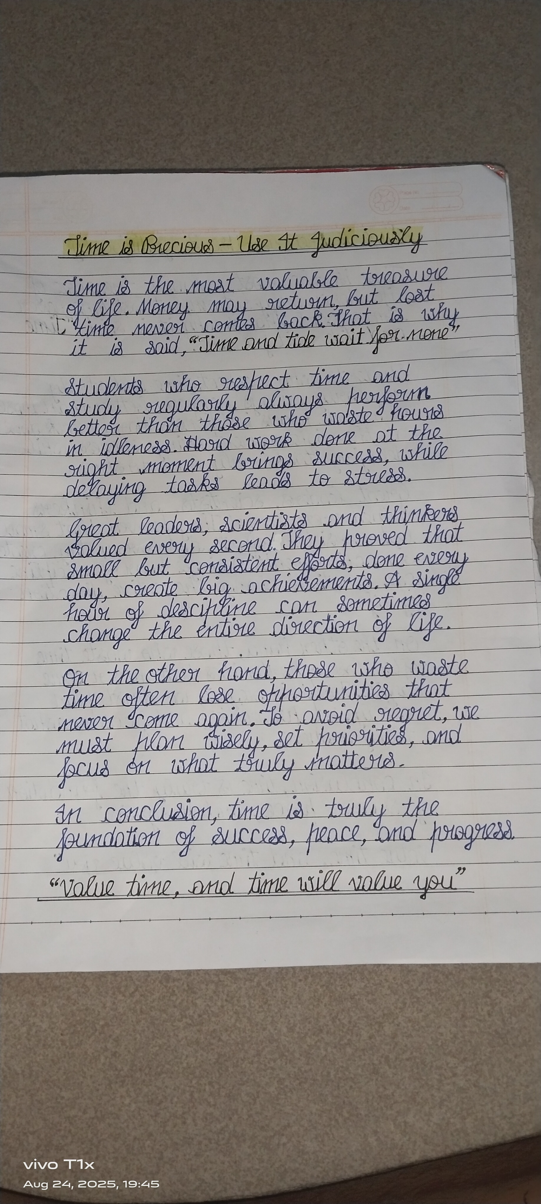
The Time Keeper's Script
This handwriting exhibits neatness and legibility, reflecting a thoughtful and organized personality, though attention to consistent letter sizes could elevate the style.
The handwriting style presents a generally neat and upright appearance, with a moderate slant. Letter formations are rounded, as seen in the 'o's and 'a's, contributing to a flowing rhythm. The writing exhibits consistent spacing between words, although the size of letters can vary slightly. Overall, the handwriting is quite legible, reflecting carefulness and attention to detail. The use of block capitals for the title contrasts with the cursive style of the body of the text.
This handwriting suggests a personality that values clarity and organization. The writer likely possesses a thoughtful and considerate nature, reflected in the deliberate and controlled strokes. The evenness of the writing indicates emotional stability and a methodical approach to tasks. There is a sense of diligence and a commitment to presenting information in an accessible manner.
To further refine your handwriting, focus on maintaining consistent letter sizes, particularly with ascending and descending strokes. Practicing letter drills can help improve uniformity. Experiment with varying the pressure applied to the pen to add more depth and character to your writing. Ensure that the 't's are fully crossed and 'i's dotted directly above the letter.
Legibility
Expressiveness
Consistency
Overall
Leaderboard for Sunday, 26 October 2025
| 1 | The Pristine Penman |
76
|
| 2 | The Determined Diarist |
75
|
| 3 | The Constitutionalist |
74
|
| 4 | The Flowing Quill |
74
|
| 5 | Geometric Author |
73
|
| 6 | The Diligent Dreamer |
73
|
| 7 | The Curator's Script |
72
|
| 8 | The Pragmatist's Script |
72
|
| 9 | The Eloquent Calligrapher |
71
|
| 10 | The Dreamer's Quill |
70
|
| 11 | The Organized Storyteller |
69
|
| 12 | The Hopeful Heart's Script |
68
|
| 13 | The Flowing Quill |
68
|
| 14 | The Constitutionalist |
68
|
| 15 | The Flowing Hand |
68
|
| 16 | The Looping Luminary |
68
|
| 17 | The Unassuming Hand |
66
|
| 18 | The Optimistic Artist |
65
|
| 19 | The Studious Student |
65
|
| 20 | The Contemplative Soul |
64
|
| 21 | The Minimalist's Mark |
64
|
| 22 | The Efficient Note-Taker |
64
|
| 23 | The Gentle Flow |
63
|
| 24 | The Flowing Font |
63
|
| 25 | Diligent Student |
63
|
| 26 | The Looping Legend |
62
|
| 27 | The Loop Whisperer |
61
|
| 28 | The Congratulatory Cursive |
60
|
| 29 | Zen Strokes |
60
|
| 30 | The Contemplative Calligrapher |
60
|