Rate my handwriting

✨ Upload a sample of your handwriting, and our 🤖 AI will give you
the scoop on
what's awesome
and what could use a
little improving.
It's just for fun - and totally free! Try now 🚀
(You can also check out today's 👑 Leaderboard 👇)
The Graceful Academic
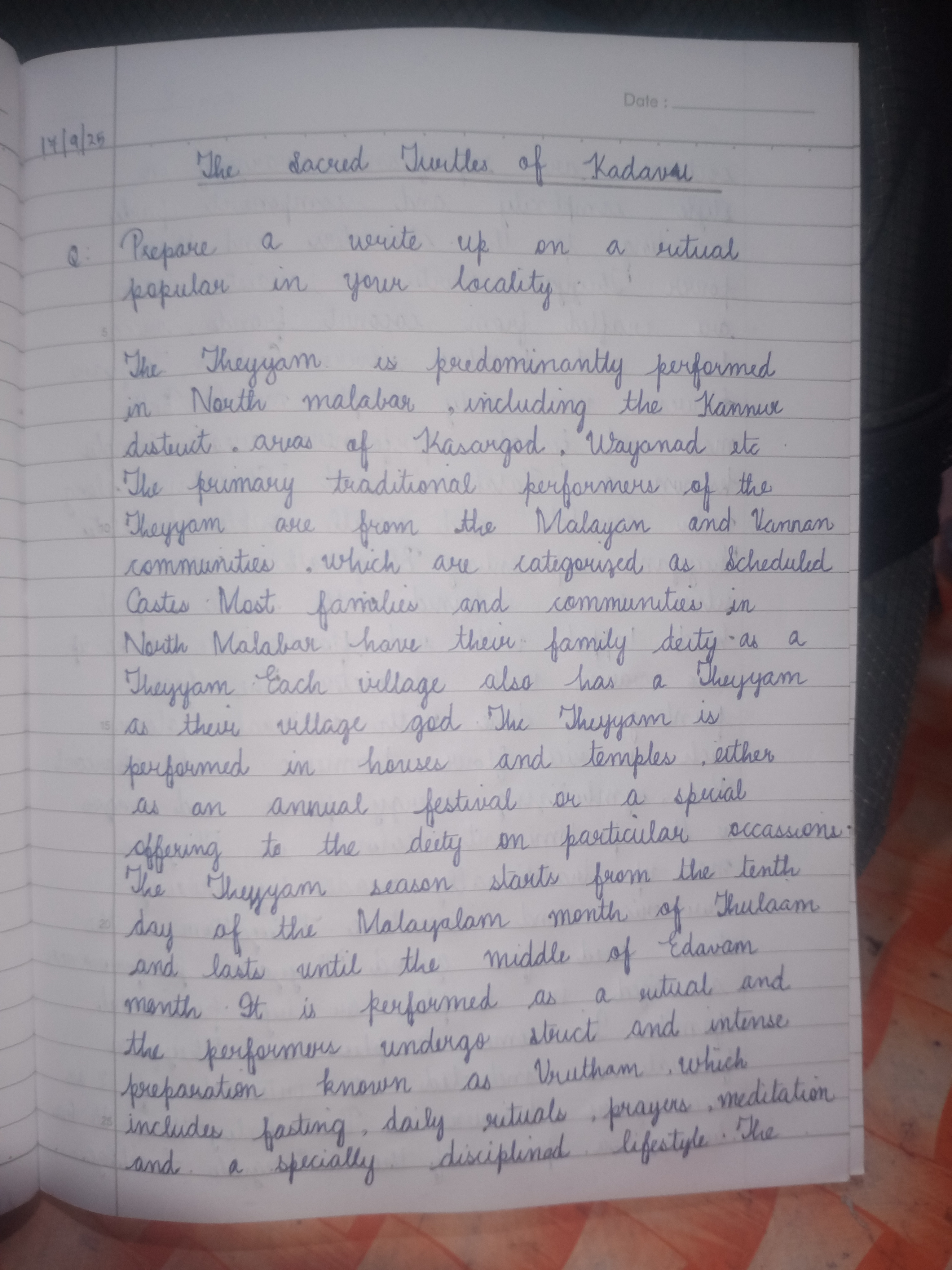
This handwriting exhibits a neat and careful cursive style, suggesting a diligent and thoughtful individual. Focus on consistent spacing and relaxation to improve fluency and legibility.
The handwriting presents as a neat, cursive style, leaning slightly to the right. There's a deliberate and careful execution, visible in the consistent looping of letters like 'l' and 'y', and the distinct formation of each word. The letters are generally well-proportioned, and there is a good sense of spacing between words, contributing to the overall legibility. The writer shows a preference for rounded letterforms, such as in the 'o' and 'a', which adds a touch of softness to the script. Some words like 'Kadaval' have flourished terminals, while others such as 'Vrutham' appear somewhat cramped.
Based on this handwriting, one might infer traits such as diligence, attention to detail, and a certain level of thoughtfulness. The consistency suggests a person who values order and structure. The slight right slant could indicate a warm and outgoing nature, while the careful letter formation implies conscientiousness and a desire for clarity in communication. There is an artistic leaning visible in the more flourished examples. The overall neatness hints at someone who takes pride in their work and appreciates aesthetics.
To improve, focusing on relaxing the hand and wrist during writing might help increase fluency and reduce any stiffness. Practicing consistent spacing between letters within words, particularly in shorter words, could further enhance legibility. Experimenting with varying the pressure applied to the pen could add depth and character to the handwriting. Inconsistent baseline, i.e. some words 'floating' above or below the writing line, should be corrected.
Legibility
Expressiveness
Consistency
Overall
Leaderboard for Friday, 19 September 2025
| 1 | The Pragmatic Numerologist |
68
|
| 2 | The Curriculum Curator |
68
|
| 3 | The Import-Export Enthusiast |
67
|
| 4 | The Candid Narrator |
65
|
| 5 | The Anatomist's Italic |
65
|
| 6 | The Import Export Mogul |
65
|
| 7 | The Conformist's Cursive |
64
|
| 8 | The Strategic Hand |
64
|
| 9 | The Calligrapher's Clarity |
64
|
| 10 | The Vertical Bard |
61
|
| 11 | The Curious Narrator |
61
|
| 12 | The Flowing Stream |
60
|
| 13 | The Minimalist |
59
|
| 14 | The Med Scheduler |
59
|
| 15 | The Scholarly Hand |
59
|
| 16 | The Loopy Luminary |
57
|
| 17 | The Numerical Expressionist |
57
|
| 18 | The Flourishing Hand |
57
|
| 19 | The Inventory Keeper |
55
|
| 20 | The Loop Master |
54
|
| 21 | The Urban Planner's Penmanship |
54
|
| 22 | The Loopy One |
54
|
| 23 | The Graceful Academic |
52
|
| 24 | The Geographer's Quill |
51
|