Rate my handwriting

✨ Upload a sample of your handwriting, and our 🤖 AI will give you
the scoop on
what's awesome
and what could use a
little improving.
It's just for fun - and totally free! Try now 🚀
(You can also check out today's 👑 Leaderboard 👇)
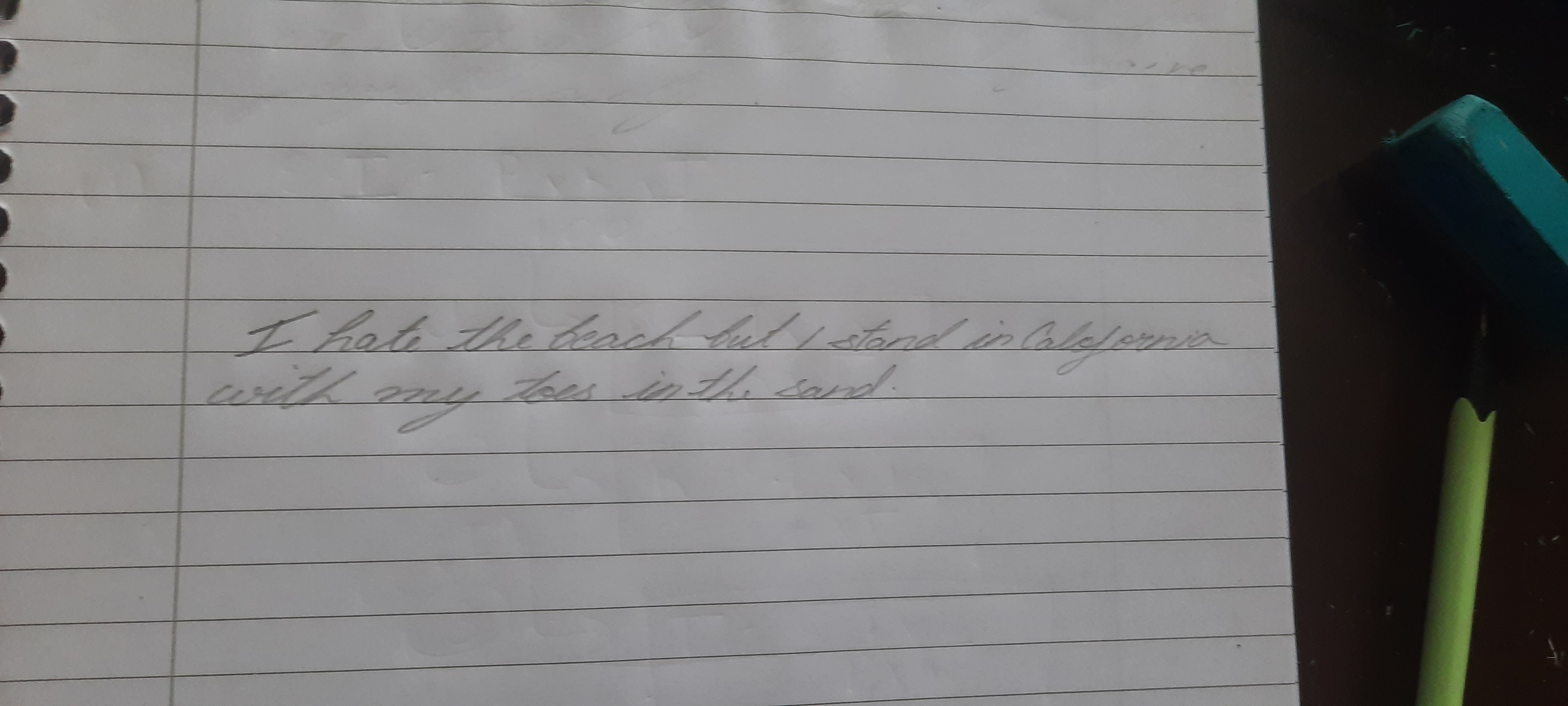
The Beachcomber's Lament
This handwriting suggests a personality that values harmony and diplomacy, while being thoughtful and reserved. Sharpening the letter formations and varying pen pressure could enhance its expressiveness and clarity.
The handwriting style presented is flowing and cursive, with a gentle slant. The connections between letters are smooth, suggesting a degree of fluidity in thought and expression. The overall impression is one of elegance, but also of perhaps a slightly hesitant or restrained energy. Some letter formations, like the 'I' in 'I hate' and the 't's are a little soft and rounded, rather than sharp and defined. The phrase 'I stand in California' shows the writer to be neat and relatively consistent.
Based on this handwriting, one might infer a personality that values harmony and diplomacy. The flowing connections suggest someone who is able to see the bigger picture and connect different ideas. The slight restraint in the letter formations might indicate a person who is thoughtful and reserved, perhaps preferring to observe and analyze before acting. There is an indication of creativity and imagination, but perhaps tempered by a desire for order and structure.
To improve, focus on adding more distinctiveness to letter formations. Experiment with varying the pressure applied to the pen to create a more dynamic and expressive stroke. Consider practicing drills to sharpen the angles and curves of individual letters. Paying attention to the spacing between words can also improve the overall legibility and aesthetic appeal of the handwriting.
Legibility
Expressiveness
Consistency
Overall
Leaderboard for Sunday, 26 October 2025
| 1 | The Constitutionalist |
74
|
| 2 | The Eloquent Educator |
71
|
| 3 | The Student's Script |
70
|
| 4 | The Dreamer's Quill |
70
|
| 5 | The Hopeful Heart's Script |
68
|
| 6 | The Constitutionalist |
68
|
| 7 | The Diligent Penman |
67
|
| 8 | The Agrarian Academic |
67
|
| 9 | The Calculating Hand |
65
|
| 10 | The Diligent Note-Taker |
64
|
| 11 | The Mathematical Muse |
64
|
| 12 | The Contemplative Soul |
64
|
| 13 | The Gentle Flow |
63
|
| 14 | The Flowing Font |
63
|
| 15 | The Looping Legend |
62
|
| 16 | The Contemplative Calligrapher |
60
|
| 17 | The Democratic Dreamer |
59
|
| 18 | The Signature Stylist |
59
|
| 19 | The Devout Note-Taker |
58
|
| 20 | The Orderly Typewriter |
56
|
| 21 | The Forward Leaning Letterer |
54
|
| 22 | The Architect of Letters |
53
|
| 23 | The Flowing River |
53
|
| 24 | The Steadfast Student |
53
|
| 25 | The Diligent Student |
53
|
| 26 | The Approximator's Script |
52
|
| 27 | The Pragmatic Hand |
52
|
| 28 | The Optimistic Loopist |
51
|
| 29 | The Visionary's Script |
51
|
| 30 | The Provocateur's Quill |
51
|