Rate my handwriting

✨ Upload a sample of your handwriting, and our 🤖 AI will give you
the scoop on
what's awesome
and what could use a
little improving.
It's just for fun - and totally free! Try now 🚀
(You can also check out today's 👑 Leaderboard 👇)
The Diplomat's Quill
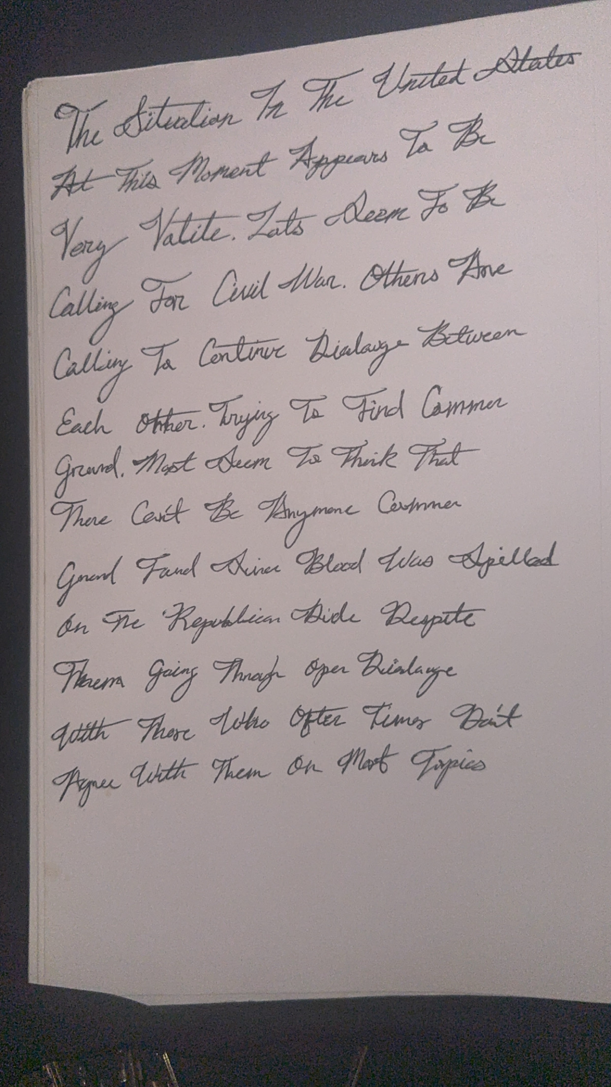
The handwriting style blends tradition with a creative flair, suggesting a personality that values order but isn't afraid to express individuality. Some refinements to spacing and consistency could further enhance legibility and overall aesthetic appeal.
This handwriting presents a blend of formality and a certain creative flourish. The script leans towards a cursive style, with looped ascenders and descenders, particularly noticeable in letters like 'T' and 'y'. There's a noticeable slant to the right, indicating a forward-moving energy. The pressure applied seems relatively consistent, creating a uniform appearance, although some letters appear more deliberately formed than others. The overall neatness is respectable, though occasional inconsistencies, such as varying spacing between words, are present. The legibility is generally good, but some words might require a second glance due to the cursive style.
Based on the handwriting, one might infer a personality that values tradition but also possesses a touch of artistic flair. The rightward slant suggests enthusiasm and a proactive nature, while the consistent pressure could point to a balanced emotional state. The attention to detail in forming certain letters indicates a methodical approach, yet the slight inconsistencies reveal a willingness to embrace spontaneity. Overall, the writer seems to be someone who appreciates order but isn't afraid to let their individuality shine through.
To enhance your handwriting, consider focusing on maintaining consistent spacing between words and ensuring uniform letter sizes. Practicing letter formations with an emphasis on consistency will improve overall legibility. Additionally, experimenting with varying the pressure applied can add depth and expressiveness to your script. For example, thicker downstrokes and lighter upstrokes. Overall, these refinements will enhance both the aesthetic appeal and the clarity of your writing.
Legibility
Expressiveness
Consistency
Overall
Leaderboard for Saturday, 13 September 2025
| 1 | The Energetic Expansive |
75
|
| 2 | The Golden Touch |
68
|
| 3 | The Agile Author |
68
|
| 4 | The Comfortable Companion |
68
|
| 5 | The Diplomat's Quill |
68
|
| 6 | The Precise Professional |
67
|
| 7 | The Precise Penman |
67
|
| 8 | The Pragmatic Pen |
67
|
| 9 | The Academic Artiste |
66
|
| 10 | The Textbook Typist |
66
|
| 11 | The Eloquent Flow |
66
|
| 12 | The Maverick's Mark |
65
|
| 13 | The Considerate Contemplator |
65
|
| 14 | The Organized Achiever |
64
|
| 15 | The Neatly Scripted |
64
|
| 16 | The Practical Dreamer |
62
|
| 17 | The Contented Cursive |
61
|
| 18 | The Tranquil Hand |
61
|
| 19 | The Organized Registrar |
61
|
| 20 | The Diligent Student |
61
|
| 21 | The Gentle Welcomer |
59
|
| 22 | The Organized Connector |
58
|
| 23 | The Intentional Inker |
58
|
| 24 | The Student's Cursive |
58
|
| 25 | The Earnest Pen |
56
|
| 26 | The Pragmatist's Hand |
56
|
| 27 | The Detached Minimalist |
53
|
| 28 | Violet Musings |
53
|
| 29 | The Daydreamer's Journal |
52
|
| 30 | The Earnest Student |
52
|