Rate my handwriting

✨ Upload a sample of your handwriting, and our 🤖 AI will give you
the scoop on
what's awesome
and what could use a
little improving.
It's just for fun - and totally free! Try now 🚀
(You can also check out today's 👑 Leaderboard 👇)
The Practical Penman
This neat and legible handwriting suggests a practical and efficient personality with a focus on clear communication.
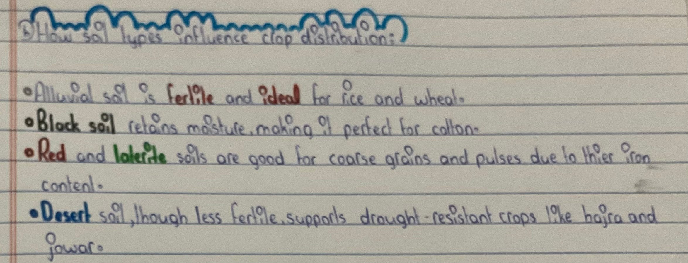
This handwriting sample showcases a predominantly cursive style, with occasional lapses into print, particularly for titles and emphasized words like "ideal". The script is generally neat and legible, flowing consistently across the page with a slight rightward slant. Letterforms are fairly uniform in size and proportion, although there's some variability in spacing between words. The rounded loops of letters like 'f', 'l', and 'g' extend gracefully, indicating fluency and rhythm. The consistent baseline and relatively uniform ascenders and descenders contribute to the overall sense of orderliness.
The Practical Penman's script suggests a personality that values clarity and efficiency. The neatness and legibility indicate a desire to communicate effectively. The rightward slant hints at a proactive nature, while the balanced proportions point towards a practical approach. The occasional lapses into print might signify adaptability, as if choosing the best tool for the job.
While generally legible and efficient, this handwriting could benefit from greater consistency. Maintaining a fully cursive or fully print style, instead of switching between the two, could enhance the overall visual appeal and further improve readability. Experimenting with varying letter sizes and spacing, particularly between words, could add dynamism and visual interest. Remember, writing should be both legible and a pleasure to look at.
Legibility
Expressiveness
Consistency
Overall
Leaderboard for Monday, 27 October 2025
| 1 | The Constitutionalist |
74
|
| 2 | The Eloquent Educator |
71
|
| 3 | The Student's Script |
70
|
| 4 | The Dreamer's Quill |
70
|
| 5 | The Hopeful Heart's Script |
68
|
| 6 | The Constitutionalist |
68
|
| 7 | The Diligent Penman |
67
|
| 8 | The Agrarian Academic |
67
|
| 9 | The Calculating Hand |
65
|
| 10 | The Diligent Note-Taker |
64
|
| 11 | The Mathematical Muse |
64
|
| 12 | The Contemplative Soul |
64
|
| 13 | The Gentle Flow |
63
|
| 14 | The Flowing Font |
63
|
| 15 | The Looping Legend |
62
|
| 16 | The Contemplative Calligrapher |
60
|
| 17 | The Democratic Dreamer |
59
|
| 18 | The Signature Stylist |
59
|
| 19 | The Devout Note-Taker |
58
|
| 20 | The Orderly Typewriter |
56
|
| 21 | The Forward Leaning Letterer |
54
|
| 22 | The Architect of Letters |
53
|
| 23 | The Steadfast Student |
53
|
| 24 | The Flowing River |
53
|
| 25 | The Diligent Student |
53
|
| 26 | The Approximator's Script |
52
|
| 27 | The Pragmatic Hand |
52
|
| 28 | Celestial Notes |
52
|
| 29 | The Visionary's Script |
51
|
| 30 | The Provocateur's Quill |
51
|