Rate my handwriting

✨ Upload a sample of your handwriting, and our 🤖 AI will give you
the scoop on
what's awesome
and what could use a
little improving.
It's just for fun - and totally free! Try now 🚀
(You can also check out today's 👑 Leaderboard 👇)
The Cooperative Calligrapher
This sample showcases a legible, connected script with a rightward slant, implying a cooperative, organized, and communicative personality. Improved consistency in letter formation and baseline alignment would enhance its neatness and professionalism.
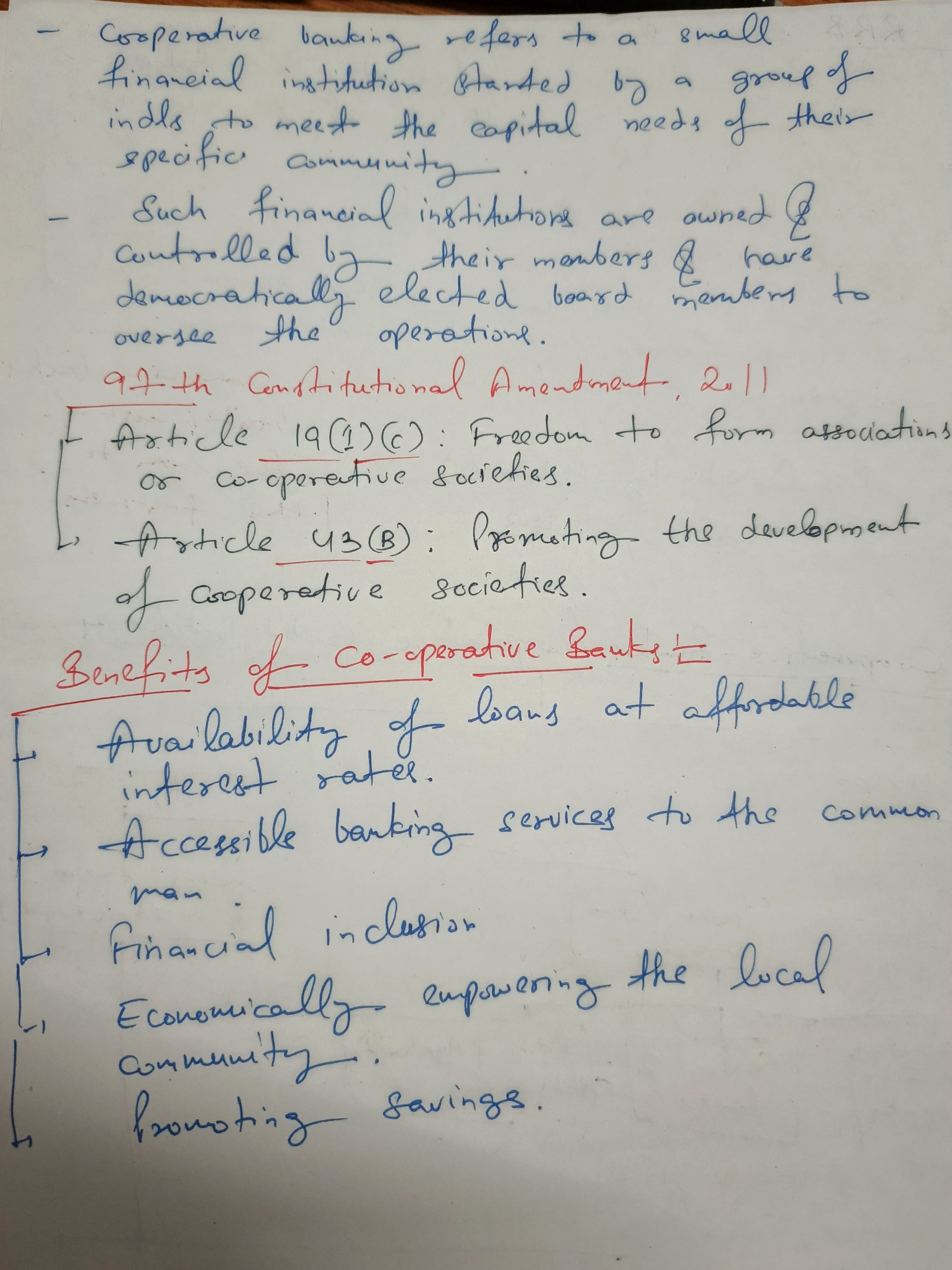
This handwriting sample presents a connected, slightly right-slanted script with average size and spacing. Words like "democratically" and "Constitutional" demonstrate a good command of spelling and vocabulary, although some inconsistency in letter formation and baseline alignment can be observed. There is a connectedness and rhythmic flow to the script, evident in phrases such as "promoting the development of cooperative societies". The mix of red and blue ink, as well as clear underlines and numbered bullet points suggest an organized approach to note-taking, as demonstrated in the clear structure of the content. The lettering is fairly legible and exhibits consistency.
The handwriting suggests a cooperative and detail-oriented individual. The clear and structured layout indicates an organized mind, while the connected script hints at good communication skills and an appreciation for process and methodology. The rightward slant and connectedness indicate an outgoing personality that likes to be involved with others, and to help improve their community. The careful note-taking style implies a thoughtful and studious nature. The slight variations in letter formation and baseline may suggest a degree of adaptability and willingness to embrace new ideas, while also revealing an underlying practicality and efficiency.
While generally legible, the handwriting could benefit from improved consistency in letter formation, particularly in letters like 'a', 'o', and 'e', which sometimes vary in shape and size. Paying attention to maintaining a consistent baseline throughout the writing would further enhance readability. Focusing on the height and spacing of letters, especially those with ascenders (like 'h', 'l', 'd') and descenders (like 'g', 'y', 'p'), could improve overall neatness. Finally, practicing joining letters smoothly and consistently will give the writing a more polished and professional appearance.
Legibility
Expressiveness
Consistency
Overall
Leaderboard for Thursday, 30 October 2025
| 31 | The Neatly Ordered Lexicographer |
56
|
| 32 | The Cartographer's Hand |
56
|
| 33 | The Earnest Author |
56
|
| 34 | The Diligent Biologist |
56
|
| 35 | The Ponderer's Prose |
54
|
| 36 | The Spirited Soul |
54
|
| 37 | The Scientific Hand |
54
|
| 38 | The Diligent Planner |
54
|
| 39 | The Data Architect's Italic Hand |
53
|
| 40 | The Pragmatic Planner |
53
|
| 41 | The Diligent Student |
53
|
| 42 | The Whirlwind Writer |
53
|
| 43 | The Continental Explorer |
53
|
| 44 | The Pensive Pupil |
53
|
| 45 | The Diligent Note-Taker |
53
|
| 46 | The Biologist's Itch |
52
|
| 47 | The Fluid Artist |
52
|
| 48 | Le Calligraphe Méthodique |
52
|
| 49 | The Studious Hand |
52
|
| 50 | The Determined Dreamer |
51
|
| 51 | The Ledger's Lament |
51
|
| 52 | The Precise Correspondent |
51
|
| 53 | The Boxed Dreamer |
49
|
| 54 | The Civic Mind |
49
|
| 55 | The Energetic Flow |
49
|
| 56 | The Pragmatic Planner |
49
|