Rate my handwriting

✨ Upload a sample of your handwriting, and our 🤖 AI will give you
the scoop on
what's awesome
and what could use a
little improving.
It's just for fun - and totally free! Try now 🚀
(You can also check out today's 👑 Leaderboard 👇)
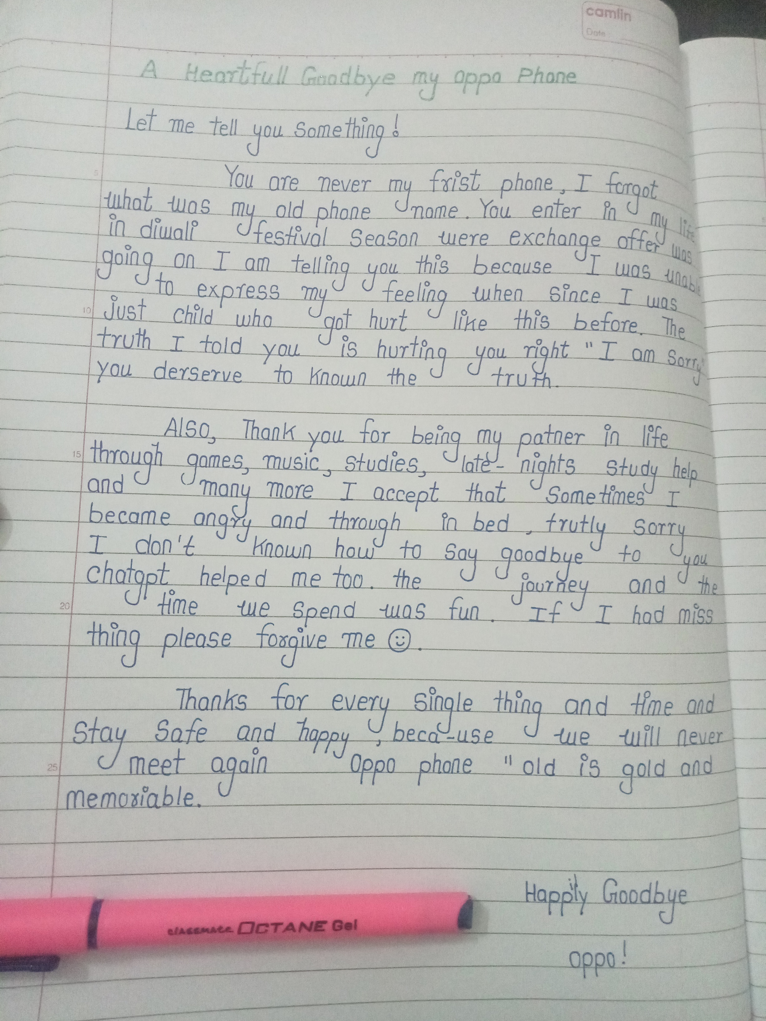
A Fond Farewell Font
This handwriting is mostly legible and indicates a warm, positive personality, although some inconsistencies and spelling errors are present.
The handwriting sample exhibits a clear, upright style with rounded letterforms, as seen in words like "phone," "going," and "happy". There's a gentle, rhythmic flow to the writing, though the letter sizes show some variation, and the spacing between words is fairly consistent. The handwriting is neat, mostly legible, and the lines of text follow a gentle curve downwards across the page. There are a few spelling mistakes, for example 'frist', 'patner', 'trutly', 'memoriable' which indicates a degree of carelessness. The use of looped 'y' and 'j' characters gives the writing a personal flair.
Based on the handwriting, it's possible the writer is someone who is warm, empathetic, and generally optimistic. The rounded letters suggest a desire for harmony and connection, and the upward slant, despite its gentle nature, implies a positive outlook. There may be a touch of sentimentality and a strong connection to personal experiences, given the reflective nature of the written content.
To enhance the writing, focusing on maintaining a more consistent letter size could improve its visual appeal. Practicing letter spacing could also enhance the overall legibility. Paying closer attention to spelling would improve the presentation. Though the current style is charming, a bit more attention to detail could make it even more refined.
Legibility
Expressiveness
Consistency
Overall
Leaderboard for Wednesday, 29 October 2025
| 1 | The Calligrapher |
83
|
| 2 | The Elegant Calligrapher |
82
|
| 3 | Flourishing Calligrapher |
77
|
| 4 | The Calligrapher |
77
|
| 5 | The Flowing Stream |
74
|
| 6 | The Fluid Calligrapher |
71
|
| 7 | The Energetic List-Maker |
71
|
| 8 | The Elegant Scholar |
71
|
| 9 | The Student's Lament |
70
|
| 10 | The Inspirational Calligrapher |
70
|
| 11 | The Jolly Optimist |
68
|
| 12 | The Pragmatic Pupil |
68
|
| 13 | The Flourishing Individual |
68
|
| 14 | The Mario Manifesto |
68
|
| 15 | The Diligent Calligrapher |
67
|
| 16 | The Perfectionist's Primer |
67
|
| 17 | The Reflective Student |
67
|
| 18 | The Considerate Soul |
67
|
| 19 | The Divine Calligrapher |
66
|
| 20 | The Elegant Calligrapher |
66
|
| 21 | The Advocate's Quill |
65
|
| 22 | The Concerned Guardian |
65
|
| 23 | The Grid Writer |
65
|
| 24 | The Analytical Alchemist |
65
|
| 25 | The Pharmacist's Note |
65
|
| 26 | The Flowing Quill |
64
|
| 27 | The Flourishing Enigma |
63
|
| 28 | The Educated Executive |
63
|
| 29 | The Typist's Tale |
63
|
| 30 | The Diligent Diarist |
63
|