Rate my handwriting

✨ Upload a sample of your handwriting, and our 🤖 AI will give you
the scoop on
what's awesome
and what could use a
little improving.
It's just for fun - and totally free! Try now 🚀
(You can also check out today's 👑 Leaderboard 👇)
The Diligent Student
This handwriting demonstrates a conscientious and organized style, prioritizing neatness and legibility, though improvements in consistency and flow could enhance its overall appeal. The writer exhibits detail-oriented tendencies with an inclination towards structure.
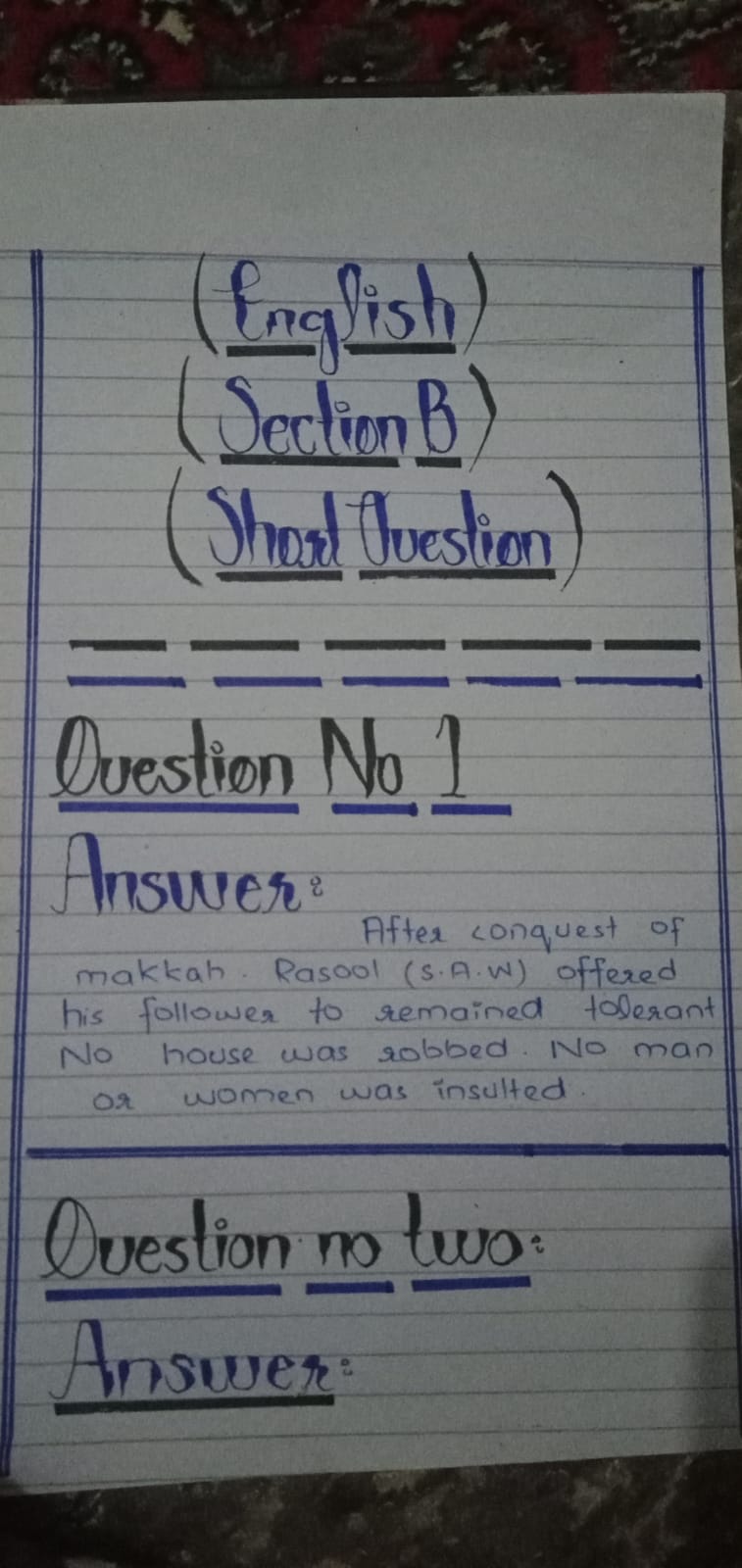
The handwriting displays a clear distinction between headings, written in a decorative and larger font, and body text, which is smaller and more compact. The capitalized sections, like "Question No 1" and "Answer", are underlined with a bold stroke. The body text exhibits a slight forward slant and varying letter heights, giving it a somewhat inconsistent flow. The connections between letters are generally present but not always fluid, creating a mix of joined and unjoined script. The pressure applied is fairly consistent throughout the sample, though some strokes appear heavier than others. Overall, the handwriting prioritizes neatness and legibility, particularly in the capitalized sections.
This handwriting suggests a conscientious and organized individual. The clear distinction between different sections and the careful underlining points to a structured approach. The varying letter heights and slight inconsistencies in the body text could reflect a blend of spontaneity and control. The writer likely values clarity and strives to present information in an orderly manner. A detail-oriented personality is implied, with a possible inclination towards planning and preparation.
To improve the handwriting, focus on achieving a more consistent letter height and slant in the body text. Practicing letter connections to create a more fluid script would enhance readability. Pay attention to the pressure applied, striving for uniformity to achieve a smoother, more harmonious appearance. While neatness is commendable, a touch of relaxed flow could make the handwriting appear more natural and less constrained.
Legibility
Expressiveness
Consistency
Overall
Leaderboard for Tuesday, 28 October 2025
| 31 | The Flowing Pen |
60
|
| 32 | The Casual Communicator |
59
|
| 33 | The Idealist's Cursive |
58
|
| 34 | The Diligent Storyteller |
58
|
| 35 | The Furious Finisher |
58
|
| 36 | The Elegant Optimist |
56
|
| 37 | The Deliberate Doodler |
56
|
| 38 | The Peaceful Warrior |
56
|
| 39 | The Fantastical Dreamer |
56
|
| 40 | The Energetic Note-Taker |
55
|
| 41 | The Budding Scholar |
54
|
| 42 | The Optimistic Brushstroke |
54
|
| 43 | The Principled Pen |
54
|
| 44 | The Pragmatic Pen |
53
|
| 45 | The Serene Hand |
53
|
| 46 | The Pragmatic Note-Taker |
53
|
| 47 | The Official's Elegant Cursive |
53
|
| 48 | The Introspective Historian |
52
|
| 49 | Pierre's Ponderings |
51
|
| 50 | The Legal Eagle's Quill |
51
|
| 51 | The Pragmatic Pen |
51
|
| 52 | The Pragmatic Pen |
50
|
| 53 | The Pensive Penman |
49
|