Rate my handwriting

✨ Upload a sample of your handwriting, and our 🤖 AI will give you
the scoop on
what's awesome
and what could use a
little improving.
It's just for fun - and totally free! Try now 🚀
(You can also check out today's 👑 Leaderboard 👇)

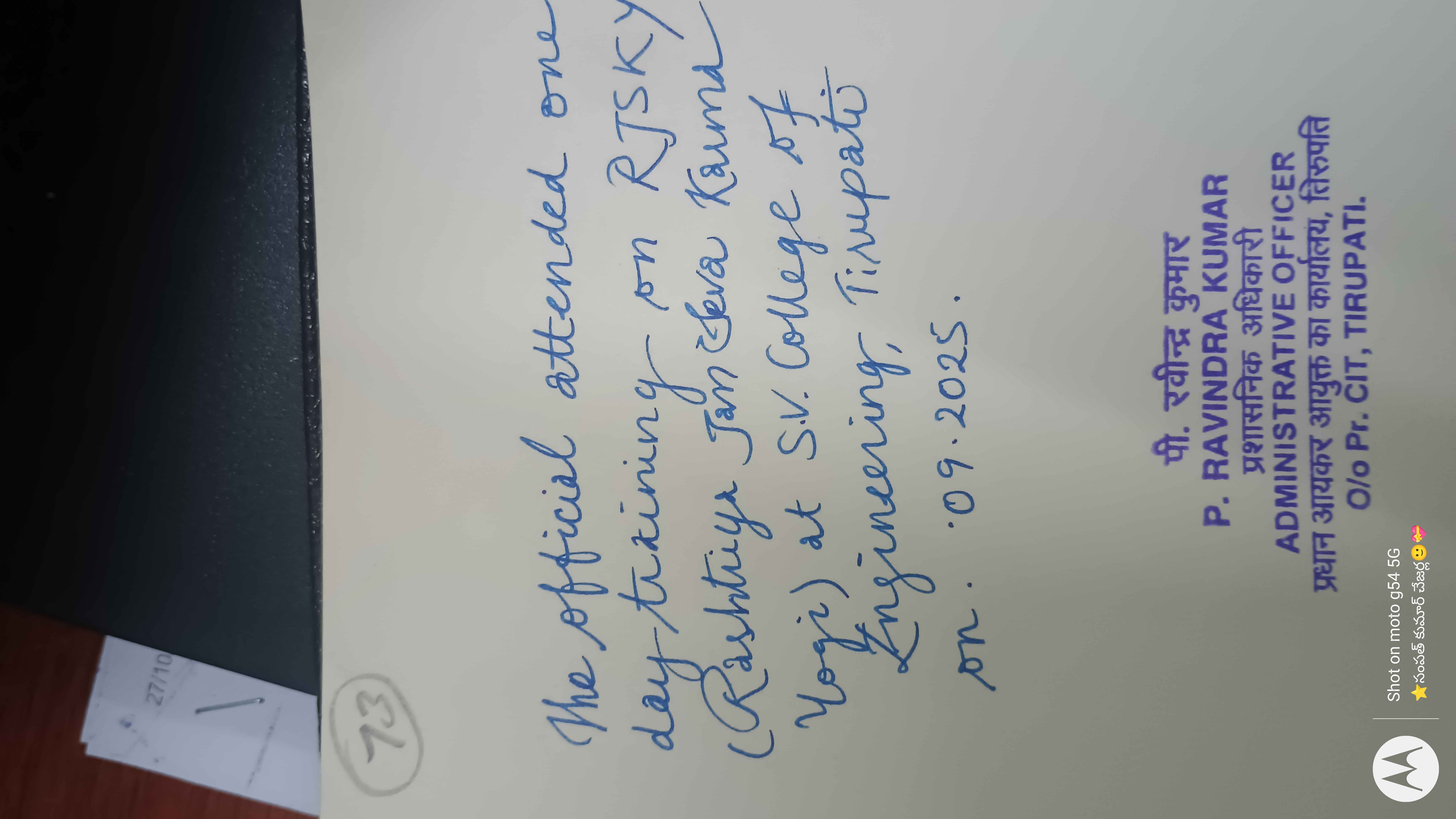
The Official's Elegant Cursive
This handwriting exhibits a graceful cursive style, suggesting a traditional yet adaptable personality with room for improved consistency. Focusing on letter uniformity and baseline consistency would enhance the handwriting's overall legibility.
The handwriting style exhibits a graceful, flowing cursive with noticeable loops and curves, particularly in letters like 'o', 'g', and 'y'. The slant is consistent, leaning slightly to the right, suggesting a forward-moving and engaging nature. There is a moderate level of neatness and legibility, though some words, such as 'Rashtriya', might require a second glance. The spacing between words is generally uniform, but the size of the letters varies, which can occasionally impact the overall clarity.
Based on this sample, the writer appears to be someone who values tradition but is also adaptable. The elegant cursive suggests an appreciation for aesthetics and attention to detail. The forward slant and flowing connections imply a personality that is open to new experiences and approaches, with a desire for engagement. The slight inconsistencies in letter size might reflect a certain level of spontaneity or perhaps a preference for expressing individuality.
To enhance legibility, consider focusing on more consistent letter sizes and shapes. Practicing the formation of letters like 'R' and 'g' with greater uniformity would also contribute to overall clarity. Paying attention to the baseline and maintaining a more consistent height for lowercase letters can further improve the neatness and readability of the handwriting.
Legibility
Expressiveness
Consistency
Overall
Leaderboard for Tuesday, 28 October 2025
| 1 | The Calligrapher |
83
|
| 2 | The Elegant Calligrapher |
82
|
| 3 | Flourishing Calligrapher |
77
|
| 4 | The Cursive Narrator |
74
|
| 5 | The Student's Lament |
70
|
| 6 | The Inspirational Calligrapher |
70
|
| 7 | The Pragmatic Pupil |
68
|
| 8 | The Jolly Optimist |
68
|
| 9 | The Considerate Soul |
67
|
| 10 | The Reflective Student |
67
|
| 11 | The Diligent Calligrapher |
67
|
| 12 | The Perfectionist's Primer |
67
|
| 13 | The Studious Note-Taker |
66
|
| 14 | The Divine Calligrapher |
66
|
| 15 | The Upright Pen |
65
|
| 16 | The Concerned Guardian |
65
|
| 17 | The Advocate's Quill |
65
|
| 18 | The Dream Weaver |
65
|
| 19 | The Pharmacist's Note |
65
|
| 20 | The Historian's Hand |
64
|
| 21 | The Educated Executive |
63
|
| 22 | The Diligent Diarist |
63
|
| 23 | The Gridiron Enthusiast |
63
|
| 24 | The Aquatic Caller |
62
|
| 25 | The Loopy Dreamer |
62
|
| 26 | The Pragmatic Pen |
61
|
| 27 | The Inquisitive Pen |
61
|
| 28 | The Dream Weaver |
61
|
| 29 | The Elegant Elocutionist |
61
|
| 30 | The Forthright Font |
61
|