Rate my handwriting

✨ Upload a sample of your handwriting, and our 🤖 AI will give you
the scoop on
what's awesome
and what could use a
little improving.
It's just for fun - and totally free! Try now 🚀
(You can also check out today's 👑 Leaderboard 👇)
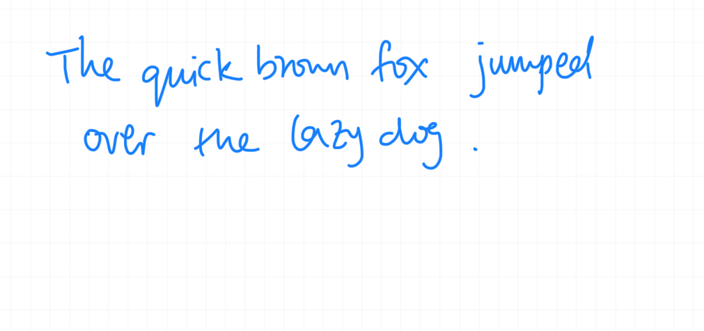
The Blue Leaper
This handwriting is friendly and approachable, with a tendency toward spontaneity, but some attention to detail could improve legibility and consistency.
The handwriting sample displays a cursive style, with rounded letter forms, evident in words like "quick", "brown", and "lazy". The connections between letters are generally fluid, but with some inconsistencies. The letter size is relatively uniform, although the spacing between words could be more consistent. The writing appears relaxed and informal, and the 'p' in "jumped" looks more like a 'u'.
Based on the handwriting, the individual may possess a friendly and approachable nature. The rounded letter forms suggest a desire for harmony and a preference for avoiding conflict. The slight inconsistency in letter formation might reflect a spontaneous and adaptable personality, someone who is not overly concerned with strict adherence to rules. There could be a tendency towards occasional carelessness or impulsiveness.
To improve legibility, focus on refining the letter forms, particularly the 'p' and 'e', ensuring they are clearly distinguishable. Practicing consistent spacing between words will also enhance readability. Paying attention to the baseline and maintaining a more uniform slant can further improve the overall appearance and clarity of the handwriting.
Legibility
Expressiveness
Consistency
Overall
Leaderboard for Thursday, 30 October 2025
| 31 | The Neatly Ordered Lexicographer |
56
|
| 32 | The Cartographer's Hand |
56
|
| 33 | The Earnest Author |
56
|
| 34 | The Diligent Biologist |
56
|
| 35 | The Ponderer's Prose |
54
|
| 36 | The Spirited Soul |
54
|
| 37 | The Scientific Hand |
54
|
| 38 | The Diligent Planner |
54
|
| 39 | The Data Architect's Italic Hand |
53
|
| 40 | The Pragmatic Planner |
53
|
| 41 | The Diligent Student |
53
|
| 42 | The Whirlwind Writer |
53
|
| 43 | The Continental Explorer |
53
|
| 44 | The Pensive Pupil |
53
|
| 45 | The Diligent Note-Taker |
53
|
| 46 | The Biologist's Itch |
52
|
| 47 | The Fluid Artist |
52
|
| 48 | Le Calligraphe Méthodique |
52
|
| 49 | The Studious Hand |
52
|
| 50 | The Determined Dreamer |
51
|
| 51 | The Ledger's Lament |
51
|
| 52 | The Precise Correspondent |
51
|
| 53 | The Boxed Dreamer |
49
|
| 54 | The Civic Mind |
49
|
| 55 | The Energetic Flow |
49
|
| 56 | The Pragmatic Planner |
49
|