Rate my handwriting

✨ Upload a sample of your handwriting, and our 🤖 AI will give you
the scoop on
what's awesome
and what could use a
little improving.
It's just for fun - and totally free! Try now 🚀
(You can also check out today's 👑 Leaderboard 👇)
Philosopher's Quill
This handwriting suggests a thoughtful and creative individual with a harmonious approach to life, though some adjustments to letter consistency and spacing could improve legibility.
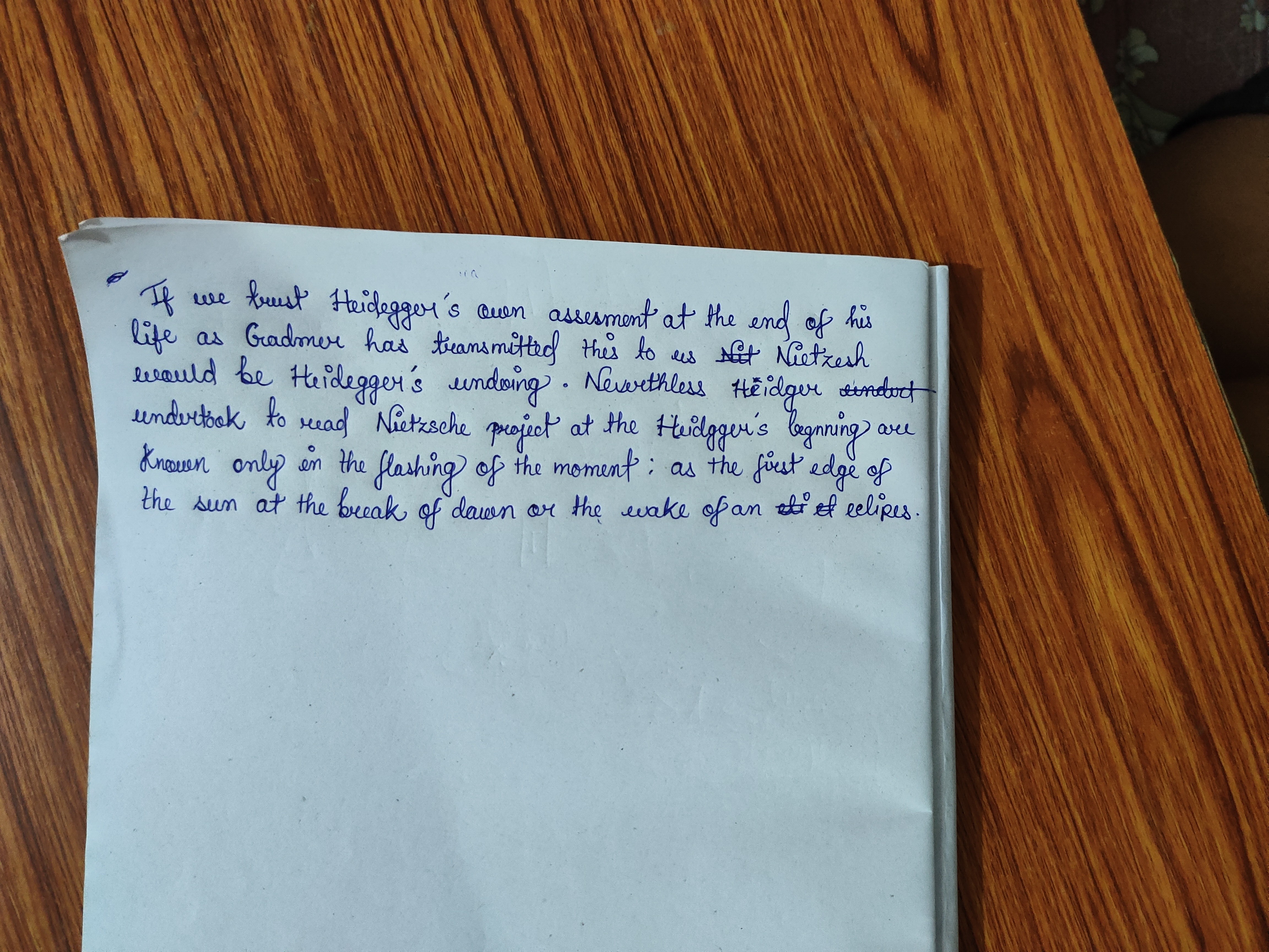
The handwriting displays a fluid, cursive style with slightly elongated ascenders and descenders, seen in letters like 'h' and 'g'. The slant is generally consistent, leaning slightly to the right, and the letter forms are rounded and connected, indicating a flowing rhythm. Spacing between words is generally good, although there's some crowding in places. The pressure appears relatively even, suggesting a consistent energy level while writing. Some words, like 'Nietzsche', show a distinct flair with more elaborate letter formations.
This handwriting suggests a personality that values harmony and connection. The rightward slant often indicates a forward-thinking and engaging nature, someone who is receptive to new ideas and experiences. The rounded letter forms point to a compassionate and empathetic disposition, while the consistent pressure implies a steady and reliable character. The occasional flourish suggests a creative streak and a desire for self-expression. Overall, the writer seems to possess a balanced blend of thoughtfulness, creativity, and social awareness.
To improve legibility, focus on maintaining consistent letter sizes and shapes. Practice writing each letter individually, paying attention to its form and proportions. Increase the spacing between words slightly to avoid crowding, and consciously vary pressure to avoid uniformity. Also, try simplifying the flourishes for greater clarity, as they occasionally distract from the text's overall readability. Finally, consider using lined paper to ensure consistent baseline alignment, as some lines appear to drift slightly.
Legibility
Expressiveness
Consistency
Overall
Leaderboard for Saturday, 13 September 2025
| 1 | The Energetic Expansive |
75
|
| 2 | The Passionate Poet |
71
|
| 3 | The Wandering Hand |
68
|
| 4 | The Comfortable Companion |
68
|
| 5 | The Agile Author |
68
|
| 6 | The Diplomat's Quill |
68
|
| 7 | The Golden Touch |
68
|
| 8 | The Precise Penman |
67
|
| 9 | The Precise Professional |
67
|
| 10 | The Academic Artiste |
66
|
| 11 | The Curious Curator |
66
|
| 12 | The Eloquent Flow |
66
|
| 13 | The Textbook Typist |
66
|
| 14 | The Considerate Contemplator |
65
|
| 15 | The Bon Vivant's Script |
65
|
| 16 | The Neatly Scripted |
64
|
| 17 | The Diligent Student |
61
|
| 18 | The Organized Registrar |
61
|
| 19 | The Contented Cursive |
61
|
| 20 | The Tranquil Hand |
61
|
| 21 | The Gentle Welcomer |
59
|
| 22 | The Intentional Inker |
58
|
| 23 | The Organized Connector |
58
|
| 24 | The Pragmatist's Hand |
56
|
| 25 | The Earnest Pen |
56
|
| 26 | The Detached Minimalist |
53
|
| 27 | Violet Musings |
53
|
| 28 | The Daydreamer's Journal |
52
|
| 29 | The Earnest Pupil |
52
|
| 30 | The Curious Hand |
52
|