Rate my handwriting

✨ Upload a sample of your handwriting, and our 🤖 AI will give you
the scoop on
what's awesome
and what could use a
little improving.
It's just for fun - and totally free! Try now 🚀
(You can also check out today's 👑 Leaderboard 👇)

The Drifting Quill
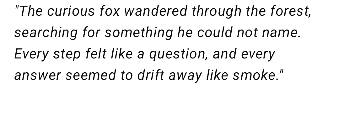
The handwriting is neat, consistent, and controlled, implying a methodical and thoughtful personality. Adding subtle variations in pressure and letter height could enhance its expressiveness.
The handwriting exhibits a neat and evenly spaced style. The letters are well-formed, with consistent sizing and a gentle, rounded appearance. The strokes appear confident, yet there's a lightness to the overall presentation, almost as if the words are 'drifting away like smoke'. The baseline is remarkably straight, which suggests a controlled and organized approach. There's a certain elegance to the way the letters flow together, creating a readable and aesthetically pleasing script. The consistency throughout the sample suggests a practiced hand.
This style of handwriting often reflects a personality that values clarity and precision. The evenness and control indicate someone who is methodical and pays attention to detail. The gentle curves suggest a friendly and approachable nature. The straight baseline speaks to a sense of stability and groundedness. Overall, the writer likely possesses a calm demeanor and a thoughtful approach to life.
To enhance this already pleasant handwriting, focus on varying the pressure applied to the pen to add more depth and character to the strokes. Experimenting with slight variations in letter height could introduce a touch of individuality. Practice slant consistency for a more polished appearance. Deliberately incorporating more expressive loops or flourishes could further elevate the aesthetic appeal, while retaining its fundamental legibility.
Legibility
Expressiveness
Consistency
Overall
Leaderboard for Saturday, 25 October 2025
| 1 | The Elegant Signature |
74
|
| 2 | The Student |
73
|
| 3 | The Pragmatic Planner |
73
|
| 4 | The Flowing Fableteller |
68
|
| 5 | The Agile Acrobat |
67
|
| 6 | The Precise Pen |
67
|
| 7 | The Acrobatic Pen |
67
|
| 8 | The Calligrapher's Apprentice |
67
|
| 9 | The Scholarly Scribe |
65
|
| 10 | The Pragmatic Pen |
63
|
| 11 | The Coordinator's Quill |
61
|
| 12 | The Enthusiastic Calligrapher |
60
|
| 13 | The Enthusiast |
60
|
| 14 | The Precise Mathematician |
59
|
| 15 | The Poet's Quill |
59
|
| 16 | The Typist's Touch |
59
|
| 17 | The Budding Botanist |
58
|
| 18 | The Arithmetician's Quill |
57
|
| 19 | The Stargazer's Quill |
56
|
| 20 | The Meticulous Note-Taker |
53
|
| 21 | The Leaping Feline's Tale |
53
|
| 22 | The Legal Eagle's Quill |
53
|
| 23 | The Calculating Calligrapher |
53
|
| 24 | The Structured List Maker |
53
|
| 25 | The Joyful Leaper |
52
|
| 26 | The Dreamer's Quill |
51
|
| 27 | The Diligent Petitioner |
51
|
| 28 | The Concentric Contemplator |
51
|