Rate my handwriting

✨ Upload a sample of your handwriting, and our 🤖 AI will give you
the scoop on
what's awesome
and what could use a
little improving.
It's just for fun - and totally free! Try now 🚀
(You can also check out today's 👑 Leaderboard 👇)
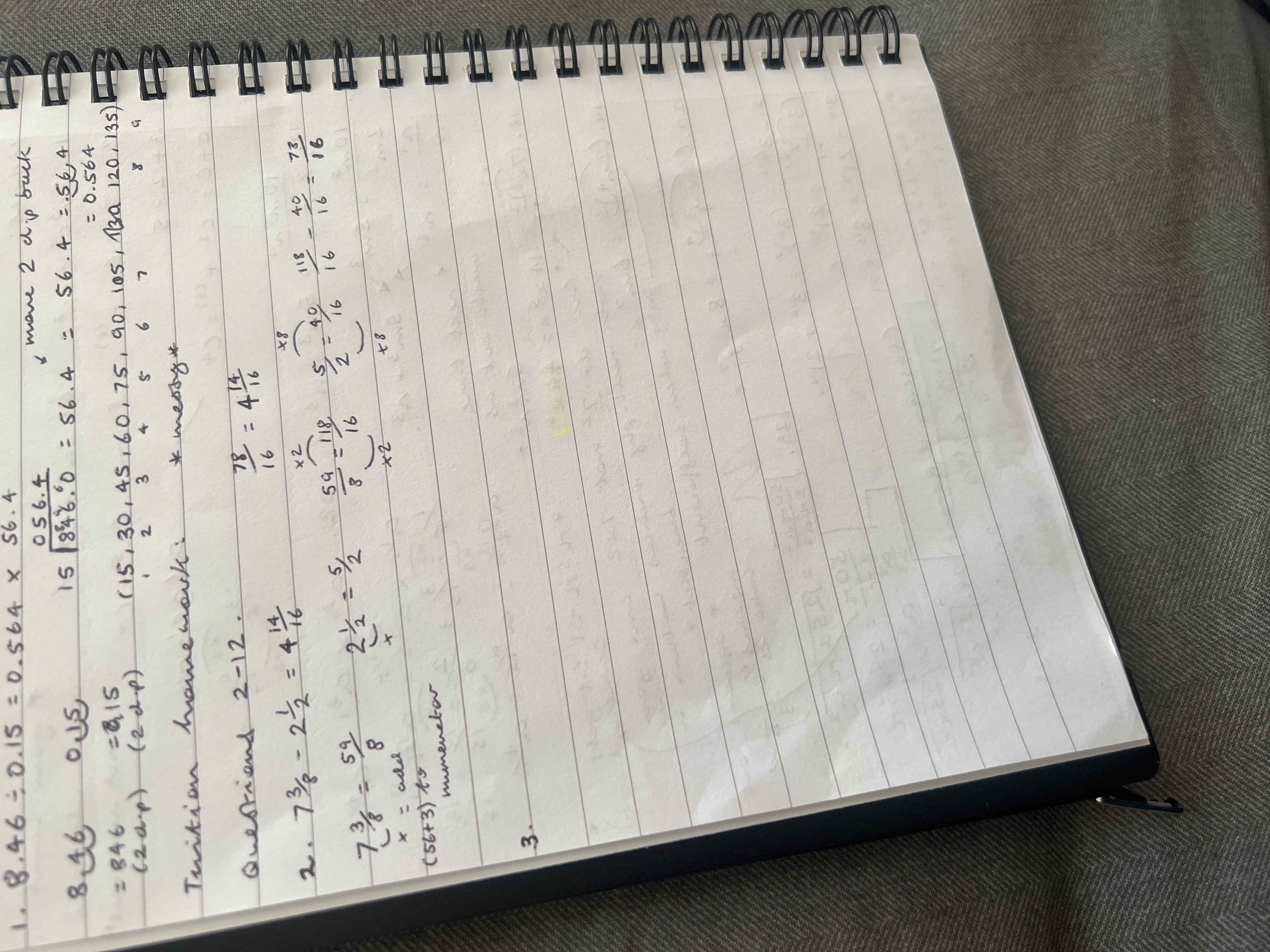
The Arithmetician's Quill
This handwriting is functional and detail-oriented, typical of someone engaged in mathematical tasks, but could benefit from improvements in consistency and spacing for enhanced legibility. It indicates a logical mind focused on accuracy and efficiency.
The handwriting style is functional and precise, primarily focused on mathematical calculations. The script features upright strokes with a slight forward slant, indicative of a practical approach. Numbers and fractions are neatly stacked, though there are instances where the writing becomes compact, such as in the calculation of "7 3/8 - 2 1/2". There is some inconsistency in letter size and spacing, noted as "messy", which may reflect the speed or complexity of the calculations being performed.
Based on this handwriting, it's reasonable to suggest the writer is logical and detail-oriented, with a strong focus on accuracy, which are common traits for someone working with numerical data. The tendency towards compactness and occasional messiness may suggest someone who prioritizes efficiency over perfect presentation, especially when dealing with complex or time-sensitive tasks. A focus on problem-solving is implied.
To improve the handwriting, consider practicing consistent letter sizing and spacing, even when working quickly. Deliberately slowing down can help in maintaining neatness, especially when dealing with fractions and multiple calculations. Focus on clarity by ensuring sufficient space between numerals and operators. Improving the consistency will increase the overall legibility of your handwriting.
Legibility
Expressiveness
Consistency
Overall
Leaderboard for Saturday, 25 October 2025
| 1 | The Elegant Signature |
74
|
| 2 | The Student |
73
|
| 3 | The Pragmatic Planner |
73
|
| 4 | The Flowing Fableteller |
68
|
| 5 | The Precise Pen |
67
|
| 6 | The Agile Acrobat |
67
|
| 7 | The Acrobatic Pen |
67
|
| 8 | The Calligrapher's Apprentice |
67
|
| 9 | The Classicist's Quill |
65
|
| 10 | The Scholarly Scribe |
65
|
| 11 | The Pragmatic Pen |
63
|
| 12 | The Coordinator's Quill |
61
|
| 13 | The Liberty Lover's Cursive |
61
|
| 14 | The Enthusiastic Calligrapher |
60
|
| 15 | The Enthusiast |
60
|
| 16 | The Typist's Touch |
59
|
| 17 | The Precise Mathematician |
59
|
| 18 | The Poet's Quill |
59
|
| 19 | The Arithmetician's Quill |
57
|
| 20 | The Stargazer's Quill |
56
|
| 21 | The Atmospheric Artist |
56
|
| 22 | The Leaping Feline's Tale |
53
|
| 23 | The Meticulous Note-Taker |
53
|
| 24 | The Legal Eagle's Quill |
53
|
| 25 | The Calculating Calligrapher |
53
|
| 26 | The Structured List Maker |
53
|
| 27 | The Joyful Leaper |
52
|
| 28 | The Dreamer's Quill |
51
|
| 29 | The Concentric Contemplator |
51
|
| 30 | The Diligent Petitioner |
51
|