Rate my handwriting

✨ Upload a sample of your handwriting, and our 🤖 AI will give you
the scoop on
what's awesome
and what could use a
little improving.
It's just for fun - and totally free! Try now 🚀
(You can also check out today's 👑 Leaderboard 👇)
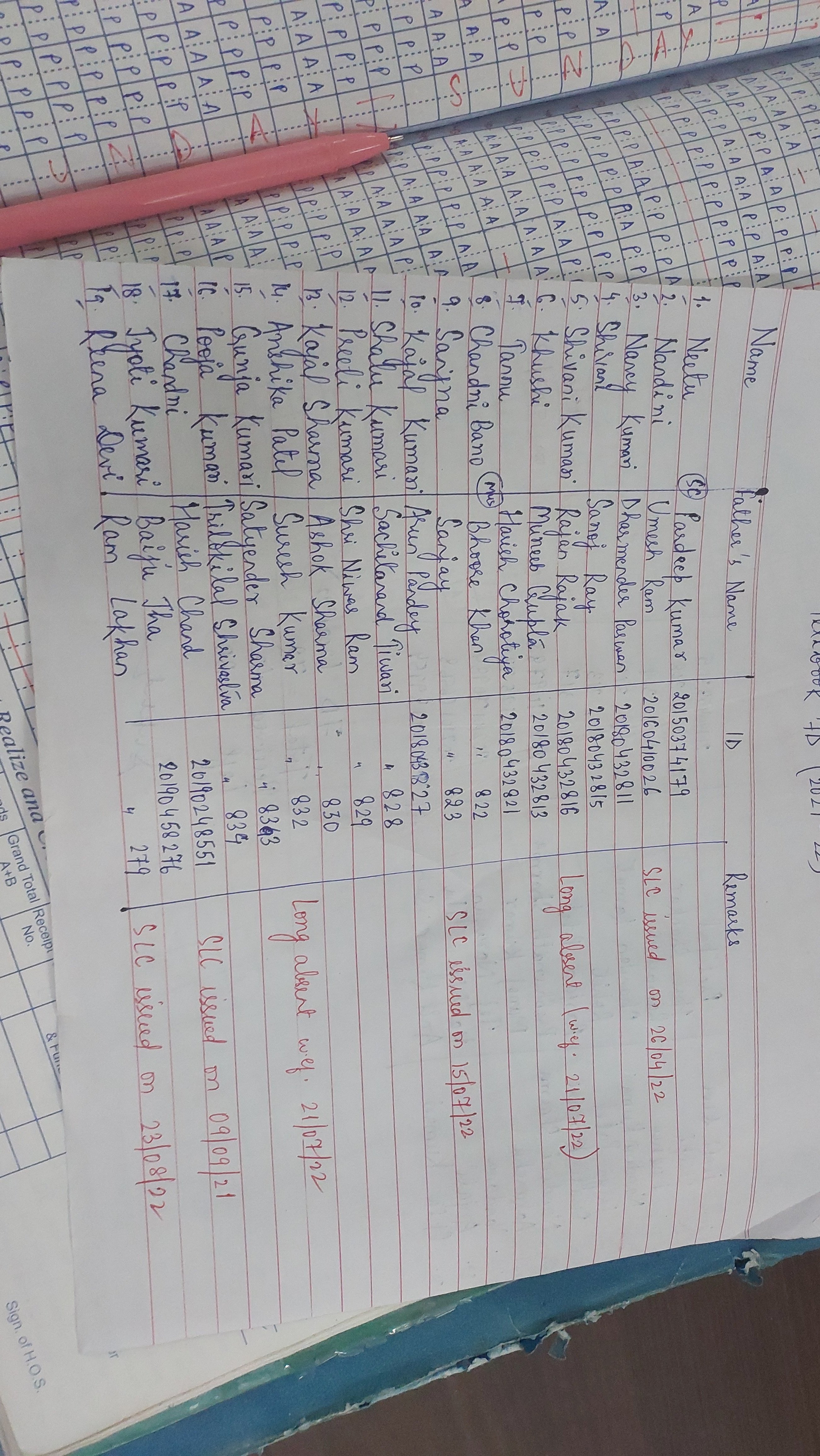
The Registrar's Ledger
This handwriting is neat, consistent, and legible, reflecting a detail-oriented and reliable personality. Introducing subtle variations in letter connections and pressure can add expressiveness.
The handwriting is neat and primarily upright, with a slight rightward slant, seen clearly in words like "Neetu" and "Nandini". The writing appears consistent in letter formation, suggesting a methodical approach. The pressure seems uniform, indicating a steady hand. Spacing between words is adequate, though letter spacing could be slightly more generous. The handwriting leans toward print rather than cursive, enhancing legibility.
This handwriting suggests a personality that values clarity and order. The neatness and consistency imply a conscientious and detail-oriented nature. The slight rightward slant indicates a friendly and approachable demeanor, and an openness to new experiences. There's a sense of reliability and diligence conveyed through the uniform pressure and careful letter formation.
To further improve the handwriting, focus on creating more space between individual letters to avoid a cramped appearance. Practicing letter connections could introduce a touch of personal flair without sacrificing legibility. Varying the pressure slightly could add depth and character to the writing, giving it a more dynamic feel.
Legibility
Expressiveness
Consistency
Overall
Leaderboard for Monday, 27 October 2025
| 1 | The Constitutionalist |
74
|
| 2 | The Eloquent Educator |
71
|
| 3 | The Student's Script |
70
|
| 4 | The Dreamer's Quill |
70
|
| 5 | The Hopeful Heart's Script |
68
|
| 6 | The Constitutionalist |
68
|
| 7 | The Diligent Penman |
67
|
| 8 | The Agrarian Academic |
67
|
| 9 | The Calculating Hand |
65
|
| 10 | The Diligent Note-Taker |
64
|
| 11 | The Mathematical Muse |
64
|
| 12 | The Contemplative Soul |
64
|
| 13 | The Gentle Flow |
63
|
| 14 | The Flowing Font |
63
|
| 15 | The Looping Legend |
62
|
| 16 | The Contemplative Calligrapher |
60
|
| 17 | The Democratic Dreamer |
59
|
| 18 | The Signature Stylist |
59
|
| 19 | The Devout Note-Taker |
58
|
| 20 | The Orderly Typewriter |
56
|
| 21 | The Forward Leaning Letterer |
54
|
| 22 | The Architect of Letters |
53
|
| 23 | The Steadfast Student |
53
|
| 24 | The Flowing River |
53
|
| 25 | The Diligent Student |
53
|
| 26 | The Approximator's Script |
52
|
| 27 | The Pragmatic Hand |
52
|
| 28 | Celestial Notes |
52
|
| 29 | The Visionary's Script |
51
|
| 30 | The Provocateur's Quill |
51
|