Rate my handwriting

✨ Upload a sample of your handwriting, and our 🤖 AI will give you
the scoop on
what's awesome
and what could use a
little improving.
It's just for fun - and totally free! Try now 🚀
(You can also check out today's 👑 Leaderboard 👇)
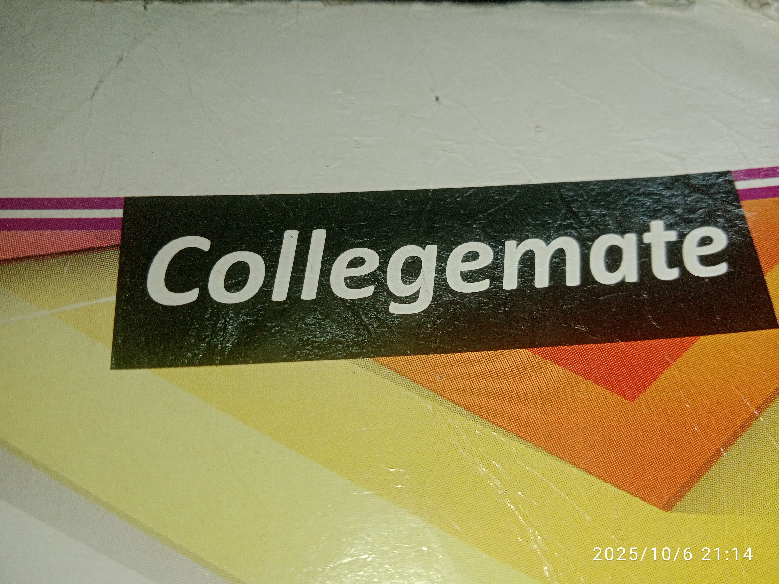
The Collegemate's Bold Stamp
The handwriting demonstrates clarity and boldness, hinting at a confident and organized personality. Slight adjustments to stroke thickness and letter spacing could further enhance its expressiveness.
The handwriting in the image is characterized by its bold, sans-serif style. Each letter is distinctly formed, showcasing a deliberate and precise execution. The uniform thickness of the strokes gives a sense of strength and stability, while the spacing between the letters is consistent and even, enhancing legibility. The rounded shapes of the letters like 'C', 'o', 'e', and 'a' contribute to an overall feeling of friendliness and approachability.
The consistent and well-defined letterforms suggest a personality that values clarity and precision. The bold style may indicate a confident and assertive nature, someone who is comfortable making a statement. The even spacing implies a thoughtful and organized approach to tasks, while the rounded letter shapes hint at a warm and approachable demeanor. This individual likely possesses a strong sense of self and a desire to communicate effectively.
To enhance the handwriting, consider experimenting with variations in stroke thickness to add visual interest and personality. Practice varying the letter spacing slightly to create a more dynamic and expressive feel. Additionally, exploring different font styles and incorporating personal flourishes could further refine and personalize the handwriting.
Legibility
Expressiveness
Consistency
Overall
Leaderboard for Sunday, 26 October 2025
| 31 | The Democratic Dreamer |
59
|
| 32 | The Elegant Calligrapher |
59
|
| 33 | The Enthusiastic Connector |
59
|
| 34 | The Signature Stylist |
59
|
| 35 | The Pragmatic Idealist |
59
|
| 36 | The Determined Motivator |
58
|
| 37 | The Devout Note-Taker |
58
|
| 38 | The Atom Alchemist |
57
|
| 39 | The Cipher's Quill |
57
|
| 40 | The Reproductive Note-Taker |
57
|
| 41 | The Loop-de-Loop Legend |
56
|
| 42 | The Scientific Mind |
56
|
| 43 | The Bold Artisan |
55
|
| 44 | The Minimalist |
55
|
| 45 | The Celestial Stylist |
54
|
| 46 | The Forward Leaning Letterer |
54
|
| 47 | The Stoic Calligrapher |
54
|
| 48 | The Calligrapher's Flourish |
54
|
| 49 | The Diligent Student |
53
|
| 50 | The Flowing River |
53
|
| 51 | The Architect of Letters |
53
|
| 52 | The Architect's Alphabet |
51
|
| 53 | The Provocateur's Quill |
51
|
| 54 | The Optimistic Loopist |
51
|
| 55 | The Pragmatic Penman |
47
|
| 56 | The Minimalist's Mark |
43
|