Rate my handwriting

✨ Upload a sample of your handwriting, and our 🤖 AI will give you
the scoop on
what's awesome
and what could use a
little improving.
It's just for fun - and totally free! Try now 🚀
(You can also check out today's 👑 Leaderboard 👇)
The Uninspired
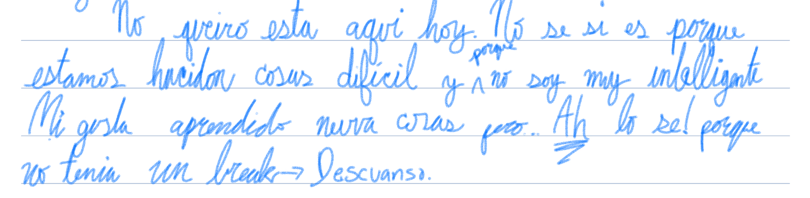
This handwriting suggests an introspective person with creative leanings, but with room for improvement in consistency and legibility. With some practice, the handwriting could become both more legible and retain its unique character.
The handwriting is cursive, with a forward slant. The size is medium, and the writing occupies the space available in a consistent way, although the baseline wavers somewhat. Some letters are formed in a simple way, while others are more stylized with loops. There are variations in letter formation and spacing. Some words, like "aqui", are slightly cramped, while others, such as "intelligentk" (presumably 'inteligente'), are stretched. Overall, the handwriting leans towards legibility, but the lack of consistent letter formation and some unconventional connections detract from it.
Based on this handwriting, one might infer that the writer is somewhat introspective and prone to moments of self-doubt, as indicated by the sentiment "no soy muy intelligentk" and the desire for "un break". There's a hint of creativity in the slight stylization of certain letters, suggesting an expressive nature. The forward slant suggests a desire to move forward, while the variable spacing and letter formation indicate a somewhat disorganized approach or a lack of attention to detail.
To improve legibility and consistency, focus on uniform letter sizing and spacing. Practice writing each letter clearly and consistently. Pay attention to the baseline and try to maintain a more consistent line. Slowing down and focusing on each word can also help improve the overall appearance of the handwriting. Finally, perhaps embrace the individuality of your writing style – it adds character, even if it's a bit chaotic.
Legibility
Expressiveness
Consistency
Overall
Leaderboard for Tuesday, 21 October 2025
| 1 | The Spencerian Enthusiast |
74
|
| 2 | The Joyful Optimist |
74
|
| 3 | The Methodical Mentor |
73
|
| 4 | The Romantic's Quill |
73
|
| 5 | The Diligent Student |
72
|
| 6 | The Student's Script |
68
|
| 7 | The Enthusiast's Italic |
68
|
| 8 | Fractions Fanatic |
68
|
| 9 | The Corporate Calligrapher |
68
|
| 10 | The Energetic Advocate |
68
|
| 11 | The Flowing Calligrapher |
67
|
| 12 | Contemplative Cursive |
65
|
| 13 | The Confident Calligrapher |
65
|
| 14 | The Determined Hand |
64
|
| 15 | The Confident Pen |
64
|
| 16 | Ang Makata |
64
|
| 17 | The Flowing River |
64
|
| 18 | The Imaginative Calligrapher |
63
|
| 19 | The Dream Weaver |
63
|
| 20 | The Scientific Mind |
63
|
| 21 | The Diligent Student |
62
|
| 22 | The Uninspired |
62
|
| 23 | The Organized Entrepreneur |
62
|
| 24 | The Pragmatic Note-Taker |
62
|
| 25 | The Diligent Student |
61
|
| 26 | The Flourishing Academic |
61
|
| 27 | The Technical Hand |
61
|
| 28 | The Pragmatic Planner |
61
|
| 29 | The Friendly Cosmopolitan |
58
|
| 30 | The Precise Performer |
58
|