Rate my handwriting

✨ Upload a sample of your handwriting, and our 🤖 AI will give you
the scoop on
what's awesome
and what could use a
little improving.
It's just for fun - and totally free! Try now 🚀
(You can also check out today's 👑 Leaderboard 👇)
The Corporate Calligrapher
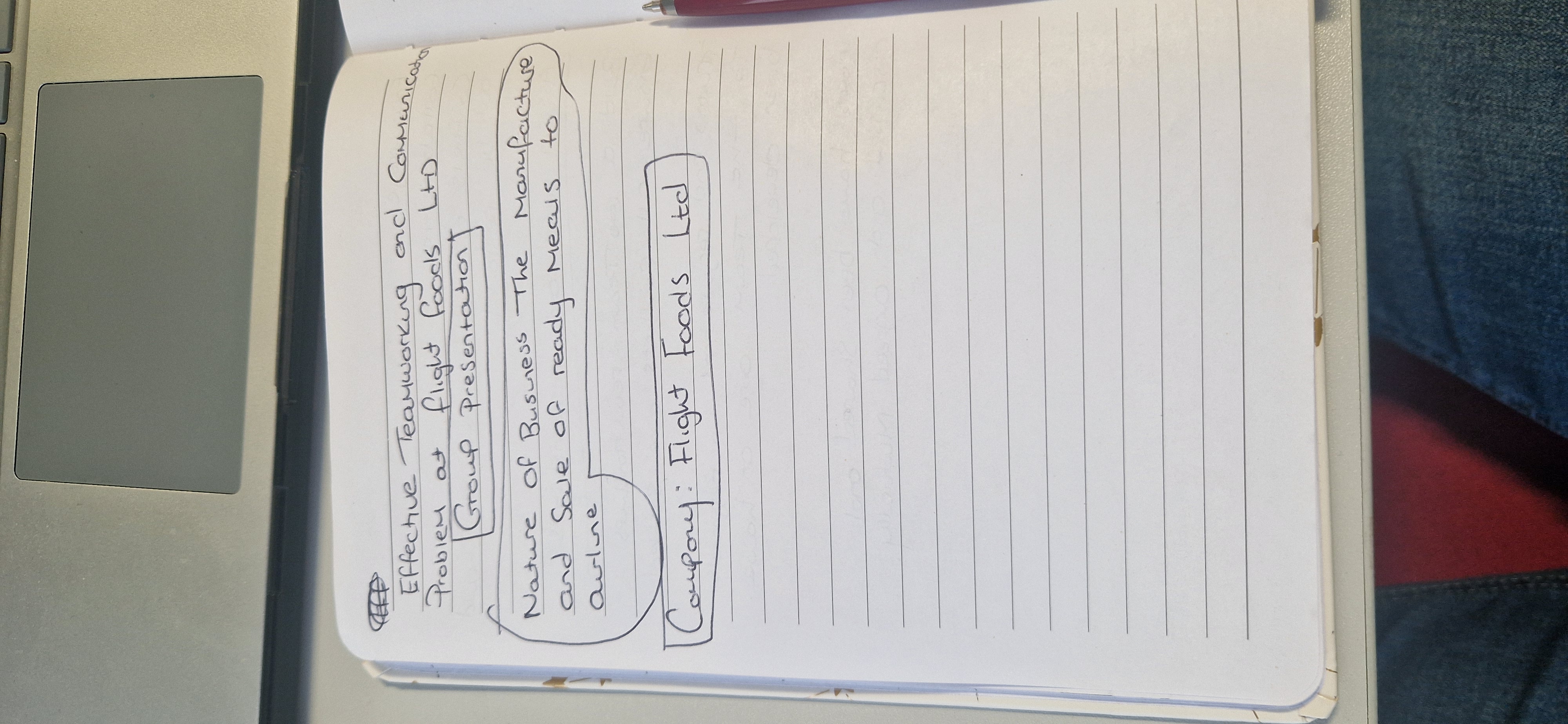
This handwriting reflects a practical and organized individual who values clear communication, with an opportunity to explore greater personal expression through subtle stylistic adjustments. The writer displays thoughtfulness and consideration through legible and well-formed characters.
The handwriting in this sample presents as upright and business-like, with a focus on clarity over flourish. The letterforms are generally well-defined, with rounded shapes that give a sense of approachability. The use of capital letters is restrained, mostly used to denote new words or names. The spacing between words and lines is consistent, creating a visually organized impression. Words such as 'Teamworking', 'Business', 'Presentation', and 'Manufacture' are clearly legible. The writing appears to be done with a steady hand, suggesting a degree of control and precision. However, the overall impression is that of functional handwriting, more concerned with conveying information than expressing personal style.
Based on this handwriting, one might infer a personality that values order and efficiency. The neatness and legibility suggest a thoughtful and considerate nature, with an emphasis on clear communication. The writer likely appreciates structure and planning, preferring to approach tasks in a methodical manner. They probably exhibit a responsible and reliable attitude, as indicated by the consistent and careful execution of their handwriting. There may be a tendency toward practicality and pragmatism, favoring simplicity and directness over elaborate displays.
To further enhance your handwriting, focus on adding a bit more personal flair. Experiment with slightly varying the slant of your letters to inject some dynamism. Consider practicing different letter connections to develop a more fluid and natural flow. Introducing subtle variations in letter size and shape could also make your handwriting more visually appealing and distinctive. Finally, practice and focus on the baseline, because in some cases the words start to slope upwards or downwards.
Legibility
Expressiveness
Consistency
Overall
Leaderboard for Monday, 20 October 2025
| 1 | The Artful Calligrapher |
74
|
| 2 | The Yearning Quill |
74
|
| 3 | The Methodical Mentor |
73
|
| 4 | The Yearning Quill |
71
|
| 5 | The Pragmatic Calculator |
70
|
| 6 | The Meticulous Student |
69
|
| 7 | The Corporate Calligrapher |
68
|
| 8 | The Energetic Advocate |
68
|
| 9 | Literary Luminary |
68
|
| 10 | The Determined Optimist |
68
|
| 11 | The Advocate's Quill |
68
|
| 12 | The Looping Optimist |
66
|
| 13 | The Budding Biologist |
66
|
| 14 | Affectionate Notes |
64
|
| 15 | The Flowing River |
64
|
| 16 | The Determined Hand |
64
|
| 17 | Ang Makata |
64
|
| 18 | The Dream Weaver |
63
|
| 19 | The Scientific Mind |
63
|
| 20 | The Considerate Soul |
63
|
| 21 | The Organized Entrepreneur |
62
|
| 22 | The Diligent Student |
61
|
| 23 | The Pragmatic Planner |
61
|
| 24 | The Diligent Achiever |
60
|
| 25 | The Student's Script |
60
|
| 26 | The Reflective Poet |
59
|
| 27 | The Optimistic Dreamer |
59
|
| 28 | The Friendly Note-Taker |
58
|
| 29 | The Elegant Idealist |
58
|
| 30 | The Pragmatic Numeralist |
55
|