Rate my handwriting

✨ Upload a sample of your handwriting, and our 🤖 AI will give you
the scoop on
what's awesome
and what could use a
little improving.
It's just for fun - and totally free! Try now 🚀
(You can also check out today's 👑 Leaderboard 👇)
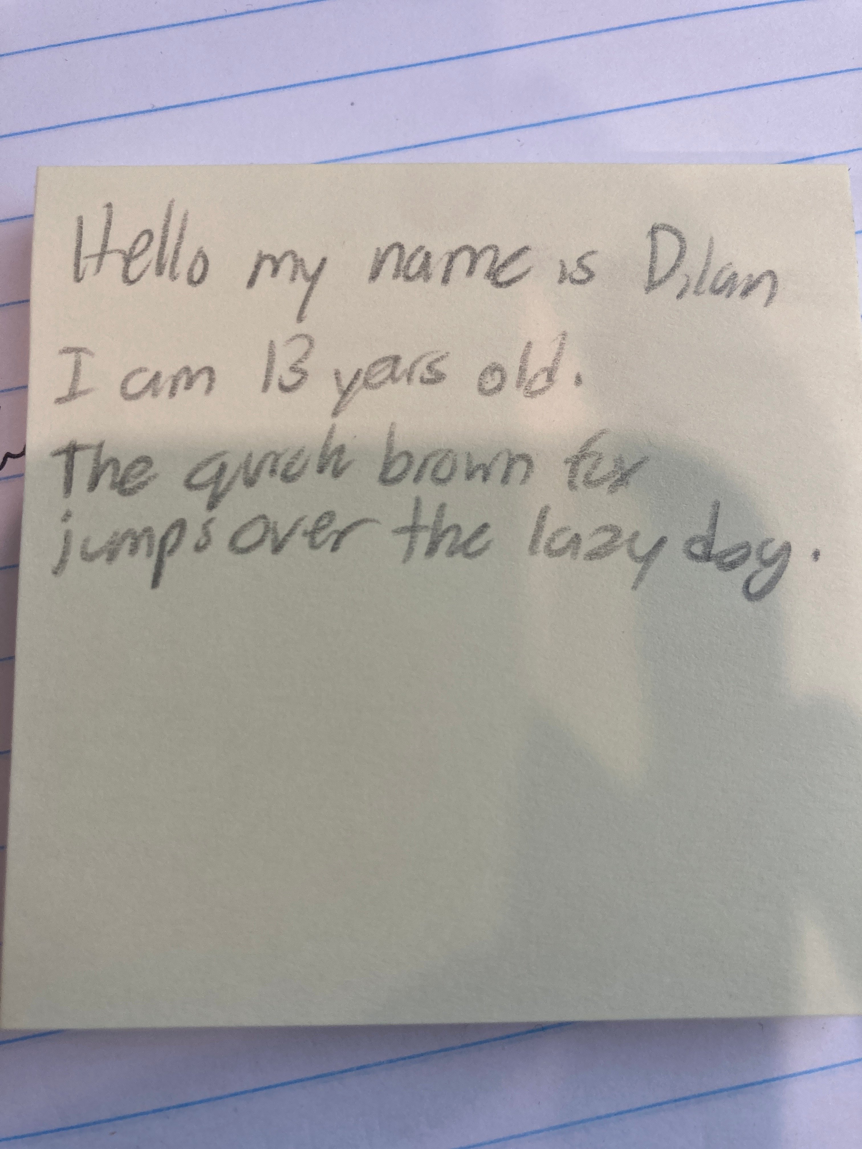
The Thirteen-Year-Old Penman
This sample displays a legible, youthful hand with a slight rightward slant, suggesting an open and communicative personality with a straightforward approach.
This handwriting sample presents a relatively consistent and legible style, with a slight rightward slant. The letters are generally well-formed, as seen in the clear formation of "brown" and "jumps." The spacing between words is fairly even, although some words, like "over the," appear slightly compressed. The baseline is generally straight, but shows a hint of upward movement, which adds a touch of dynamism. The overall impression is one of youthful fluency.
The rightward slant suggests a person who is open and communicative, perhaps even eager to engage with the world. The clarity and legibility of the writing hint at a clear and organized mind, someone who values communication and strives for understanding. The slight upward slant of the baseline could indicate a touch of optimism and enthusiasm. The simplicity of the letterforms, as seen in "lazy" and "day," might point to a straightforward, unpretentious nature.
While generally legible, some letters could benefit from more precise formation. The "a" in "name," for instance, could be more rounded, and the "y" in "lazy" could be more clearly distinguished. Practicing consistent letter formation, especially for letters like "a," "y," and "g," would enhance the overall neatness and legibility. Paying attention to the spacing between words and letters, ensuring a more consistent distance throughout, would also improve the visual appeal of the writing.
Legibility
Expressiveness
Consistency
Overall
Leaderboard for Monday, 27 October 2025
| 1 | The Constitutionalist |
74
|
| 2 | The Eloquent Educator |
71
|
| 3 | The Student's Script |
70
|
| 4 | The Dreamer's Quill |
70
|
| 5 | The Hopeful Heart's Script |
68
|
| 6 | The Constitutionalist |
68
|
| 7 | The Diligent Penman |
67
|
| 8 | The Agrarian Academic |
67
|
| 9 | The Calculating Hand |
65
|
| 10 | The Diligent Note-Taker |
64
|
| 11 | The Mathematical Muse |
64
|
| 12 | The Contemplative Soul |
64
|
| 13 | The Gentle Flow |
63
|
| 14 | The Flowing Font |
63
|
| 15 | The Looping Legend |
62
|
| 16 | The Contemplative Calligrapher |
60
|
| 17 | The Democratic Dreamer |
59
|
| 18 | The Signature Stylist |
59
|
| 19 | The Devout Note-Taker |
58
|
| 20 | The Orderly Typewriter |
56
|
| 21 | The Forward Leaning Letterer |
54
|
| 22 | The Architect of Letters |
53
|
| 23 | The Steadfast Student |
53
|
| 24 | The Flowing River |
53
|
| 25 | The Diligent Student |
53
|
| 26 | The Approximator's Script |
52
|
| 27 | The Pragmatic Hand |
52
|
| 28 | Celestial Notes |
52
|
| 29 | The Visionary's Script |
51
|
| 30 | The Provocateur's Quill |
51
|