Rate my handwriting

✨ Upload a sample of your handwriting, and our 🤖 AI will give you
the scoop on
what's awesome
and what could use a
little improving.
It's just for fun - and totally free! Try now 🚀
(You can also check out today's 👑 Leaderboard 👇)

The Literary Android
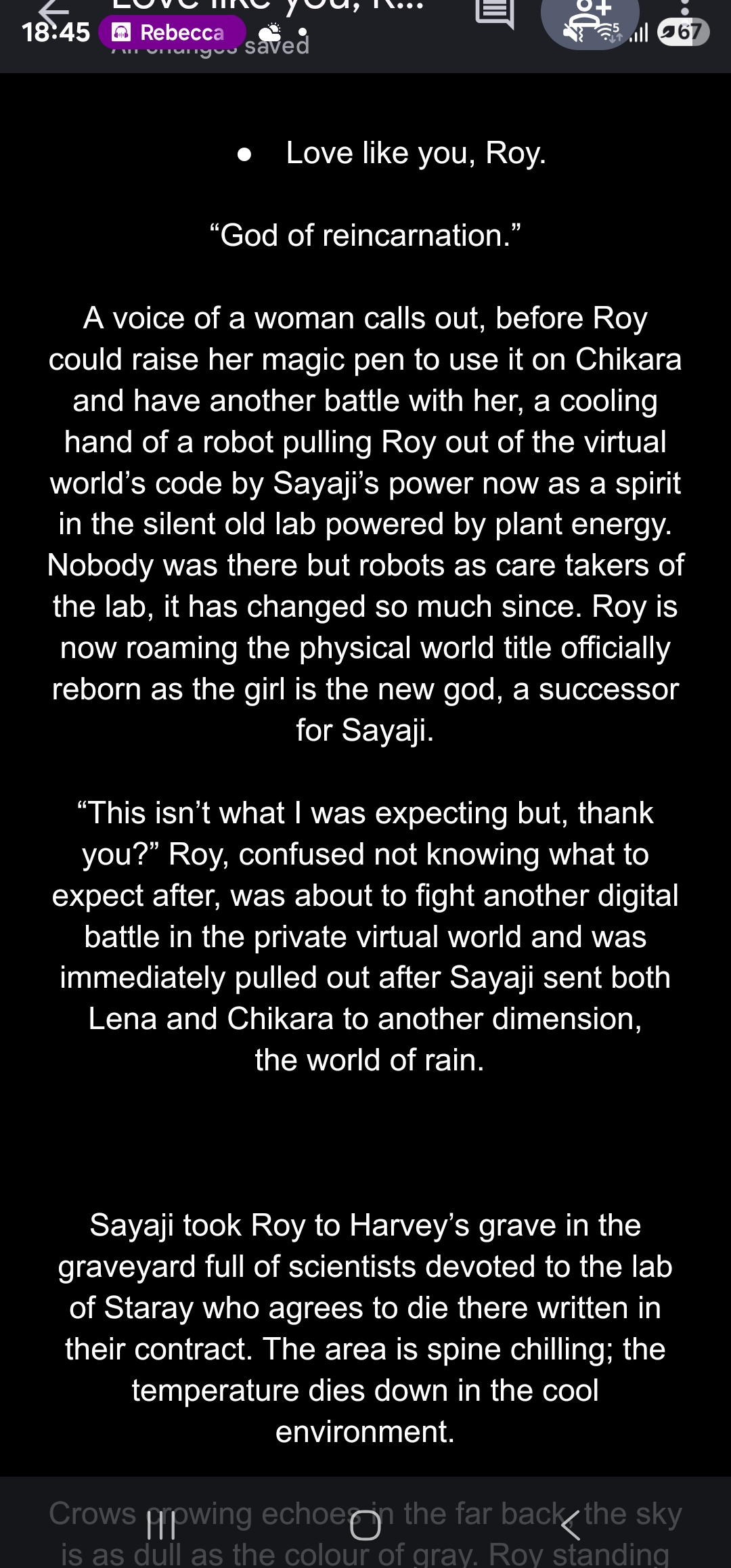
This handwriting is neat and highly legible, resembling a digital font, which suggests a detail-oriented and disciplined personality. Adding personal flair through variations in slant and pressure could make it more expressive.
The handwriting presents as neat and legible, closely resembling a clear, sans-serif digital font. There is a notable uniformity in letter size and spacing, which gives it a very consistent appearance. The overall impression is one of precision and clarity, almost as if produced by a machine rather than a human hand. There is no obvious slant or variation in pressure, and the letterforms are well-defined.
Based on this handwriting, one might assume the writer is detail-oriented and values clarity and precision. They likely possess a logical and methodical approach to tasks, favoring order and consistency. The neatness suggests a disciplined nature, and the absence of flourish implies a preference for straightforward communication over elaborate expression.
While legibility is excellent, the handwriting could benefit from the addition of some personal flair. Experimenting with slight variations in slant or pressure could add a touch of individuality and make the handwriting appear more natural and expressive. Consider incorporating subtle curves or loops to soften the otherwise rigid letterforms. A bit more spacing between words could also improve readability and prevent a cramped appearance.
Legibility
Expressiveness
Consistency
Overall
Leaderboard for Friday, 31 October 2025
| 1 | The Elegant Hand |
80
|
| 2 | The Flourishing Maestro |
74
|
| 3 | The Flowing Hand |
74
|
| 4 | The Elegant Flow |
74
|
| 5 | The Calligrapher's Contemplation |
74
|
| 6 | The Artistic Hand |
74
|
| 7 | The Literary Android |
70
|
| 8 | The Crisp Communicator |
69
|
| 9 | The Deliberate Drafter |
68
|
| 10 | The Print-Maker |
68
|
| 11 | The Artistic Soul |
68
|
| 12 | The Typewriter's Tale |
66
|
| 13 | The Optimistic Calligrapher |
66
|
| 14 | The Spirited Athlete |
65
|
| 15 | The Flourishing Numeralist |
65
|
| 16 | The Leader's Mark |
64
|
| 17 | The Methodical Dreamer |
64
|
| 18 | The Dream Weaver |
64
|
| 19 | Architect's Draft |
63
|
| 20 | The Elementary Enthusiast |
63
|
| 21 | The Spirited Signature |
63
|
| 22 | The Bard's Quill |
63
|
| 23 | The Determined Deep Diver |
62
|
| 24 | The Green Dreamer |
61
|
| 25 | The Architect's Signature |
60
|
| 26 | The Watercolor Calligrapher |
60
|
| 27 | The Introspective Calligrapher |
59
|
| 28 | Cosmic Cursive |
59
|
| 29 | The Culinary Calligrapher |
58
|
| 30 | The Typist |
57
|