Rate my handwriting

✨ Upload a sample of your handwriting, and our 🤖 AI will give you
the scoop on
what's awesome
and what could use a
little improving.
It's just for fun - and totally free! Try now 🚀
(You can also check out today's 👑 Leaderboard 👇)
The Pragmatic Projector
This handwriting demonstrates a blend of practicality and balance, suggesting a straightforward and composed individual. Minor adjustments to letter consistency and baseline adherence could further enhance the writing's clarity and visual appeal.
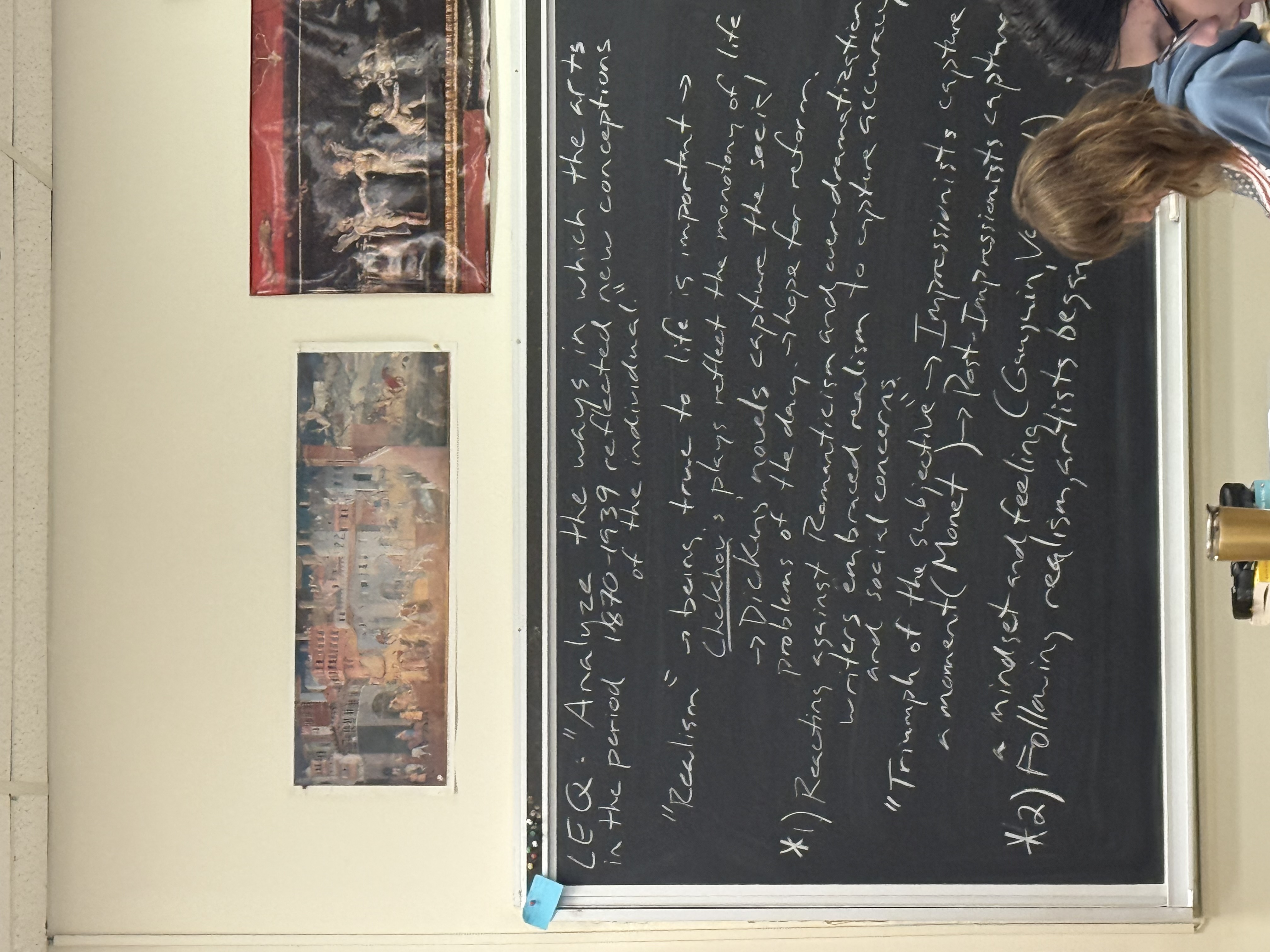
The handwriting presents a blend of functional clarity and a touch of casualness. The writing is upright, demonstrating a straightforward approach. The size of the letters appears moderate and quite uniform, suggesting consistency. The spacing between words and lines is generally adequate, contributing to legibility. The slant is neutral, hinting at a balanced emotional expression. There is an effort to form the letters distinctly, yet there's a certain speed in the execution, as seen in some connecting strokes. For example, the words like "Analyze" and "Realism" showcase a mix of deliberate formation and a quick flow.
This handwriting style suggests a personality that values clarity and directness. The individual likely has a practical mindset and an ability to communicate effectively. The consistent letter size and spacing point to a composed nature, capable of maintaining composure under pressure. The balanced slant indicates emotional stability and a tendency to approach situations with a rational perspective. There may be a preference for clear communication and a dislike for ambiguity.
To improve, focusing on refining the consistency of letter forms, especially in the lowercase letters, would be beneficial. Practicing with slightly more deliberate strokes could enhance the overall neatness and readability, without sacrificing the natural flow. Paying attention to the baseline and ensuring the letters consistently adhere to it would further enhance the visual appeal and coherence of the writing. Although the handwriting is already legible, these small adjustments could elevate it to a more polished and refined state.
Legibility
Expressiveness
Consistency
Overall
Leaderboard for Monday, 27 October 2025
| 1 | The Constitutionalist |
74
|
| 2 | The Eloquent Educator |
71
|
| 3 | The Student's Script |
70
|
| 4 | The Dreamer's Quill |
70
|
| 5 | The Hopeful Heart's Script |
68
|
| 6 | The Constitutionalist |
68
|
| 7 | The Diligent Penman |
67
|
| 8 | The Agrarian Academic |
67
|
| 9 | The Calculating Hand |
65
|
| 10 | The Diligent Note-Taker |
64
|
| 11 | The Mathematical Muse |
64
|
| 12 | The Contemplative Soul |
64
|
| 13 | The Gentle Flow |
63
|
| 14 | The Flowing Font |
63
|
| 15 | The Looping Legend |
62
|
| 16 | The Contemplative Calligrapher |
60
|
| 17 | The Democratic Dreamer |
59
|
| 18 | The Signature Stylist |
59
|
| 19 | The Devout Note-Taker |
58
|
| 20 | The Orderly Typewriter |
56
|
| 21 | The Forward Leaning Letterer |
54
|
| 22 | The Architect of Letters |
53
|
| 23 | The Steadfast Student |
53
|
| 24 | The Flowing River |
53
|
| 25 | The Diligent Student |
53
|
| 26 | The Approximator's Script |
52
|
| 27 | The Pragmatic Hand |
52
|
| 28 | Celestial Notes |
52
|
| 29 | The Visionary's Script |
51
|
| 30 | The Provocateur's Quill |
51
|