Rate my handwriting

✨ Upload a sample of your handwriting, and our 🤖 AI will give you
the scoop on
what's awesome
and what could use a
little improving.
It's just for fun - and totally free! Try now 🚀
(You can also check out today's 👑 Leaderboard 👇)

The Curator's Script
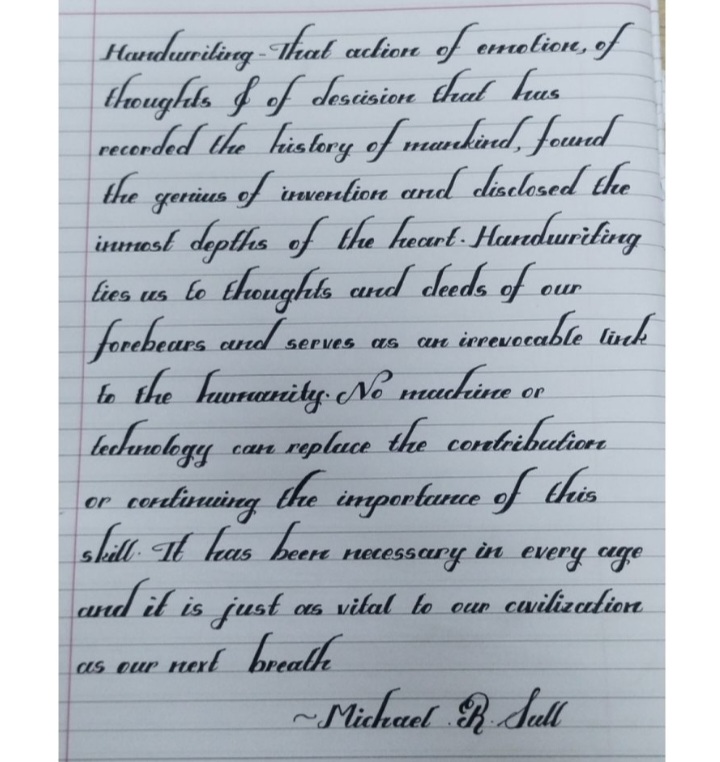
This handwriting showcases a deliberate and artistic style, suggesting a personality that values tradition, aesthetics, and leaving a lasting impression, though some simplifications could enhance legibility.
The handwriting presents as a meticulously crafted script, reminiscent of traditional calligraphy. The upstrokes are delicate, and the downstrokes have a pronounced, almost exaggerated thickness, lending a dramatic flair. There's a clear attempt at consistency, though slight variations exist, particularly in the letter 't' and the formation of 'h'. The letter 'g' shows a looping descent, and there's a distinct curvature in letters like 'm' and 'n'. The overall impression is one of deliberate control and artistic expression.
Based on this careful and considered style, the writer likely possesses a strong sense of tradition and a desire for order. The pronounced strokes might indicate a flair for the dramatic and a wish to leave a lasting impression. The dedication required to develop such a script suggests patience, discipline, and an appreciation for aesthetics. There is a good attention to detail and a respect for form.
While the handwriting is beautiful, some of the extreme curves can impact legibility. Experimenting with slightly simplified forms could improve clarity without sacrificing the elegant style. Maintaining a consistent slant throughout the text would also enhance readability. Consider slightly reducing the thickness of the downstrokes for a more balanced appearance. Overall, the style is distinctive and pleasing to the eye.
Legibility
Expressiveness
Consistency
Overall
Leaderboard for Saturday, 25 October 2025
| 1 | The Pristine Penman |
76
|
| 2 | The Determined Diarist |
75
|
| 3 | The Elegant Signature |
74
|
| 4 | Geometric Author |
73
|
| 5 | The Pragmatic Planner |
73
|
| 6 | The Diligent Dreamer |
73
|
| 7 | The Student |
73
|
| 8 | The Pragmatist's Script |
72
|
| 9 | The Eloquent Calligrapher |
71
|
| 10 | The Organized Storyteller |
69
|
| 11 | The Flowing Hand |
68
|
| 12 | The Looping Luminary |
68
|
| 13 | The Acrobatic Pen |
67
|
| 14 | The Agile Acrobat |
67
|
| 15 | The Classicist's Quill |
65
|
| 16 | The Optimistic Artist |
65
|
| 17 | The Efficient Note-Taker |
64
|
| 18 | The Minimalist's Mark |
64
|
| 19 | Diligent Student |
63
|
| 20 | The Pragmatic Pen |
63
|
| 21 | The Coordinator's Quill |
61
|
| 22 | The Loop Whisperer |
61
|
| 23 | The Liberty Lover's Cursive |
61
|
| 24 | The Congratulatory Cursive |
60
|
| 25 | Zen Strokes |
60
|
| 26 | The Enthusiastic Connector |
59
|
| 27 | The Poet's Quill |
59
|
| 28 | The Precise Mathematician |
59
|
| 29 | The Elegant Calligrapher |
59
|
| 30 | The Typist's Touch |
59
|