Rate my handwriting

✨ Upload a sample of your handwriting, and our 🤖 AI will give you
the scoop on
what's awesome
and what could use a
little improving.
It's just for fun - and totally free! Try now 🚀
(You can also check out today's 👑 Leaderboard 👇)

The Calculating Calligrapher
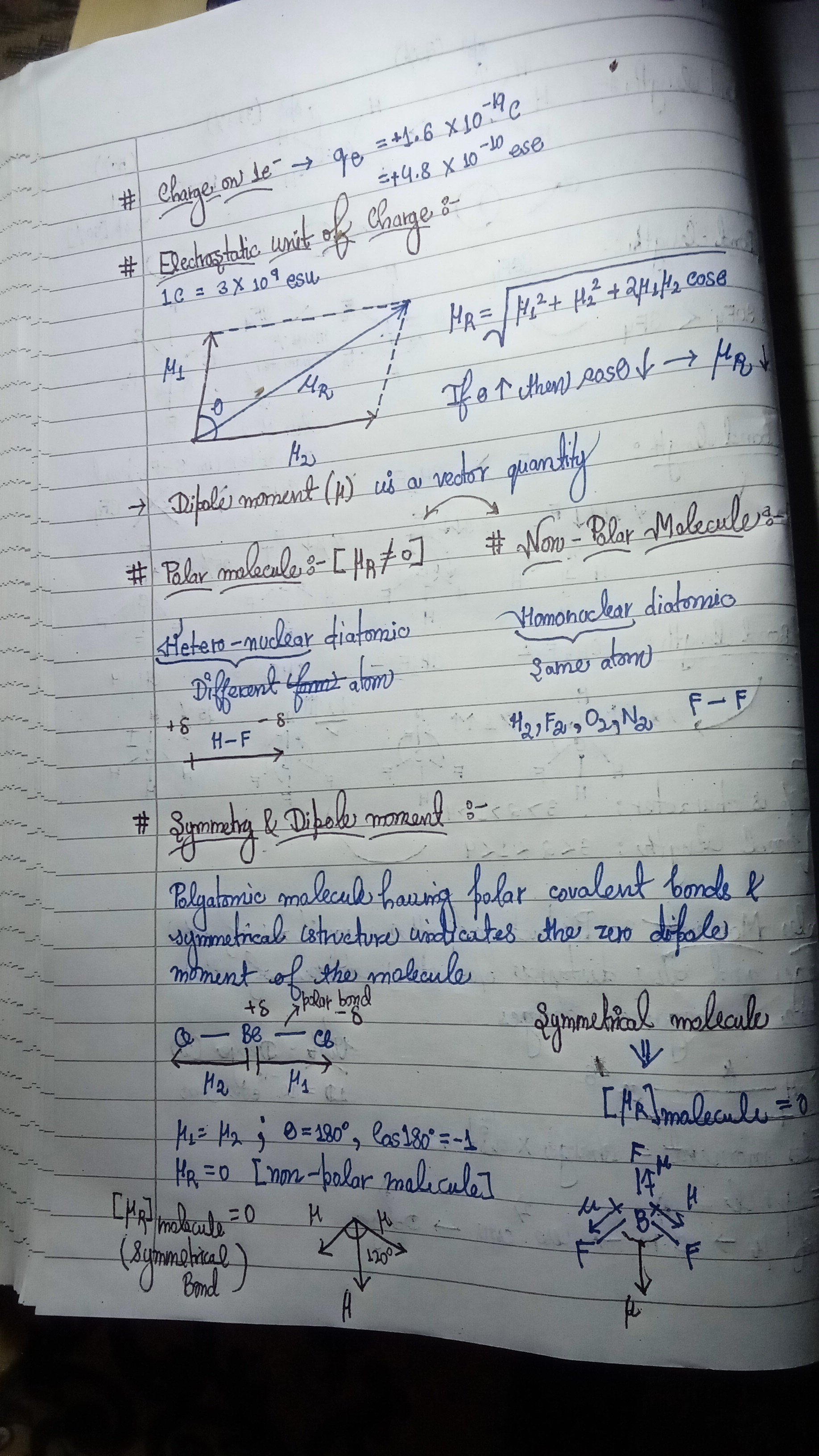
This handwriting sample reveals a methodical and detail-oriented individual who values both precision and aesthetic appeal. A few minor adjustments could enhance consistency and overall legibility.
The handwriting in this sample leans towards a cursive style, evident in the connected letters and flowing strokes. The slant is relatively consistent, showing a slight rightward inclination. Notice the neatness in the formation of mathematical symbols and chemical structures. Letter sizes are somewhat uniform, though variations exist. Overall, the writing is quite legible, though certain flourishes might require closer inspection. For example, the loops on letters like 'l' and 'y' are elegantly formed but occasionally elongated. The writer seems to favour underlining key terms for emphasis, as seen with phrases like "Polar molecule" and "Symmetry & Dipole moment".
Based on this handwriting, the writer is likely detail-oriented and possesses a methodical approach. The clear and organized presentation of information suggests a logical mind and a preference for structure. The underlining of important terms points to a desire to emphasize key concepts, indicating a thoughtful and analytical nature. The overall neatness implies a degree of self-discipline and attention to detail. The combination of precision and flair suggests an individual who values both accuracy and aesthetic appeal.
To further refine your handwriting, consider focusing on maintaining a more consistent letter size throughout. While the current variation adds character, greater uniformity could enhance legibility. Experiment with different pen grips to find one that promotes fluidity and reduces hand fatigue. Practicing specific letter formations that you find challenging, such as the 'R', can also contribute to a more polished and consistent style. Try to vary the thickness of the strokes in your letters to give more definition and depth.
Legibility
Expressiveness
Consistency
Overall
Leaderboard for Tuesday, 28 October 2025
| 31 | The Pragmatic Professor |
61
|
| 32 | The Elegant Penman |
60
|
| 33 | The Flowing Pen |
60
|
| 34 | The Perpetual Cycler |
60
|
| 35 | The Budding Pianist's Plea |
60
|
| 36 | The Casual Communicator |
59
|
| 37 | The Furious Finisher |
58
|
| 38 | The Analytical Artisan |
58
|
| 39 | The Diligent Storyteller |
58
|
| 40 | The Flowing Pen |
57
|
| 41 | The Mythical Typewriter |
57
|
| 42 | The Dreamer's Quill |
56
|
| 43 | The Peaceful Warrior |
56
|
| 44 | The Fantastical Dreamer |
56
|
| 45 | The Elegant Optimist |
56
|
| 46 | The Deliberate Doodler |
56
|
| 47 | The Energetic Note-Taker |
55
|
| 48 | The Principled Pen |
54
|
| 49 | The Optimistic Brushstroke |
54
|
| 50 | The Budding Scholar |
54
|
| 51 | The Pragmatic Note-Taker |
53
|
| 52 | The Official's Elegant Cursive |
53
|
| 53 | The Pragmatic Pen |
53
|
| 54 | The Serene Hand |
53
|
| 55 | The Fluid Minimalist |
53
|
| 56 | The Diligent Student |
52
|
| 57 | The Bold Capitalist |
52
|
| 58 | The Historian's Quill |
52
|
| 59 | The Introspective Historian |
52
|
| 60 | The Pragmatic Pen |
51
|