Rate my handwriting

✨ Upload a sample of your handwriting, and our 🤖 AI will give you
the scoop on
what's awesome
and what could use a
little improving.
It's just for fun - and totally free! Try now 🚀
(You can also check out today's 👑 Leaderboard 👇)
The Pen of Reason
The handwriting exhibits neatness, legibility, and a smooth flow, indicating an organized and rational mind with a focus on clear communication.
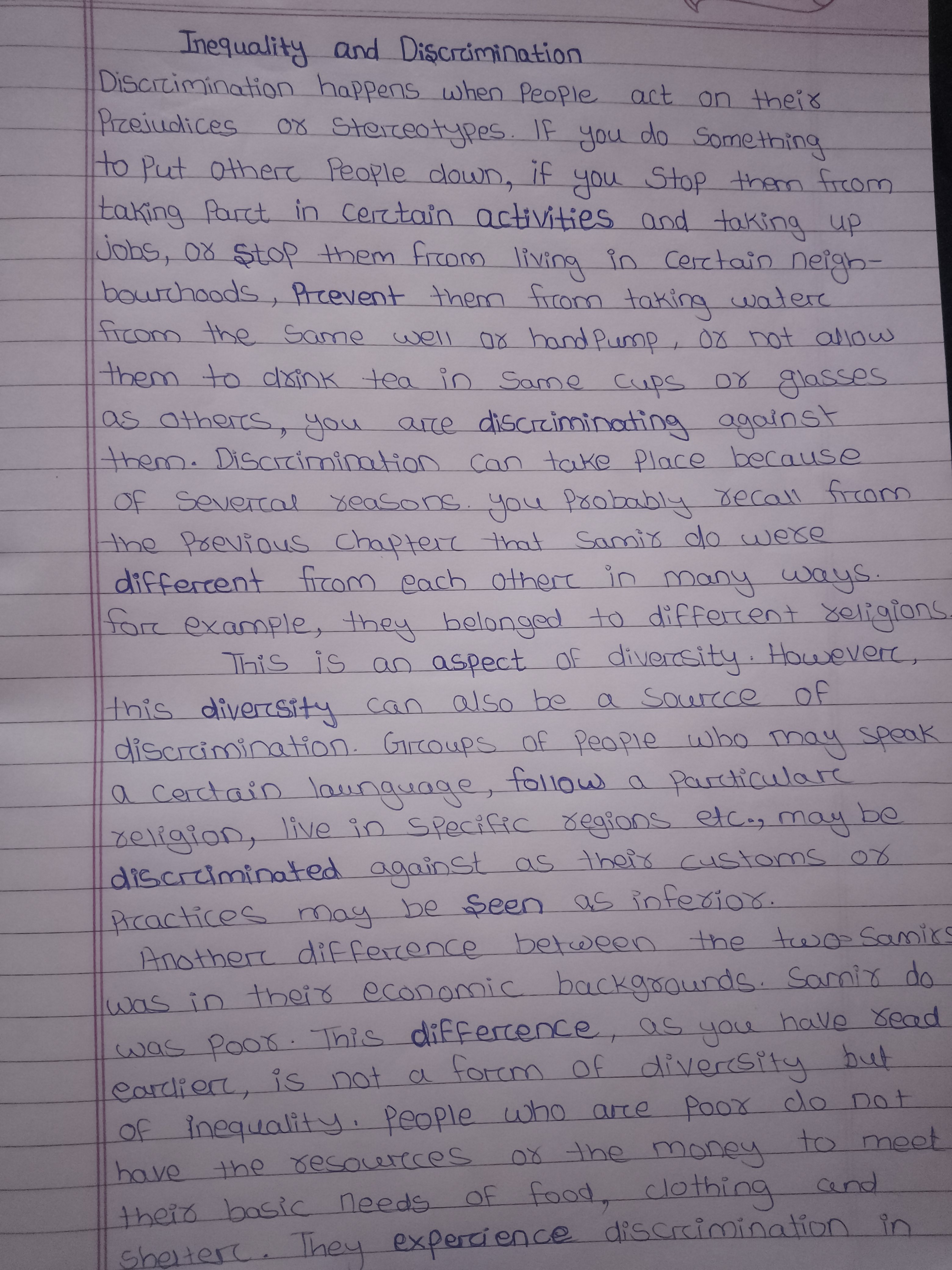
This handwriting sample presents a consistent and legible style, flowing smoothly across the page. The words are neatly formed, with a balanced proportion between height and width. The letters are well-defined, exhibiting a comfortable rhythm in their formation, as seen in words like "discrimination" and "activities." The baseline is relatively straight, reflecting a structured approach.
This handwriting suggests a personality that is organized and methodical, with a clear and rational mind. The neatness implies a preference for order and precision, while the fluency of the script indicates a good flow of thoughts and ideas. The balanced proportions and rhythmic strokes may signify an inclination towards fairness and diplomacy. The clarity and legibility reveal a desire for clear communication and a respect for the reader's comprehension.
To enhance this already commendable handwriting, focus could be given to adding a touch more expressiveness. Experimenting with slight variations in slant, letter size, and stroke weight can infuse more personality and dynamism into the writing. While maintaining the existing clarity, introducing controlled flourishes or distinctive letterforms could elevate the aesthetic appeal and create a unique signature style.
Legibility
Expressiveness
Consistency
Overall
Leaderboard for Saturday, 25 October 2025
| 1 | The Pristine Penman |
76
|
| 2 | The Determined Diarist |
75
|
| 3 | The Elegant Signature |
74
|
| 4 | Geometric Author |
73
|
| 5 | The Pragmatic Planner |
73
|
| 6 | The Diligent Dreamer |
73
|
| 7 | The Student |
73
|
| 8 | The Pragmatist's Script |
72
|
| 9 | The Eloquent Calligrapher |
71
|
| 10 | The Organized Storyteller |
69
|
| 11 | The Flowing Hand |
68
|
| 12 | The Looping Luminary |
68
|
| 13 | The Acrobatic Pen |
67
|
| 14 | The Agile Acrobat |
67
|
| 15 | The Classicist's Quill |
65
|
| 16 | The Optimistic Artist |
65
|
| 17 | The Efficient Note-Taker |
64
|
| 18 | The Minimalist's Mark |
64
|
| 19 | Diligent Student |
63
|
| 20 | The Pragmatic Pen |
63
|
| 21 | The Coordinator's Quill |
61
|
| 22 | The Loop Whisperer |
61
|
| 23 | The Liberty Lover's Cursive |
61
|
| 24 | The Congratulatory Cursive |
60
|
| 25 | Zen Strokes |
60
|
| 26 | The Enthusiastic Connector |
59
|
| 27 | The Poet's Quill |
59
|
| 28 | The Precise Mathematician |
59
|
| 29 | The Elegant Calligrapher |
59
|
| 30 | The Typist's Touch |
59
|