Rate my handwriting

✨ Upload a sample of your handwriting, and our 🤖 AI will give you
the scoop on
what's awesome
and what could use a
little improving.
It's just for fun - and totally free! Try now 🚀
(You can also check out today's 👑 Leaderboard 👇)
The Celebratory Announcer
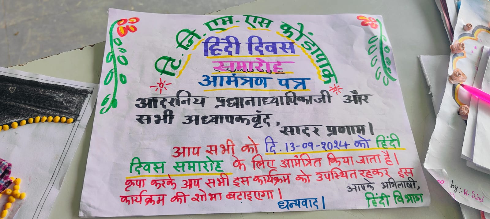
This handwriting showcases a blend of formality and creativity, indicating a personality that values tradition but also expresses individuality. Some focus on consistency would enhance the overall legibility and presentation.
The handwriting style presented in this invitation card is a mix of formal and somewhat playful, evident in the varied use of colors and font styles. The overall impression is neat, but the consistency in letter size and spacing varies slightly. Words like "आदरनिय प्रधानाध्यापिकाजी" show a deliberate effort in forming each letter, indicating care and attention to detail. The strokes are generally firm, although there's some inconsistency in pressure, suggesting a writer who is generally confident but may have moments of hesitation.
Based on the handwriting, the person may be someone who values tradition and formality, given the context of the invitation. However, the use of color and varying font styles also indicates a creative and expressive side. They likely have a good sense of responsibility, as shown by the neatness, but are also capable of injecting their personality into their work. The handwriting suggests a blend of seriousness and creativity.
To improve the handwriting, focus on maintaining a consistent slant and pressure throughout. Practicing letter formations with uniform spacing can enhance legibility. Consider using guidelines to maintain consistent letter heights. While the varying font styles add character, standardizing a few core styles could bring a more polished look to the overall writing.
Legibility
Expressiveness
Consistency
Overall
Leaderboard for Tuesday, 28 October 2025
| 1 | The Calligrapher |
83
|
| 2 | The Elegant Calligrapher |
82
|
| 3 | Flourishing Calligrapher |
77
|
| 4 | The Calligrapher |
77
|
| 5 | The Flowing Stream |
74
|
| 6 | The Fluid Calligrapher |
71
|
| 7 | The Inspirational Calligrapher |
70
|
| 8 | The Student's Lament |
70
|
| 9 | The Pragmatic Pupil |
68
|
| 10 | The Flourishing Individual |
68
|
| 11 | The Jolly Optimist |
68
|
| 12 | The Mario Manifesto |
68
|
| 13 | The Perfectionist's Primer |
67
|
| 14 | The Diligent Calligrapher |
67
|
| 15 | The Considerate Soul |
67
|
| 16 | The Reflective Student |
67
|
| 17 | The Elegant Calligrapher |
66
|
| 18 | The Divine Calligrapher |
66
|
| 19 | The Upright Pen |
65
|
| 20 | The Concerned Guardian |
65
|
| 21 | The Pharmacist's Note |
65
|
| 22 | The Analytical Alchemist |
65
|
| 23 | The Advocate's Quill |
65
|
| 24 | The Grid Writer |
65
|
| 25 | The Flowing Quill |
64
|
| 26 | The Historian's Hand |
64
|
| 27 | The Educated Executive |
63
|
| 28 | The Diligent Diarist |
63
|
| 29 | The Flourishing Enigma |
63
|
| 30 | The Gridiron Enthusiast |
63
|