Rate my handwriting

✨ Upload a sample of your handwriting, and our 🤖 AI will give you
the scoop on
what's awesome
and what could use a
little improving.
It's just for fun - and totally free! Try now 🚀
(You can also check out today's 👑 Leaderboard 👇)

The Conversational Penman
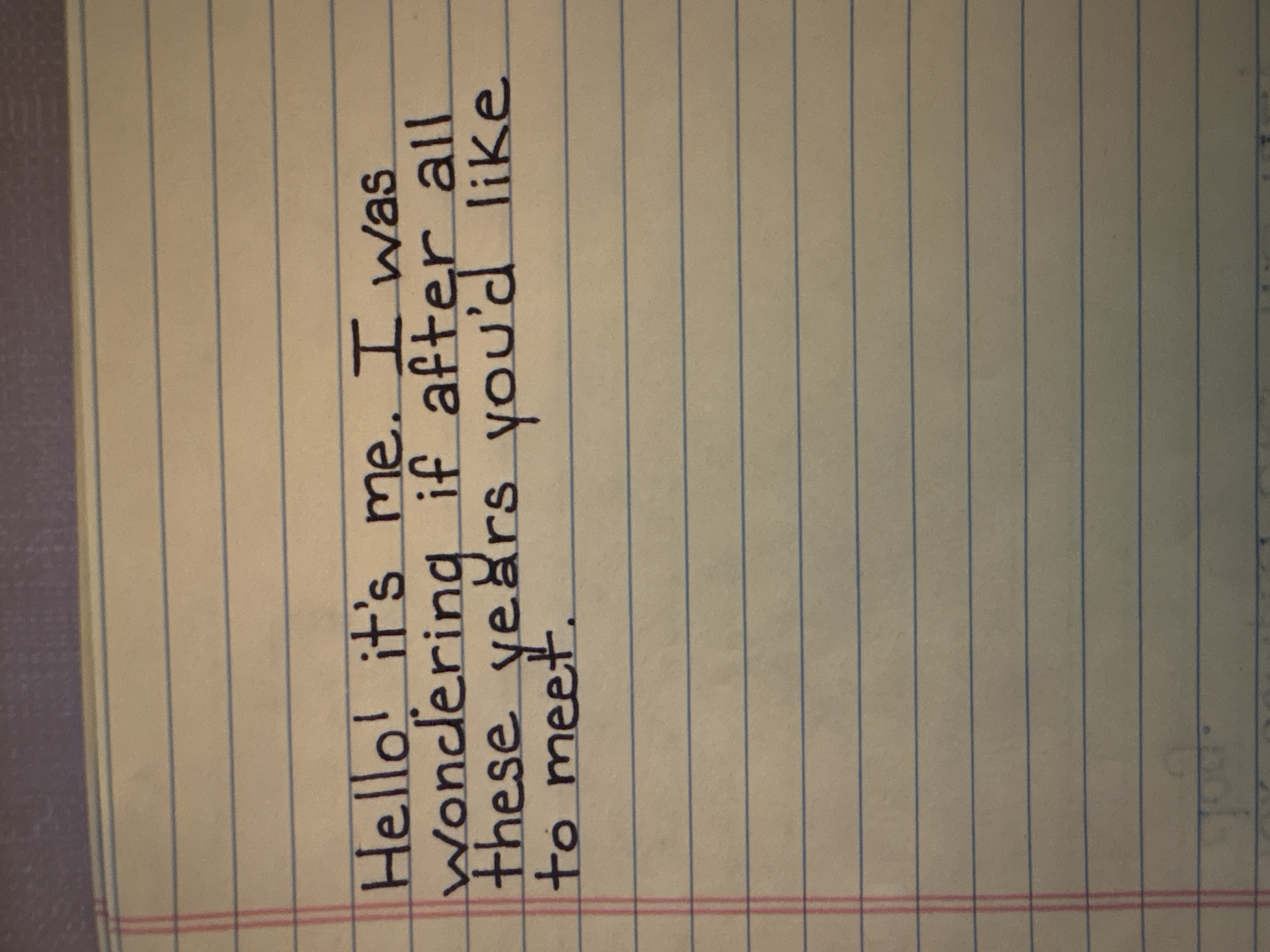
The handwriting reveals a warm and approachable personality with a touch of spontaneity, and would benefit from some refinement in letter spacing and baseline consistency.
This handwriting sample presents a friendly and approachable style. The letters are generally rounded and flowing, as seen in the words "Hello" and "wondering", suggesting a relaxed and easy-going nature. The size of the letters is consistent, indicating a balanced personality. The slant of the writing leans slightly to the right, implying a willingness to connect with others. The baseline of the handwriting appears mostly straight, despite the ruled paper, showing a degree of stability and focus, though the vertical alignment could be more precise. There is a touch of individuality expressed in certain letters, like the way the 'y' in 'years' is formed. The overall neatness and legibility of the script are high, demonstrating respect for the reader and a desire to communicate clearly.
This handwriting style hints at a warm, approachable individual. The fluency and ease of the script indicate someone adaptable and outgoing. The rightward slant combined with the rounded letters implies optimism and a tendency to connect with others emotionally. The fairly consistent size of the letters indicates a level-headedness and stability in decision-making. The somewhat rapid and free-flowing style might also suggest a touch of spontaneity and a preference for experiences over detailed planning.
To refine this already appealing handwriting, the writer could pay more attention to maintaining consistent spacing between letters. Sometimes, as in the word 'after', the letters become slightly cramped. Practicing consistent spacing would further enhance legibility and reinforce the impression of balance and organization. Additionally, focusing on vertical alignment of the text on the ruled lines would further improve neatness and the overall impression of focus and precision. These minor improvements would add polish to an already expressive and engaging hand.
Legibility
Expressiveness
Consistency
Overall
Leaderboard for Saturday, 25 October 2025
| 1 | The Pristine Penman |
76
|
| 2 | The Determined Diarist |
75
|
| 3 | The Elegant Signature |
74
|
| 4 | Geometric Author |
73
|
| 5 | The Pragmatic Planner |
73
|
| 6 | The Diligent Dreamer |
73
|
| 7 | The Student |
73
|
| 8 | The Pragmatist's Script |
72
|
| 9 | The Eloquent Calligrapher |
71
|
| 10 | The Organized Storyteller |
69
|
| 11 | The Flowing Hand |
68
|
| 12 | The Looping Luminary |
68
|
| 13 | The Acrobatic Pen |
67
|
| 14 | The Agile Acrobat |
67
|
| 15 | The Classicist's Quill |
65
|
| 16 | The Optimistic Artist |
65
|
| 17 | The Efficient Note-Taker |
64
|
| 18 | The Minimalist's Mark |
64
|
| 19 | Diligent Student |
63
|
| 20 | The Pragmatic Pen |
63
|
| 21 | The Coordinator's Quill |
61
|
| 22 | The Loop Whisperer |
61
|
| 23 | The Liberty Lover's Cursive |
61
|
| 24 | The Congratulatory Cursive |
60
|
| 25 | Zen Strokes |
60
|
| 26 | The Enthusiastic Connector |
59
|
| 27 | The Poet's Quill |
59
|
| 28 | The Precise Mathematician |
59
|
| 29 | The Elegant Calligrapher |
59
|
| 30 | The Typist's Touch |
59
|