Rate my handwriting

✨ Upload a sample of your handwriting, and our 🤖 AI will give you
the scoop on
what's awesome
and what could use a
little improving.
It's just for fun - and totally free! Try now 🚀
(You can also check out today's 👑 Leaderboard 👇)
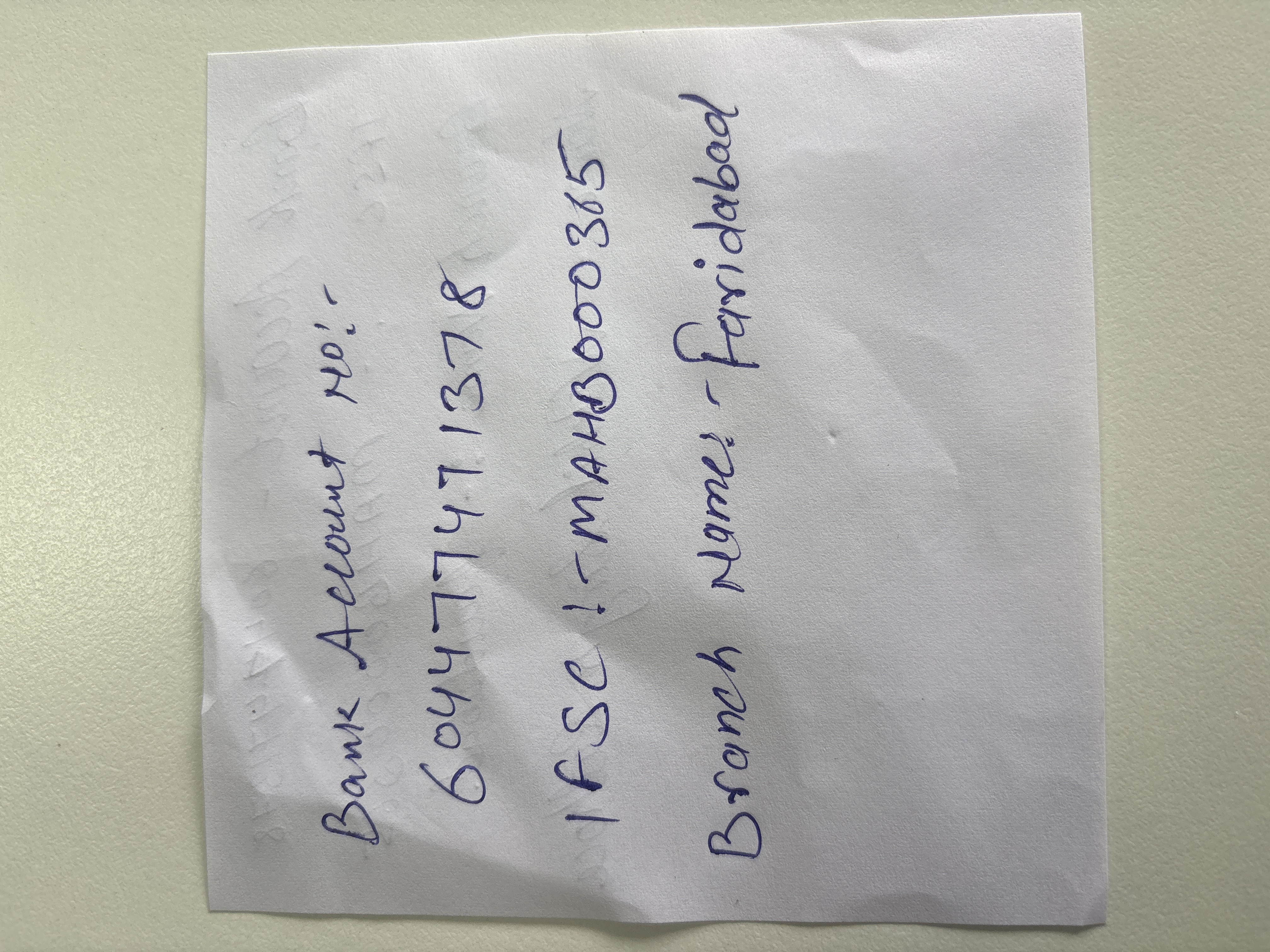
The Pragmatic Penman
This handwriting reflects a practical and direct personality with a focus on clear communication. Improved consistency in letter sizing and spacing would enhance legibility and add subtle expressiveness.
The handwriting is generally upright with a slight slant. The letter formations are mostly simple and functional, prioritizing clarity over flourishes. There is some variation in letter size and spacing, particularly noticeable between the words in "Branch Name: - Faridabad". The pressure appears consistent, indicating a steady hand, but the overall appearance suggests a focus on practicality and efficiency rather than artistic expression.
This handwriting suggests a personality that values directness and clarity. The writer likely prioritizes communication and functionality over aesthetics. The consistent pressure may reflect a reliable and grounded nature, while the slight slant hints at a degree of emotional expression balanced with a practical outlook. This individual probably approaches tasks methodically and prefers a straightforward approach.
To improve legibility, consider focusing on consistent letter sizing and spacing, particularly between words. Practicing letter formation to achieve greater uniformity can also enhance the overall appearance. While the current style is functional, incorporating slight variations in pressure and a more deliberate slant could add expressiveness without sacrificing clarity.
Legibility
Expressiveness
Consistency
Overall
Leaderboard for Monday, 27 October 2025
| 31 | Celestial Notes |
52
|
| 32 | The Ambitious Note-Taker |
52
|
| 33 | The Approximator's Script |
52
|
| 34 | The Visionary's Script |
51
|
| 35 | The Provocateur's Quill |
51
|
| 36 | The Pragmatic Penman |
47
|