Rate my handwriting

✨ Upload a sample of your handwriting, and our 🤖 AI will give you
the scoop on
what's awesome
and what could use a
little improving.
It's just for fun - and totally free! Try now 🚀
(You can also check out today's 👑 Leaderboard 👇)
The Refined Quill
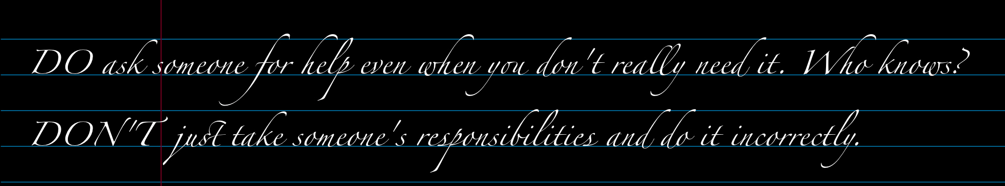
This handwriting exhibits a formal and aesthetically pleasing style, suggesting a detail-oriented and patient personality, but some simplification could improve legibility.
The handwriting sample presents a formal, almost calligraphic style. The capital letters 'DO' and 'DON'T' are prominently displayed with elaborate curves and serifs. There is a clear attempt at maintaining a consistent baseline, aided by the lined paper. The letters are generally well-formed, though some, like the 'f' in 'for' and the loops in 'l' and 'y', are particularly flourished. The spacing between words is generally good, contributing to the overall legibility.
This style suggests a personality that values precision and aesthetics. The deliberate and careful formation of each letter implies patience and attention to detail. The writer likely appreciates beauty and may have a penchant for tradition or formality. The overall neatness suggests an organized and methodical approach to tasks.
While the handwriting is visually appealing, legibility could be slightly improved by reducing the exaggeration of the letter flourishes. Focusing on consistency in letter size and slant would also enhance clarity. Perhaps practice writing at a slightly faster pace to encourage a more natural flow while maintaining the overall elegance.
Legibility
Expressiveness
Consistency
Overall
Leaderboard for Monday, 03 November 2025
| 1 | The Studious Storyteller |
74
|
| 2 | The Bold Type |
74
|
| 3 | The Guitar Breaker's Hand |
74
|
| 4 | The Geometer's Script |
72
|
| 5 | The Pragmatic Note-Taker |
71
|
| 6 | The Atomic Note-Taker |
71
|
| 7 | The Spirited Signature |
70
|
| 8 | The Orderly Historian |
69
|
| 9 | The Signature's Secrets |
68
|
| 10 | The Open Doorway |
68
|
| 11 | The Patriot's Quill |
68
|
| 12 | The Minimalist's Hand |
68
|
| 13 | The Upright Citizen |
68
|
| 14 | The Scientific Mind |
67
|
| 15 | The Mac & Cheese Enthusiast |
67
|
| 16 | The Refined Quill |
67
|
| 17 | The Upward Slant |
67
|
| 18 | The Diligent Geographer |
65
|
| 19 | The Earnest Note-Taker |
65
|
| 20 | The Pragmatic Pen |
65
|
| 21 | The Artful Calligrapher |
64
|
| 22 | The Articulate Instructor |
64
|
| 23 | The Pragmatic Planner |
64
|
| 24 | The Forthright Penman |
64
|
| 25 | The Artistic Calligrapher |
64
|
| 26 | The Curious Linguist |
63
|
| 27 | The Inky Inventor |
63
|
| 28 | The Pragmatic Narrator |
63
|
| 29 | The Flowing Poet |
63
|
| 30 | The Energetic Elocutionist |
62
|